Formatting
Page layout concepts
MuseScore generally does an excellent job of arranging music and text on the page, but there are situations where you may need to adjust things—to make music larger or smaller, to add space between staves, to change the number of measures on a page, to move text closer to or further away from the staff, etc. In order to make these types of changes, it helps to understand how MuseScore works with respect to page layout.
Definitions
There are a number of terms used throughout this chapter that you will need to be familiar with.
Spatium (plural: Spatia) / Space / Staff Space / sp.
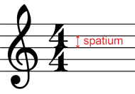
The size of everything on a score, such as staff, note heads, note stems, accidentals, clefs etc., uses a basic unit of measurement called "staff space" or "sp." to maintains correct proportions.
One sp is defined as the standard vertical distance between the midpoints of two lines of a music staff (or one quarter of vertical dimension of a full five-line staff, assuming a hypothetical staff line thickness of 0).
When you create a new score, MuseScore tries to adjust the staff space automatically so that the staves all fit on the page initially.
This usually leads to 1 sp = 1.75 mm, which results in a staff height of around 7 mm (more details explained in "Final absolute staff height" section), which is a good staff height for most solo music, choral music, small ensemble scores, and individual parts. Lead sheets and children's music may benefit from a larger staff size. Large ensemble scores may often require a smaller staff size in order to fit all instruments on the page.
You may need to adjust this value further as you add music, if auto-place results in additional space being added between staves in order to avoid collisions.
Modify the definition of "staff space" itself in the "Page settings" window. See Score size and spacing chapter, the overriding options are also explained there.
Staff
Not to be confused with concept of Musescore instrument.
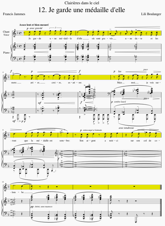
A staff is the set of lines and spaces on which notes are written. When the term is used in MuseScore, it refers to that set of lines and spaces for a given instrument throughout an entire score. In the following score for voice and piano, everything marked in yellow constitutes a single staff—the staff for the voice:
Final absolute staff height
Staff line thickness is set in Format→Style...→Measure. Its default value is 0.11sp, and the default value of sp is 1.75mm, so the default staff line thickness 0.1925mm. The 'absolute' height of default 5-line stave, measuring from the top edge of the top line to the bottom edge of the bottom line, is 0.5x0.11sp + 4sp + 0.5x0.11sp = 0.5x0.1925mm + 4x1.75mm + 0.5x0.1925mm = 7.1925mm. source: https://musescore.org/en/node/362733
Grand staff
In music for piano and certain other instruments, two staves are used—one primarily for the right hand, the other for the left. This set of two staves is normally connected by curly braces and is referred to as a grand staff. In the following excerpt, the portion marked in yellow is a grand staff:

System
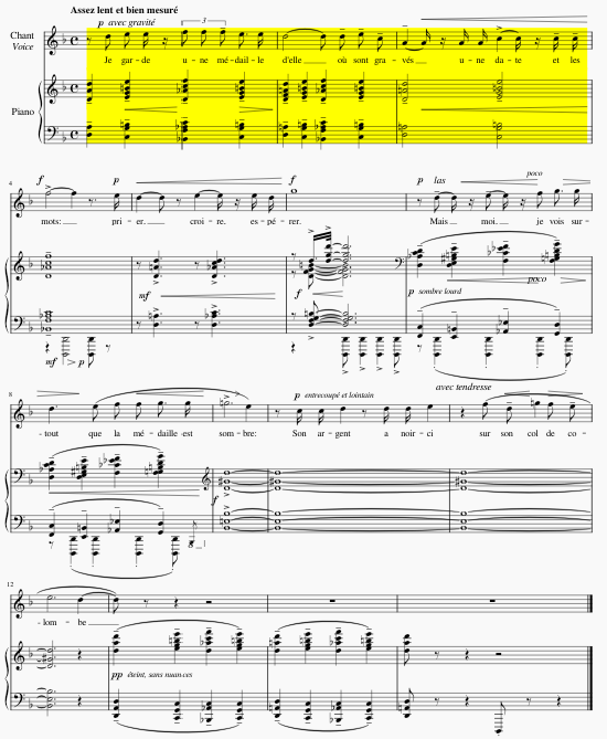
Like text, music is read left to right, top to bottom. Each line of music read across the page is called a system, and it contains the staves and grand staves for all instruments. In the following example, the yellow highlighted region represents a single system:
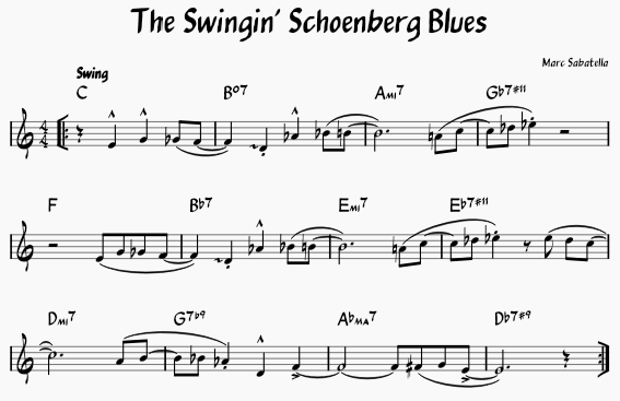
Even if a score has only a single staff for a single instrument, we still refer to a line of music read across the page as a system. In the following lead sheet, there is only a single staff but three systems:
Frame
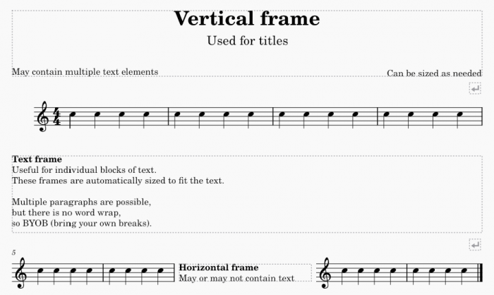
Most text in notated music is associated with specific notes or measures. However, you may also need to place text that is not associated with a specific note or measure—the title at the beginning of a score, lyric verses placed at the end of a score, explanatory information placed between systems or even between measures. MuseScore uses elements called frames for this. There are vertical, text, and horizontal frames—each optimized for a particular type of use. Horizontal frames can also be used to create separation between measures on a system, with or without associated text.
Margin
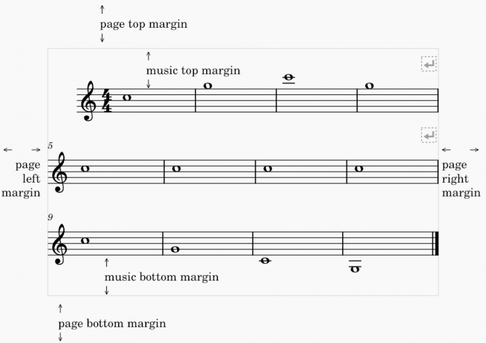
A margin is an area in which MuseScore will not normally place music or other elements. The page margin is the area around all four edges of the page where no elements are placed. The music margin is the area between the top and bottom margin and the first and last staff. The staves themselves will not be placed in those margins, but notes and other markings above or below the staves may be.
Positioning of elements
MuseScore places elements in your score automatically according to a set of rules and style settings. These are designed to produce excellent results by default in most cases‐elements positioned according to standard engraving practices while avoiding collisions between elements. MuseScore also provides the ability to customize these defaults and also to override the defaults for any given element.
Default position
Most elements in MuseScore have a default position that is determined by a style setting that can be customized via the Properties panel or the Format→Style dialog. For elements that are placed above the staff, the position is specified as an offset from the top line of the staff; for elements that are placed below the staff, the position is specified as an offset from the bottom line of the staff. These offsets, like most measurements in MuseScore, are expressed in staff spaces—abbreviated sp. For many element types, you can specify an offset to be used when placed above as well as a separate offset to be used when placed below, and also which of these placements should be applied by default.
For more info, see Templates and styles chapter.
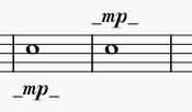
For example, for dynamics, the default placement is below the staff, and the default offset below the bottom staff line is 2.5 sp. If you flip a dynamic marking above the staff, it defaults to 1.5 sp above the top staff line staff (expressed as a negative offset: -1.5 sp). These settings are all found in Format→Style→Dynamics.
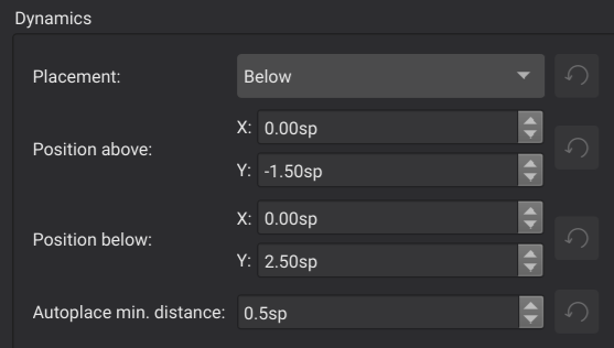
Note that the default offset is larger for dynamics placed below the staff than above only because the offset is measured from the baseline of the text.
Auto-place
Auto-place is the term MuseScore uses for a set of algorithms used to avoid collisions as well as to align certain elements automatically. A basic understanding of how auto-place works can be useful when making adjustments.
Vertical collision avoidance
For most elements placed above or below the staff, collision avoidance works vertically. When an element is being positioned, MuseScore first tries to place it according to the default offset for that element type. If that would result in a collision with another element, then one of the two elements will be moved further from the staff to avoid the overlap. MuseScore follows standard engraving rules in determining which elements to move. For example, tempo markings will be moved further above the staff to trill lines, rather than vice versa.

The Minimum distance style setting found determines how much distance MuseScore places between elements when avoiding collisions in this manner. The corresponding setting in the Properties panel allows you to override this for individual elements where necessary. But MuseScore adjusts this value automatically when positioning elements manually, as seen below in the section on manual adjustment.
Horizontal collision avoidance
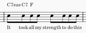
For certain elements such as lyrics or chord symbols, MuseScore will widen measures to avoid collisions rather than displace these elements vertically.
Vertical alignment
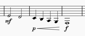
MuseScore will also try to align certain elements vertically, so that if one element of that type needs to be adjusted vertically to avoid a collision, other elements of that same type on the same system will automatically be adjusted as well. Elements that are always aligned vertically include lyrics and pedal markings. Dynamics and hairpins will be aligned if they are directly adjacent, as will pedal markings.
Chord symbols can also be aligned vertically if you enable this in the chord symbol style settings, by setting a Maximum shift value. See Chord symbols for more information.
Disabling auto-place
Auto-place normally does a good job of avoiding collisions and of aligning elements. And in cases where you wish to position an element manually, you can normally do so directly, without the need to disable auto-place (see manual adjustment below). However, there can be some situations in which you may still wish to disable auto-place. For example, rehearsal markings default to displaying above voltas, but you may wish to reverse this for some specific case where the volta was already displaced higher and there is then room for the rehearsal mark underneath.

In this case, disabling auto-place for the rehearsal mark allows it to display underneath the volta, while still allowing the volta to automatically avoid collisions with the notes.
To disable auto-place for an element, select it and then disable the Auto-place setting in the Properties panel.
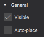
The element will be returned to its default position (as determined by its style settings) and it will not be included in the detection of collisions with other elements. Disabling auto-place for an element also causes it to be excluded from any vertical alignment that would otherwise have applied.
Manual adjustment
Whether auto-place has displayed an element from its default or not, the position of elements can be adjusted manually, such as by dragging, using the cursor keys, or the Offset fields in the Properties panel. See Adjusting elements directly for more information.
MuseScore even allows you to perform manual adjustments that would result in collisions. In the example above, if you drag the rehearsal letter below the volta, MuseScore will allow this and will automatically set the Minimum distance for that element to a negative value, thus effectively allowing the collision without disabling auto-place.
Manual alignment
Elements of the same type will normally be aligned by default simply because they have the same style settings and therefore the same offset. However, auto-place can result in some of the elements being moved further from the staff than others. As described above under Vertical alignment, MuseScore will automatically align some types of elements. For other elements types, you can align them manually by assigning them the same vertical offset.
To do this, simply select the elements you wish to align (e.g., click the first, Shift+click the last), then gradually increase or decrease the vertical offset in the Properties panel. For example, to align a series of tempo markings above the staff, you will need to set their vertical offsets to the same value. To make sure they are aligned and also avoid the collisions that cause auto-place to display one or more of them to begin with, you will need to set the offset to a sufficiently large negative value.

Score size and spacing
MuseScore provides a number of score-wide settings to control the overall size and spacing of music.
Below we will cover these settings and Musescore's algorithm. These settings are in the "Page settings" window, and in the items around the top of "Style" window left pane: Format → Style → Score, Page, Size, System, Bars etc.
There are also a variety of ways to override these defaults to change the horizontal or vertical spacing of individual systems pages, and these are covered in Systems and horizontal spacing and Pages and vertical spacing chapters.
See also Templates and styles if you are using Musescore Part feature.
Page settings
The settings that control the overall size of your music are found in Format→Page Settings.
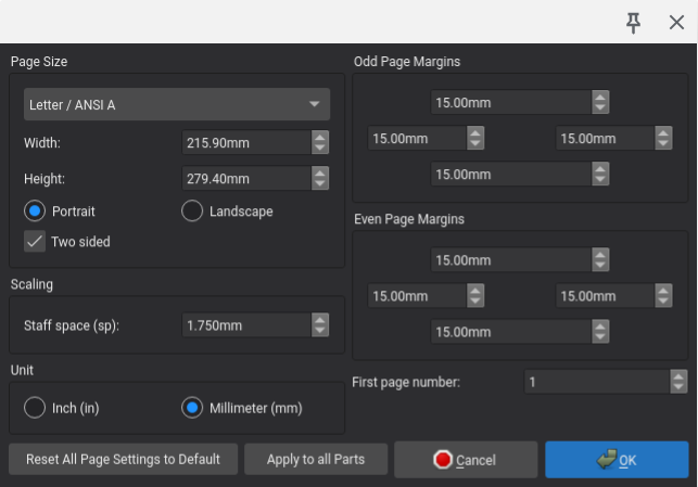
Note that units in this dialog default to millimeters, but you can change to inches using the control provided.
Page and margin sizes
- Page Size: select from predefined pages sizes
- Width: set a custom width
- Height: set a custom height
- Portrait / Landscape: set the page orientation
- Two sided: determines whether margins as well as Header and footer can be set independently for odd and even pages
The default page size is Letter in North and Central America, and A4 in most of the rest of the world.
- Odd Page Margins: set the top, bottom, left, and right page margins for odd-numbered pages
- Even Page Margins: set the top, bottom, left, and right page margins for even-numbered pages
The margins default to 15 mm regardless of the page size. If Two sided is not enabled, then only the Odd Page Margins settings are applicable.
Scaling
Staff space (sp) : changes the definition of staff space (sp) itself. See Page layout concepts chapter.
See overview above for info on other overall size and spacing options and the two chapters detailing individual systems pages specific options.
Overriding options for individual object on a score are available:
- Each Text object on a score has a "Follow staff" size checkbox property set in Properties panel, see Formatting text chapter.
- Various profiles "style for text inside certain type of object" have "Follow staff size" checkboxes set in Format → Style → Text Styles → (middle pane items), see Templates and styles and Formatting text chapter.
- Each Image on a score has a Size in staff space units checkbox property set in Properties panel, see Working with images.
- [Please add missing options if you find them]
Other settings
- First page number: Set the number on which page numbering starts (useful if your score has a title page, for example)
- Unit: select between inches and millimeters for values in this dialog
Actions
In addition to the standard OK and Cancel buttons, this dialog also contains:
- Reset All Page Settings to Default: reset all settings in this dialog to their default values
- Apply to all Parts: apply the current page settings to all individual parts
Note that in large ensemble scores where MuseScore has automatically reduced the staff size in order to fit all instruments on a single page, resetting page settings will revert to the standard staff space default of 1.75 mm.
Style settings
The horizontal spacing of notes and the vertical spacing of staves and systems are controlled by style settings.
Horizontal spacing
This section contains overview, see Systems and horizontal spacing for details.
MuseScore determines an initial width for each measure based on the music it contains, then calculates how many measures can fit on each system, and then stretches those measures out so that all systems (except the last if desired) are filled to the right margin, similar to the "justified" option in word processor software. You cannot change this behavior, but see overriding options in Systems and horizontal spacing.
The initial width for a measure is determined by the music within it as well as a group of style settings that control the spacing between notes and other symbols. Most of the settings affecting the horizontal spacing for a score are found in Format→Style→Bars. The most important are:
- Minimum measure width: set the minimum width for a measure
- Minimum note distance: set the minimum distance between two notes
- Spacing ratio: set the ratio of space allocated for one note value compared to the next shorter value
The default spacing ratio of 1.5 means that each note value takes 1.5 times as much space as the next shorter value. So, a half note takes 1.5 times as much space as a quarter note, etc. The minimum note distance specifies the smallest distance MuseScore will allow between two notes, and this sets the initial distance for the shortest note values. Longer note values will always receive more space as per the spacing ratio, and by the time measures are stretched to fill the page width, it is likely that even the shortest notes will not actually be as close as the minimum. The minimum note distance and spacing ratio settings together determine how tight or loose the spacing is.

At one extreme, the top staff above uses a Spacing ratio of 1.0, which results in all notes taking equal space regardless of note duration. At the other extreme, the bottom staff uses a ratio of 2.0, which results in notes spaced proportionally to their relative duration, such that a half note gets twice as much space as a quarter note. This is useful if measures of equal width are desired. Values closer to the default of 1.5 are best for most cases. A slightly smaller value allows for tighter spacing, while a slightly higher value allows for looser spacing. Decreasing or increasing the minimum note distance also results in tighter or looser spacing.
If the spacing calculation results in some measures (those containing relatively few notes) working out to less than the minimum measure width, extra space is added to enforce the minimum.
There are also many individual settings in this same dialog to control specific details such as the padding from Clef to time signature or Barline to grace note. More such settings are added over time, and these are meant to be self-explanatory.
Additional relevant style settings can be found in :
- Format→Style→Score
- Enable indentation on first system: set to indent the first system of the score
- First system indentation: set the amount of indentation
- Format→Style→Page
- Last system fill threshold: determines whether to fill the last system of the score to the right margin
Vertical spacing
This section contains overview, see Pages and vertical spacing for details.
MuseScore provides a choice of two different vertical spacing algorithms.
In both algorithms, MuseScore fills pages with systems in a similar manner to how it fills systems with measures. First, it determines an initial size for each system, then it determines how many systems can fit on each page, and then it spreads those systems out so that all pages are filled well. Depending on your style settings, MuseScore may literally fill each page to the bottom margin, or it may leave additional space on the bottom of some pages if trying to fill the page completely would spread things out too widely.
The difference between the two algorithms has to do with how the spreading to fill the page occurs.
If you select Disable vertical justification of staves, the distance between the staves within a system is fixed, unless that would result in collisions. In this algorithm, if MuseScore needs to spread systems to fill a page, it will always do so by adding space between systems rather than within systems. This yields consistent spacing between staves from one system to the next, but it can result in spacing between systems being much larger than spacing within them, and it will usually result in ragged bottom margins on pages with only a single system (since the staves within the system won't be spread to fill the page).
The default, however, is to Enable vertical justification of staves. With this method selected, the distance between staves within systems is also subject to spreading. This results in more even spacing overall—the spacing between systems will still be larger than the spacing within them but not to the same extreme—and it mostly avoids ragged bottom margins on pages with only a single system (since the staves within the system can be spread to fill the page).
Most of the settings controlling the vertical spacing for a score are found in Format→Style→Page. There is, however, one relevant setting in Format→Style→Score.
- Minimum vertical distance: set the minimum amount of space that MuseScore will allow between symbols below one staff or system and symbols above the next staff or system below
Music margins
Regardless of whether vertical justification is enabled or disabled, MuseScore will add space above the top staff and below the bottom staff of each page:
- Music top margin: set the minimum amount of space between the page top margin and the top staff
- Music bottom margin: set the minimum amount of space between the page bottom margin and the bottom staff
Distance between staves within systems
If you select DIsable vertical justification of staves, then there are two settings that control spacing within systems:
- Staff distance: set the distance between the staves of adjacent instruments
- Grand staff distance: set the distance between the staves of a grand staff (e.g., for piano, actually for all staves connected by a curly brace).
Note: even with DIsable vertical justification of staves selected, MuseScore will still add more space between staves as necessary to avoid collisions. To force a completely consistent distance between staves (and accept the resulting collisions), set the Minimum vertical distance to a large negative number.
If you select Enable vertical justification within staves, then there is not a single setting for staff or grand staff distance. Instead, you select a range of acceptable distances and values that control how much of the available space MuseScore will fill by spreading systems versus spreading staves (and how much extra space to add between bracketed and braced groups of staves). The relevant settings include:
- Minimum staff distance: set the minimum distance between adjacent staves
- Maximum staff distance: set the maximum distance between adjacent staves
- Maximum grand staff distance: set the maximum distance between adjacent staves of a grand staff
- Factor for distance above/below bracket: set the extra amount to spread between bracketed staff groups
- Factor for distance above/below brace: set the extra amount to spread between braced staff groups
Distance between systems
Whether vertical justifications of staves is enabled or disabled, you specify the distance between systems as a range:
- Minimum system distance: set the minimum distance between adjacent systems
- Maximum system distance: set the maximum distance between adjacent systems
In addition, if you select Enable vertical justification of staves, there are two more settings:
- Factor for distance between systems: set the extra amount to spread between systems
- Maximum page fill distance: the total maximum amount of spread
Staff/part properties
See Staff/Part properties main chapter.
There are also a couple of staff-specific settings that affect size and spacing. To access these, right-click (Ctrl+click) a staff and then select Staff/Part properties. The relevant settings are:
- Small staff: set staff size to percentage specified in Format→Style→Sizes
- Scaling: set staff size to a custom percentage
- Extra distance above staff: set an extra distance between this staff and the staff above
Systems and horizontal spacing
The horizontal spacing algorithm in MuseScore determines the width of each measure, which in turn determines how many measures will fit on each system. While this will produce good results in many cases, there are also situations where you may wish to override this and have fewer or more measures on a system, or to have them spaced differently within the system.
Features
The main tools used to control systems and horizontal spacing are described below.
System breaks
A system break causes MuseScore to end a system after a specific measure or horizontal frame, even if more measures would fit. To add a system break, select a measure (or any element within it) or a frame, and then click the System break icon in the Layout palette:
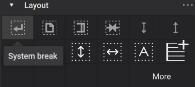
You can also use the keyboard shortcut Enter. Both methods of adding breaks also work while in note input mode.
After adding a break, the icon will appear above the measure you added it to:
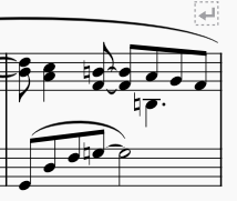
As with other formatting elements, system breaks appear in gray and will not print, and their on-screen display can be disabled via the Properties panel.
Layout stretch
You can increase or decrease the width of measures, and their contents will stretch accordingly. The calculated width of a measure is multiplied by a layout stretch factor that you can set numerically for selected measures, but you can also use commands to increase or decrease the stretch of selected measures directly without needing to set a specific number.
To change the layout stretch directly, you can select one or more measures, then use one of the commands in Format→Stretch:
- Increase layout stretch: increase the width of the measure (shortcut })
- Decrease layout stretch: decrease the width of the measure (shortcut {)
- Reset layout stretch: reset the width of the measure
To set the layout stretch value numerically, you can select one or more measures and then set the Measure width in the Appearance section of the Properties panel.

As you can see if you watch this setting, each press of } or { increments or decrements this value by 0.1.
You can also set this value for a single measure by right-clicking it, selecting Measure properties, and setting Layout stretch in the resulting dialog.
Horizontal frames
A horizontal frame is a container for empty space, text, or images, that can be placed between measures in a score. Although you can place text or images within horizontal frames (see Using frames for additional content), one of their main purposes is to create empty space within systems, as shown below.
To add a horizontal frame to your score, select a measure and then click the Insert horizontal frame icon in the Layout palette:
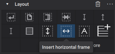
The frame will be inserted in front of the selected measure. If the measure is at the beginning of a system, the frame may actually appear at the end of the previous system, if there is room.
You can also use the commands in the Add→Frames menu.
You can then change the width of the frame using the Width setting in the Properties panel, or by selecting the frame and dragging its handle or using the Left and Right cursor keys to change the width. Keyboard adjustment occurs in steps of 0.5 sp, or 1.0 sp if you hold Ctrl (Cmd on Mac).
- Insert horizontal frame: insert a horizontal frame before the selected measure
- Append horizontal frame: append a horizontal frame to the end of the score
Keep measures on the same system
To keep measures together for the purpose of determining if they fit on a given system or not, you can select them and then click the Keep measures on the same system icon on the Layout palette:
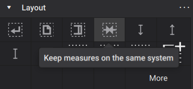
When MuseScore is deciding how measures to place on a given system, and it encounters such a group and determines that they do not all fit, MuseScore will move the entire group to the next system.
Tasks
These features can be used in a variety of ways, but there are a handful of tasks that are especially common.
Placing fewer measures on a system
It is always possible to get fewer measures on a system than what MuseScore places by default. To end a system on a particular measure or horizontal frame, select it and add a system break.
Placing more measures on a system
While it is not always physically possible to fit more measures onto a given system at the current page and staff size and spacing settings—there may simply be “too many notes” to fit without overlapping—you can reduce the widths of selected measures.
To place more measures on a system:
- Select and delete any system break that might be present already
- Select the measures you wish to combine onto one system
- Reduce stretch for the selected measures until they fit (e.g., by pressing {)
Depending on how close it was to fitting before, it might take multiple Decrease layout stretch operations before the stretch is reduced enough for them all to fit. But it may also be the case that it just is not possible without reducing your overall page or staff size, or spacing settings. See Score size and spacing for more information.
Changing the relative spacing of measures within a system
The default spacing is designed to make sure that all notes of a given duration on the same system take the same amount of space, unless more space is required to make room for markings between specific notes. But there can be cases where it might make sense to increase the spacing in one or more measures, thus correspondingly decreasing the spacing in the others (or vice versa).
To change the spacing in one or more measure, simply select them and increase or decrease the layout stretch as described above.
Creating space between measures
To create space between two measures, select the second measure, then insert and adjust a horizontal frame as described above.
Creating space at the beginning or end of a system
To create extra space at the beginning or end of an individual system, add horizontal frame. For the first system of a score, the First system indent style setting (in Format→Style→Score) automatically creates space. See Score size and spacing for more information. You may want to create separate sections with a "Section Break" instead, when you think of extra space at the end of an individual system, see Using sections for multiple movements or songs chapter.
To add space at the beginning of a system, select the first measure of the system then insert and adjust a horizontal frame as described above. You may also need to place a system break on the last measure of the previous system to ensure that the horizontal frame does not appear there instead.
To add space at the end of a system, first make sure there is no system break on the last measure, then select the next measure and insert a horizontal frame. Then add a system break to the horizontal frame itself if needed.
Adjusting the width of the final system
The last system of a score will normally be right-justified (stretched to fill the width of the page) if its default width exceeds the Last system fill threshold as set in Format→Style→Page. See Score size and spacing for more information. This normally produces good results, but there may be cases where the last system is filled but would look better if it were not, or vice versa.
For cases where the system is filled but you would prefer it not to be, you can increase the threshold. A value of 100% will mean the last system is never filled (since its width will never exceed that threshold). Conversely, if the last system is not filled but you want it to be, then decrease the threshold. A value of 0% will mean the last system will always stretch (because its width will always exceed that threshold).
Normally, however, you should select a threshold value that will accommodate future changes to the score that might result in more or fewer measures ending up on the last system. For instance, if your last system currently has several measures and you force it to be filled by setting the threshold to 0%, this might look bad if the layout changes in the future and the last system has only one measure. Or if the last system has only one measure and you force it not to be filled by setting the threshold to 100%, this might look bad if the layout changes in the future and the last system ends up with several measures. This is why a more middle-of-the-road value usually makes sense.
It is usually even better, however, to plan system breaks to avoid having the last system being less full than others.
Grouping measures
As discussed in Score size and spacing, MuseScore normally fits as many measures as it can on each system. This can sometimes result in two or more musically-related measures being split across a system break, when it might be easier to read if they were kept together on the next system. While you could add a system break to the measure before the group, this could easily turn out to be counterproductive if the layout changes later and all the measures could have fitted on that system. What you really want is to be able to specify that a group of measures should be kept together if possible, whether that means keeping them on the original system or moving them all together to the next.
In a word processor, a “non-breaking space” character can be used to keep two words together. If the words both fit on the current line, then the non-breaking space acts like a regular space. But if the two words cannot both fit on a line, word wrap will move them both together to the next line rather than split them apart at the non-breaking space.
In MuseScore, you can use the Keep measures on the same system icon in the Layout palette to group selected measures in the same way. These measures will be treated as a single block for the purpose of deciding whether to place them on one system or the next.
Note that this will not allow you to fit more measures on a system than your current settings would normally allow. It simply tells MuseScore that it should keep them all together if possible.
Pages and vertical spacing
Features
As described in Vertical spacing, MuseScore fills each page with as many systems as can fit given the current score settings, and then adjusts the spacing within each page according to one of two different algorithms. You can also adjust the number of systems on a page, or the spacing between specific staves or systems, manually.
Page breaks
A page break causes MuseScore to end a page after a given system, even if more systems would fit. To add a page break, select a measure or frame and then either press Ctrl+Enter (Cmd+Enter on Mac) or click the Page break icon in the Layout palette:
![]()
Spacers
A spacer is a formatting element you can add to a measure to control the amount of space above or below that particular staff. Spacers can work to either add or remove space, and they can operate either within or between systems.
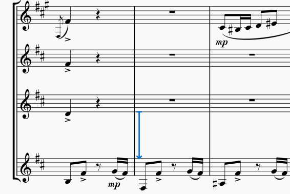
To add a spacer to your score, select a measure and then click the appropriate icon in the Layout palette:
![]()
You can also drag and drop a spacer from the palette to a measure in your score.
Once you have added a spacer, you can adjust its height by selecting it and dragging its handle, or by using the Height setting in the Properties panel. There are three different types of spacers, and the height setting affects the score differently according to the spacer type:
- Staff spacer down: ensure there is at least the specified given amount of space below this staff
- Staff spacer up: ensure there is at least the specified amount of space above this staff
- Staff spacer fixed down: ensure there is exactly the specified amount of space below this staff
In all cases, the spacer works within a system when added between staves of a system. In addition, a Staff spacer down or Staff spacer fixed down works between systems when added to the bottom staff of a system, and a Staff spacer up works between systems when added to the top staff of a system.
Vertical frames
A vertical frame is a container for empty space, text, or images, that can be placed between systems in a score. Although vertical frames can be left empty and thus function in a manner similar to spacers, the primary purpose of vertical frames is to add text or images. For more information, see Using frames for additional content.
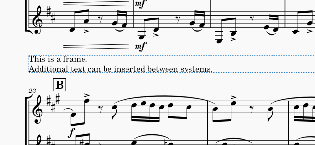
System dividers
In ensemble music in which multiple systems fit on a single page of music, it is common to use a pair of diagonal strokes to help clarify the division between the systems.
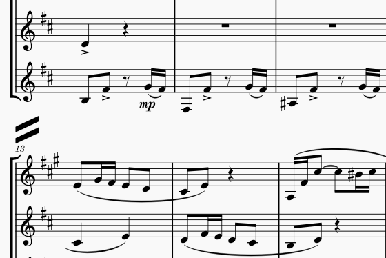
MuseScore can add these automatically via the settings in Format→Style→System. You can enable Left and Right dividers independently. For each, you can customize a number of settings:
- Symbol: select between System divider, Long system divider, or Extra long system divider
- Horizontal offset: distance from default position (aligned with the page margin)
- Vertical offset: distance from default position (midway between systems)
Tasks
The feature listed above can be used to achieve a number of common tasks.
Placing fewer systems on a page
To place fewer systems on a page, simply add a page break to the system or frame you wish to appear last on the page.
Placing more systems on a page
As with horizontal spacing, in some cases it might not be possible to fit more systems onto a page than your current settings permit. So you may also want to consider a smaller staff size, or reducing the minimum system distance score-wide, or other style changes. However, in some cases you may be able to fit more systems on a page by manually reducing the distance between specific systems.
To reduce the distance between two specific systems, add a Staff spacer fixed down to the bottom staff of the upper system, then set its height as desired. If this reduction allows another system to fit on the page, then it will happen automatically.
Adjusting the spacing on sparse pages
MuseScore normally spreads systems and staves out to fill a page (see Vertical spacing for more information). Whether you enable or disable vertical justification, however, pages that are especially sparse may still look awkward. This is especially common for the last page of a score, where it is possible more systems could have fit.
In many cases, the best results would be obtained by planning the system and/or page breaks throughout the score to avoid these overly sparse pages. But in cases where this is unavoidable, you will need to decide where you want the extra space—all at the bottom of the page, equally divided between the top and bottom, dispersed between systems, or dispersed between staves within systems as well as between systems.
To force all extra space to the bottom of the page, once solution is to add a Staff spacer down below the last system, and adjust its height as appropriate to take the space you wish to leave below. Another is to reduce either the Maximum system distance or Maximum page fill distance (see Vertical spacing). These settings may affect other pages as well, but in most cases, they will only be relevant for especially sparse pages.
To force some space at the top of the page, you can add a Staff spacer up above the first system.
To change the distribution of space between systems and staves within systems, be sure Enable vertical justification of staves is enabled in Format→Style→Page, then adjust Factor for distance between systems. A value of 1.0 means that space is equally distributed within and between systems. Larger values mean that more of the available space will be allocated between systems as opposed to within them.
Adjusting space between specific systems
To add space between two specific systems, add a Staff spacer down to the bottom staff of the upper system, or a Staff spacer up to the top staff of the lower system.
Adjusting space between specific staves
To add space between specific staves within a single system, add a Staff spacer down to the upper staff, or a Staff spacer up to the lower staff.
To add space between specific staves across all systems—such as to separate piano accompaniment from the vocal staves in a choral score—right-click the lower staff, select Staff/Part properties, and increase the Extra distance above staff setting.
Using frames for additional content
Overview
A frame is a rectangular space in the score into which one or more text objects or images may be inserted. In the score window the sides of the frame are marked by dotted lines (these do not show up in the printed score).
A frame may be one of three types:
- Vertical frame: A full-width rectangle inserted before the first system, after the last system, or between systems. It may contain several text objects and/or images.
- Text frame: A full-width rectangle inserted before the first system, after the last system, or between systems. It may contain one text object only.
- Horizontal frame: A rectangle between two measures which may contain several text objects and/or images.
Note: Although you can use frames to create extra space between systems, it is best to use spacers for this purpose.
Uses of frames
Frames may be used to
- Display the title, subtitle, composer, arranger, lyricist etc., at the top of a score. This is done automatically for new scores if you have completed the relevant details on page 2 of the New Score dialog.
- Display details of movements within a score.
- Display lyrics at the end of a song.
- Create a blank space before a coda
and so on.
Adding frames between or before/after systems
Text frames
A text frame is a full-width rectangle placed either before the first system or after the last one, or between systems. One text block (only) may be added to the frame. The height of the frame is automatically adjusted to the height of any text block contained within it.
Adding a text frame
- Select a measure, or a frame
- Apply one of the following methods:
- From the menu bar select Add→Frames→Insert text frame
- In the Layout palette click on the “Insert text frame” icon
- Use an “Insert text frame” custom keyboard shortcut (you can set this up in the Preferences: Shortcuts dialog).
If the measure selected is the first one in the system, the frame will simply be inserted above the system. If the selected measure is any one but the first, it will start a new system and the frame will appear above it.
Adding text
To add a text block to the text frame:
- Double-click the frame; or right-click on the frame and choose Edit element; or select the frame and use the shortcut F2, or Alt+Shift+E.
- Type the desired text.
The text has the “Frame” style by default but you can change this using “Text style” in the Text tab of the Properties panel. You can also apply character formatting in the usual way.
Vertical frames
A vertical frame is a full-width rectangle placed either before the first system or after the last one, or between systems. Several text blocks and/or images may be added to the frame.
Adding a vertical frame
- Select a measure, or a frame
- Apply one of the following methods:
- From the menu bar select Add→Frames→Insert vertical frame
- In the Layout palette click on the “Insert vertical frame” icon
- Use an “Insert vertical frame” custom keyboard shortcut (you can set this up in the Preferences: Shortcuts dialog).
If the measure selected is the first one in the system, the frame will simply be inserted above the system. If the selected measure is any one but the first, it will start a new system and the frame will appear above it.
Adding text
To add a text block to the vertical frame apply one of the following methods:
- Right-click on the frame, select Add, then choose one of the options (Text, Title, Subtitle, Composer, Lyricist, Part name).
- Select the frame, and from the menu bar choose Add→Text. Then choose one of the first five options (Title, Subtitle, Composer, Lyricist, Part name).
- Select the frame and use keyboard shortcuts to add applicable text blocks (you can set these up in the Preferences: Shortcuts dialog).
Adding an image
- Right-click on the vertical frame
- Select Add→Image
- Search for and add the image from the “Insert image” window.
Size
The height of the vertical frame is automatically adjusted to the height of any text block contained within it. But you can override this using “Height” in the Vertical frame tab of the Properties toolbar.
Position and alignment of content
The position of a text object which abuts directly onto the border of a vertical/text frame can be altered by adjusting the relevant margin (Top/Bottom/Left/Right) in the Vertical frame tab of the Properties panel.
For example, a left- and top-aligned text object will be pushed away from the respective border by increasing the “Left margin” and/or “Top margin”, and so on.
Spacing
In the Vertical frame or Text frame tab of the Properties panel, adjust “Gap above” and “Gap below” to create extra space above/below the frame.
Adding frames between measures
Horizontal frames
A horizontal frame is used to create space between the measures of a particular system with optional text and/or image content.
Adding a horizontal frame
- Select a measure.
- Apply one of the following methods:
- From the menu bar select Add→Frames→Insert horizontal frame
- In the Layout palette click on the “Insert horizontal frame” icon
- Use an “Insert horizontal frame” keyboard shortcut (you can set this up in the Preferences: Shortcuts dialog).
The frame is inserted between the selected measure and the following one.
Adding text
To add a text block to a horizontal frame, right-click on the frame and select Add→Text.
Adding an image
- Right-click on the horizontal frame
- Select Add→Image
- Search for and add the image from the “Insert image” window.
Size
You can adjust the width of the frame in the Horizontal frame tab of the Properties panel.
Spacing
You can adjust the space on either side of the horizontal frame using “Left gap” and “Right gap” in the Horizontal frame tab of the Properties panel.
Other horizontal frame properties
- Display brackets, clefs and key signatures in the next measure
See also
Working with images
Images may be inserted into scores by attaching them to score objects or to frames.
The supported image formats are SVG (*.svg), PNG (*.png), JPEG (*.jpg and *.jpeg).
- SVG is recommended for symbols and 2D graphics because it enables you to adjust the image size without pixelation.
- Transparency and gradients are supported.
- Advanced SVG features such as shading, blurring, clipping and masking are not supported.
- PNG also supports transparency and is preferable to JPEG for symbols and 2D graphics.
- Use PNG if you can't obtain an SVG version of the graphic.
- Don't try to convert PNG to SVG because this won't provide the benefits of a true SVG image.
- Consider using a free tool such as TinyPNG to reduce the PNG file size without reducing quality.
- JPEG is recommended for photographs and detailed 3D textures.
- Use it for 2D graphics only if you have no other option.
- Don't try to convert JPEG to SVG or PNG as this will increase file size without providing the benefits of those formats.
In addition, images saved in the Bitmap (*.bmp), and TIFF (*.tif and *.tiff) formats work but are not fully supported. It's best to convert these images to PNG or JPEG before importing into MuseScore Studio.
Other formats such as GIF (*.gif), WebP (*.webp) and X PixMap (*.xpm) are not supported. These images must be converted to PNG or JPEG before importing in MuseScore Studio.
Importing images
Add an image to a vertical or horizontal frame
This method doesn't work with Bitmap (*.bmp) or TIFF (*.tif and *.tiff) images.
- Right-click on the frame
- Select Add→Image
- Search for and add the image from the “Insert image” window.
Attach an image to a score object
Use this method for small images associated with staves, such as musical symbols, or for image formats not supported by the above method (e.g. Bitmap, TIFF).
- Locate the image file in your operating system's file manager (i.e. outside of MuseScore Studio).
- Shrink the file manager's window so it fits on the same screen as MuseScore Studio.
- Drag the image file from the file manager across to MuseScore Studio.
- Keep dragging until the cursor is positioned over a note, rest, measure, or a vertical or horizontal frame.
Saving images to palettes
To save an imported image to a palette, see Adding elements from the score.
Copying imported images
Once an image has been imported into the score it can be copied/cut and pasted to another location, such as a frame, note or rest, using the standard commands and procedure (see Copy and paste).
Adjusting images
Change image height/width
Select the image and use either of the following methods:
- Drag either of the image adjustment handles.
- Edit the “Image height/width” in the Image section of the Properties panel.
As long as the padlock symbol is active (colored blue in Properties: Image) the aspect ratio (height/width) of the image will be maintained throughout. If you want to adjust a side independently of the other, click on the padlock to break it (colored grey).
Scale image
To scale an image to the height of the containing frame:
- Adjust the frame to the desired height
- Check “Scale to frame size” in the Image section of the Properties panel.
As long as “Scale to frame size” remains checked the image size will follow the frame height.
Adjust image position
The image can be repositioned by dragging, or adjusting the horizontal/vertical offsets in the Appearance section of the Properties panel. Ctrl+R restores the image to its default position.
Image properties
The image properties of a selected image can be adjusted in the Image section of the Properties panel.
- Image height / Padock / Image width: Adjust dimensions of image. The padlock, which is active by default, ensures that the desired aspect ratio (height/width) is maintained.
- Scale to frame size: See Scale image (above).
-
Use staff space units: When checked (the default setting), the image automatically scales proportionally with the Scaling setting in Format→Page Settings, and uses the staff space unit, sp. If unchecked, the image uses mm and does not scale proportionally. See Page layout concepts.
This symbol is 4sp in height so it fits perfectly into the space between the top and bottom line of a 5-line staff. Its "Use staff space units" option is checked so it scales proportionally.
See also
- Using the palettes for info on how apply palette items.
Using sections for multiple movements or songs
Overview
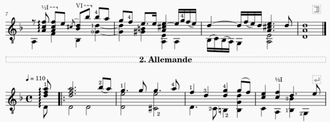
A section break is used to divide a score into separate sections, such as might be required in a musical suite, for example.
In the following score example, there is a section break at the end of the first system, followed by a text frame providing the title of the next movement.
Features
A section break has the following features:
- The measure after the point of application is forced to start a new system (like a system break)
- An adjustable playback pause between movements
- An option to restart measure numbering
- An option to display long instrument names (as you might at the start of a piece).
These options are detailed in Section break properties (below).
Time and key signatures
If the beginning of a new section is accompanied by a change of time or key signatures, there will be no courtesy signature at the end of the previous section.
Adding section breaks
To add a section break, select a measure, barline (or any element within the measure), then click the Section break icon in the Layout palette. You can substitute the latter action with a custom shortcut if desired (see Preferences: Shortcuts).
Section break properties
The following properties of section breaks are adjustable from the Section break part of the Properties panel:
Pause
To adjust the playback pause after a section break: select the break and edit “Pause before new section starts”.
Instrument names
To display the long intrument names on the first system after a section break: select the break and make sure that “Start new section with long instrument names” is checked.
Bar numbers
To restart measure numbering after a section break: select the break and make sure that “Reset bar numbers for new section” is checked.
Additional settings for measure number display are available in the Measure properties dialog.