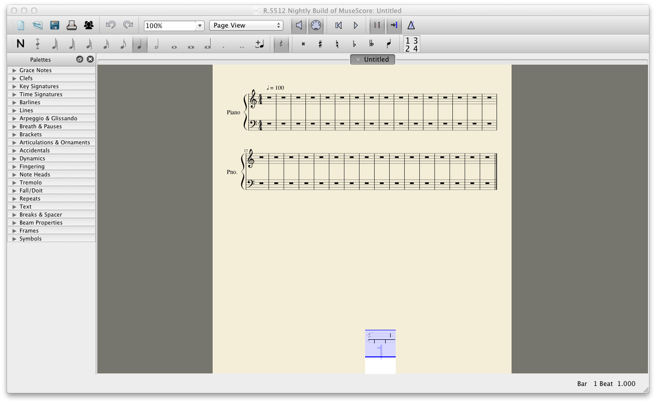
Redesigning the navigator
The navigator could be placed centre without the non-occupied grey space (see attached image for the concept). If there's more pages, it just expands horizontally. If you want the navigator to appear bigger, you can grab the top and move vertically.
I also thought about a floating navigator.
It could allow the user to see and work better around the score, without losing the navigator.
What do others think?
| Attachment | Size |
|---|---|
| Redesigned Navigator.png | 100.32 KB |
Comments
I think a floating navigator would be a great idea!
In reply to I think a floating navigator by musiclover007
So do I :)
I filed issues for these (and another - the last one):
#15860: Floating navigator
#15861: Display essentials of navigator
#15862: Resizable navigator