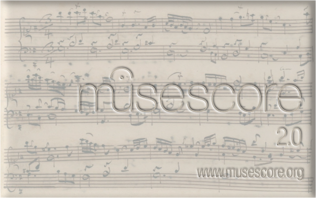
New Splash Screen for 2.0
I have designed a brand new splash screen for 2.0, and am showing it here for comment before submitting as a pull request.

The music in the background is the autograph of the Goldberg Variations Aria from Anna Magdalena's notebook, which I thought tied in nicely with 2.0's association with the Open Goldberg Project.
I thought we should do something to differentiate 2.0 from 1.x
Let me know what you think :)
| Attachment | Size |
|---|---|
| splash.png | 336.35 KB |
Comments
Very striking, I like it! Although I wonder if people would see it and then wonder why MuseScore can't produce scores with that kind of handwritten look?
I agree that 2.0 should differentiate from 1.x but I don't like the proposal for several reasons.
- It's not lisible, white on white, despite the embossing doesn't make enough contrast.
- The embossing of the edges looks like a paper out of a copy machine
- The font of "2.0" and "http://musescore.org" is not the same than the MuseScore logo and then the balance doesn't feel good
- We need to mention the GPL in the splashscreen. We didn't do it for 1.2 and it would be good to fix this.
- OpenGoldberg is a nice project , but it's over, I don't see the need to tie 2.0 with it
- If we choose to put music notation in the background, I would use music notation created with MuseScore, if possible not too much "dated" or "styled" since one of the big step forward in MuseScore 2.0 will be guitar tablature. But no music notation in the background would be fine as well.
In reply to I agree that 2.0 should by [DELETED] 5
I was under the impression that the MuseScore logo was not made from a font, but was custom designed - am I wrong here?
I have been searching for a while for fonts to match it, and Basic Sans Light is the nearest I have found so far, although I shall keep looking for a better match - maybe if I stretched Basic Sans Light horizontally it might look better.
Regarding the GPL - have you any particular text in mind? Maybe we could have on the splash screen "The Open Source alternative to Sibelius & FInale"??
I think it's important to important to have a consensus on this, so I shall have another go when inspiration strikes :)
In reply to The font of "2.0" and "http://musescore.org" is not the same by ChurchOrganist
I wouldn't mention Finale or Sibelius on the splash screen. Maybe it's just me, but I don't want to see the name of two competing softwares every time I open MuseScore.
I would also agree the text is hard to read. The MuseScore logo and other text should "pop," and it's very muted here.
In reply to The font of "2.0" and "http://musescore.org" is not the same by ChurchOrganist
Not really. Just mention it's GPLv2 licensed. And no, mentioning proprietary competition is not a good idea...
The font used for the logo is mentioned here at the bottom. As far as I know the closest free font is Raleway as mentioned.
Here's my second attempt.

Lettering is clearer and the edges of the 3d aren't as blurred, but there's still work to do get the 3D effect to look right.
I've retained the Goldberg autograph for now, but perhaps we could use Reunion as the background?
What do you think?
Maybe I should keep the Alpha channel when exporting to PNG as it seems to be losing something in the rendering to bitmap image.
In reply to Version 2:) by ChurchOrganist
Thanks Michael for trying :).
I think it probably is a good idea to play around with it for opinions and improvements before implementing it.
If a score is going to be present, I think we should use something generic, rather than existing material.
I'm not sure about the prominence of the GPL text - what happens in other software?
I'm looking at some other splash screens and came up with some questions:
Should there be a URL?
I don't think so, as I can't see it in others.
Should 'MuseScore' appear smaller?
I think perhaps.
Should 'MuseScore' (excluding version number) appear centred?
I think so.
If there is something at the left or right in the overall box, 'MuseScore' should appear at the centre of the space next to it.
Should the overall font of the version number be different from the name?
I think so, as it keeps both separate, but still informs.
Should the position of the version number be different?
It depends.
Should the overall box be smaller?
Perhaps a little.
In reply to Version 2:) by ChurchOrganist
I'd expect there would be a new demo song for 2.0, but since they'll see it when the program loads, I don't know if it's so important to tie in to that. Might make more sense to go with a contrasting, to show something of the possibilities. Maybe even snippets of several different things.
In reply to I'd expect there would be a by Marc Sabatella
I think it's probably better to use a generic score, something like the Goldberg Aria I'm currently using rather than try to collage snippets of ways you can use MuseScore 2. Perhaps it should be a printed rather than handwritten score? A handwritten one does suggest (to me) that it is a replacement for pen and manuscript paper, however.
To address some of Chen's concerns (in no particular order)
1. Regarding fonts: Lasconic particularly asked for the font to be the same throughout - I have been lucky enough to obtain a free version of the Neue Helvetca fonts with which the MuseScore logo was designed, so one possibilty would be to use varying weights of this across the splash screen.
2. The size is exactly the same as the splash screen for 1.2
3. It would be easy enough to make the GPLv2 less prominent - we just make it smaller.
4. I will play around with various positions for the logo/version
5. The URL was present on the original splash screen, so I just kept it. It is useful information, however, particularly if the splash screen is used for Video titling.
Keep your thoughts coming in on this, and we will eventually get it right.
In reply to I think it's probably better by ChurchOrganist
I like the handwritten score, but I agree with Marc that it might indicate that MuseScore is able to produce it (which would be nice if it could), so to avoid that, we could add a qilll and maybe an inkpot?
In reply to Version 2:) by ChurchOrganist
For me it's still "too much", the 3D effect, the score background etc...
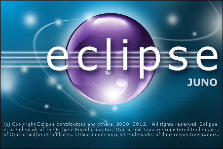
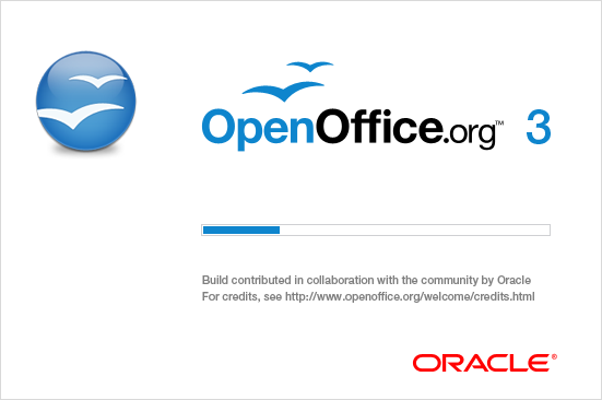
Some examples from other open source project.
Scribus

Gimp

Blender

Eclipse
OpenOffice
LibreOffice

The two other big proprietary music notation software
Sib
Fin
Previous versions
In reply to For me it's still "too much", by [DELETED] 5
My graphics skills are also crap, but the Scribus window looks like the approach I would use. I was thinking of two small snippets of score, one old and one from MS (a part from the Goldbergs would still be appropriate), the old one blending/morphing across into what it would look like in MS, with the pen (preferrably quill, but fountain will do) "drawing" the notes on the computer part and the bar lines being continuous. No text overwriting these snippets. Simple colors, simple fonts, simple text. I wish I could do a mock-up.
In reply to My graphics skills are also by schepers
It would be practically impossible to get the barlines as you describe.
I did actually experiment with this but the blend looked a mess.
There is little enough space for the text as it is, so limiting it even further to not overwriting the scores is pretty unrealisitic.
First of all, thanks to Michael for working in this and sharing his thoughts.
Michael's drafts
Overall I prefer the first draft for:
*) the grey theme rather than the sepia (?)
*) the right justification (sorry chenlung!)
*) the version on a separate line and with the trailing ".0" (ready for version "2.1", "2.2", ...)
However from the second draft the greater contrast is preferable.
I like the idea of a manuscript score as background (regardless of connections with the Open Goldberg project), but I agree I might be biased on this. A score made with MuseScore itself is nice in demos or other things about it, but it is not necessary on the splash screen: it disappear too quickly to evaluate its capabilities and the user is going to try by himself in a few seconds; so, anything which makes clear what the program is all about (notating music) is appropriate and a manuscript might convey the right idea of careful handiwork, as Michael said.
An alternative could be some very beautiful or otherwise peculiar music engraving of the past, for instance: http://www.bibliotecamusica.it/cmbm/viewschedatwbca.asp?path=/cmbm/imag… (just a mere suggestion, I agree it is quite specialistic).
GPL text
I understand the point, but I wonder how many users would understand what it means (even vaguely). Would it not be better some more general text like "the Open Source solution"? (or anything on the genre, longer or shorter at will)
The other
Thanks to lasconic for collecting the samples; it seems to me that most of them are even more "too much" than Michael drafts; for sure Scribus, GIMP, Blender and Eclipse; {Open|Libre}Office are perhaps a bit on the other side ("not enough"?); the only one really nice looking to me is latest Finale splash screen, but it is hard to understand what it is about (assuming one does not know already what Finale is!).
I regret my capabilities in graphics are approaching zero, so I only can give comments.
Thanks,
M.
A very different idea
The 3D look has now gone to be replaced with the simplicity of black lettering imposed on the handwritten score.
I've emphasised the 2, and entered GPL and version information within that area.
It could be argued that version information need only be present in thye About menu - it would certainly suit the minimalist look of this version to remove it.
It's possible that this needs a defining border round it - depending on the colour the screen would be displayed on.
In reply to Version 3 by ChurchOrganist
Version 3 looks a bit better I think (the GPL message too), but:
The version number is far too big and detracts from the name.
There's no need to include non-essential version details.
The website is there (I know 1.2 had it, but no other software seems to do this).
In reply to Version 3 looks a bit better by chen lung
The whole point of this design is to emphasise the fact that this is MuseScore 2.
Hence the emphasis on the number.
I think this screen is very nice. I'm just afraid there has copied many flavors as Musescvore users. So that the makers of MuseScore just have to choose which they find themselves very nicely.
FredPaul
In reply to Splash screen by FredPaul Vogel
Once there were pen and ink, today MuseScore.
If the splash screen suggest progress?
Congratulations, nice graphics, Franz.
http://it.bing.com/images/search?q=pennino+musicale&view=detail&id=61E7…
In reply to A thought aloud by Shoichi
Is that image public domain Franz?
In reply to Is that image public domain by ChurchOrganist
A selection of images on the web, processed with Gimp (however, dip-pen are on the market).
I was interested to propose the idea: a background,
completed as by hand, and MuseScore logo in the foreground.
A picture is easier than a language that I do not know.
There is someone very able in graphics (and with scores) in the community, perhaps he can take a cue. If the idea is accepted, someone could work around ;-).
In reply to Pot-Pourri by Shoichi
Yes Franz - that was exactly what I was trying to put across in the last version.
Very minimalisitc - handwritten music behind the simple logo and version number.
The picture needs to be either open source, public domain or withe the appropriate Creative Commons licence otherwise we won't be able to use it for copyright reasons.
In reply to Yes Franz - that was exactly by ChurchOrganist
Between a commitment to another (tonight Te Deum), I look for something (HTH?).
A photo can be converted into design, invent something.
Good luck and best wishes to all of you, Franz.
Played around a bit more with shepers' idea and managed to tidy up the transition:-

I've also managed to lose the pretty nasty background colour from the Goldberg scan.
I'm not sure about this myself - I think it's a bit too complicated.
Despite what Chen says I think we should retain the URL, as the splash screen may be used outside MuseScore itself.
In reply to Version 3a by ChurchOrganist
That is somewhat what I had in mind but I wasn't using a score as the whole background, only a snippet of the Goldberg, with a digital morph to what that snippet would look like in MS. That's why I said the text would not overwrite the snippet. The morph would hide the transition between the bar lines. I like the idea of the old style inkwell pen still writing on the computer generated side, indicating that you are still in creative control.
In reply to Version 3a by ChurchOrganist
If the drawings of Escher can be considered as public domain image ...
A box (see picture) of dip-pen of my grandfather, patience and time to do scanning and retouching, here is another attempt.
To use freely if you need to overlapping the Variations, and add the logo.
Franz
In reply to Version 3a by ChurchOrganist
The transition is a good idea and worth playing with more. Right now as I see it, the main issue is that the transition still seems too harsh. The two halves read too differently - the thickness, spacing, and darkness of staff lines don't match well. The dividing line is also too perfectly centered for my tastes.
What I could picture (but not execute!) is something where the page itself was shown as curling into an S shape, so the actual dividing line would be obscured within the fold. You'd see handwritten manuscript on the left, disappearing under the fold, and then the notation emerging on top and extending to the right.
But actually, I'd be fine with it simply being a sheet of typeset notation overlapping a sheet of handwritten manuscript, at some pleasingly cockeyed angle.