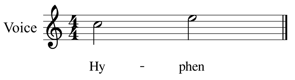
Hyphen too high
1. Open attached score (produced in 1.3).
Result: Hyphen is too high.

Using MuseScore 2.0 Nightly Build (a4bab21) - Mac 10.7.5.
| Attachment | Size |
|---|---|
| Hyphen too high.png | 21.75 KB |
1. Open attached score (produced in 1.3).
Result: Hyphen is too high.
Using MuseScore 2.0 Nightly Build (a4bab21) - Mac 10.7.5.
| Attachment | Size |
|---|---|
| Hyphen too high.png | 21.75 KB |
Comments
Doesn't help. How too high? Can you propose a good height?
I don't see anything wrong either. Draw a line between the centers of the H and the E and the hyphen is perfect.
Forgot to attach the mscz.
lasconic didn't say he didn't see anything wrong - he once said it was a problem with it, actually.
I'm not very good at LilyPond, so there's multiple hyphens :).
I checked the supplied score in 1.3 and 2.0. While the hyphen in 2.0 was slightly higher, and I mean ever so slightly, the difference was negligible. I do recall an issue in recent days with hyphens in imported 1.3 scores being way out (too high), are you referring to that bug? Do you think the correction to bring them back in line was not done far enough?
I don't remember an issue.
It applies to 1.3 and 2.0 scores.
The difference isn't negligible to me :).
Do you have a problem with the hyphen height in MS 1.3? What I compared was MS 1.3 and MS 2.0, not 1.3 and 2.0 scores in 2.0. What height difference do you see using some measurable scale between 1.3 and 2.0?
I don't know what you see on your score on your systems, and I imagine the result is font-dependent. But comparing the posted images, it looks like the MuseScore example shows the hyphen somewhere very close to the x-height, and the Lilypond example shows the hypens only around 60-70% of the x-height. It's a simple enough matter to compare this with how ordinary text is rendered in your favorite word processor. Most fonts show the hypen around that same range of 60-70% of the x-height. A few show it closer to 100%, and they do look a little odd to me in comparison (see Marker Felt if you are using an Apple product). I wouldn't call it a big deal personally, but I would agree the lower figure is probably better.
The issue seemed specific to 1.3 scores, and appeared to have affected the lyric location, not the hyphen specifically.
http://musescore.org/en/node/21152
I had to do the comparison between programs to see what differences there are wrt hyphen locations as it didn't seem like much at first.
MS 2.0 seems to peg it at 50% height, down the centerline of the font. It's high by a bit compared to 1.3, maybe it should be about 10% (estimated) down?
Thanks for the comparison schepers!
And just to add to this discussion, this is a cropped scan of a hyphenated word from a choral book from Lillenas. It to shows the lower hyphen:
as far as I know, MuseScore doesn't use the font's hyphen in Lyrics, but draws a short line instead. Getting this changed is in another issue ( can't find it right now, fairly recent, by me)
I noticed that the hyphen size does not change if a staff size is set to "small." Then the hyphen is definitely too high.
@danryan This should have been for another report. It should be fixed now in e044361cc4
Sorry lasconic - I should have opened a new issue. Thanks for fixing it.
Jojo-Schmitz was refering to #21239: Style of dash doesn't follow lyrics style.
Also see #1904: Hyphens do not resize with text and werner's comment there.
yes, thanks for looking this up for me
Here's another example, a 'normal' lyrics dash followed by a 'Ctrl+'-'

Looks particularly bad in italics
Some scores look more problematic - possibly due to scaling.
Using MuseScore 2.0 Nightly Build 9f36d19 - Mac 10.7.5.
I don't understand how those lyrics got so small? The text style says they should be 11pt, and then scaled up from there because Space is 2.32. The hyphen appear the correct height for the text style.
I guess maybe you tried using the text toolbar to change individual syllables to be smaller than the actual text style default? That's all well and good I guess, but I guess I wouldn't be surprised if the hyphen - which is generated on the fly - continues to use the text default. After all, you never changed the size of the hyphen, just the individual syllables. I suppose the algorithm could be changed to "borrow" the previous syllable's size, but that's bound to wrong just as as often - depending on what real world reason you have for changing syllable size rather than text style in the first place.
In any case, that's a separate issue from the one discussed here, which is about a fairly subtle / subjective difference in how high hyphens should be within normal-sized text (and it looks like it is now somewhat different than what the screenshots show).
It probably is a separate issue, yes.
I don't think I've ever adjusted the lyric size, just the page scaling and instrument set-up.
You might not have adjusted lyric size, but someone definitely did. The text style says 11pt, and so do text properties for any given syllable, but if you double click a syllable and look at the toolbar below, you'll see it's been set syllable by syllable to 4pt.
I think it's only me who has edited it, and I rarely, if ever, adjust lyric size.
I believe the score was produced in 1.2 and saved in 1.3 - perhaps the bug lies there.
If you've got steps to reproduce, I'll believe it's a bug. But the far more plausible explanation right now is that you changed size and forgot.
1. Open attached score (produced in 1.3) in 1.3.
2. 'Layout'>'Page Settings…'.
3. Reduce scaling to 0.764mm.
4. 'OK'.
5. 'Save'.
6. Open score in 2.0.
Result: Hyphen is too high.

Note: The 1.3 score adds instruments, notes and lyrics - there have been no adjustments to either scaling or size.
Using MuseScore 2.0 Nightly Build 1812015 - Mac 10.7.5.
This is unrelated to the original issue. The hyphens are actually correct here - it's the lyrics that are too small. Compare 1.3 to 2.0 to see.
I've made an issue for #25: #33016: Reducing page scaling makes lyrics too small
I was looking at this , and I think the equals sign (and possibly others) is also too high. See the attached score (produced in 1.3).
LilyPond: 2.18.2:
![Characters too high - LilyPond.png]()
MuseScore 2.0 Nightly Build d9e3e93:
![Characters too high - MuseScore.png]()
Using Mac 10.7.5.
This is just a matter of how the equal sign is designed to look in the font you happen to be using - MuseScore does no special processing here. That's the same height the charcater will have in any other text using that font as well. If you prefer a font in which the equals sign happens to be lower, you are welcome to use it instead of the one you are using.
It's *only* the hyphen that is special, because it is not a true hyphen but a drawn line.
And I think there was a request to use a real hyphen, from the current font, rather then a drawn line... not sure whether in issue tracker or forum. Need to search for it ...
Doing that would of course be ideal. I think there were pretty good reasons why that was impractical in the old implementation of hyphens. With the new implementation, I don't know, it's conceivable it could be done, even if just by overriding the draw() function.
Syllabic dashes in lyrics are drawn with lines instead of using glyphs from the font for one primary reason:
1) The width of the dash has to vary according to the room actually available between the syllables from a maximum down to a minimum. The width of the font glyphs are fixed.
and for another (rather secondary) reason:
2) The glyph most commonly used for the '-' character is U+002D "HYPHEN-MINUS", which is an all-purpose glyph and is usually too short; the proper glyph for the (un-shortened) dash would probably be U+2013 "EN DASH", but it is not necessarily present in all fonts.
The current code uses fixed values (stored here ) heuristically determined for the following measures:
1) Maximum dash length
2) Minimum dash length
3) Percentage of total font height to raise the dash above the base line
4) Dash thickness
It also contains code to (attempt to) derive 3) and 4) from the font metrics themselves, in particular from the geometry of U+2013 glyph in the font currently used (as it can be seen for instance here ), but it is currently commented out because Qt does not provide a reliable way to retrieve that geometry.
If the provided fixed values need improving, it can be done, but please keep in mind that in particular value 3) should accommodate the variety of x-height ~ caps-height ratios exhibited by fonts, from the low x-height value of, say, Garamond to the greater x-height value of, say, Arial.
If I understand correctly, there is a tension between these two requirements
I have no idea which of these two requirements is the most crucial. Anyone knows what other software do?
I just tried in Sibelius, and even with the lyric font set to Comic Sans, the hyphens seem to be ordinary drawn lines as they are in MuseScore.
To me, a reasonable solution - but hardly worth worrying about for now - would be an option to force a minimum hyphen length (which has been requested elsewhere anyhow), and with it, an option to use the font hyphen/en-dash character. These could probably be collapsed into a single pair of radio buttons:
* Draw line of variable length. There would possibly be an accompanying spin box to specify a minimum length to enforce, or we could just assume 0 as we currently do.
* Use character from font and enforce enough space for it. There would be an accompanying text box where you could enter the specific character to use, defaulting to, say, en-dash. Or perhaps just radio buttons to select between hyphen and en-dash.
Just a few notes, for future implementations:
1) The current minimal dash length is not 0; it is 1/4 sp; if there is no room for even such a short dash, then the dash is entirely skipped.
2) Another limitation of using the font dash (of whatever kind) is its thickness: the usual hyphen glyph is normally intended for a frequency of use rather low (usually texts do not have a dash every few letters) and then it has a certain thickness which allows it to be readable.
In lyrics, the dash occurs with a much greater frequency -- with language differences, from the 'less dashed' like English to the 'heavily dashed' like Spanish, Italian or German -- and the usual font hyphen thickness would give the effect of a machine gun burst. Luckily, in well designed fonts, the en-dash is somewhat thinner than the 'standard' hyphen, but still it often assumes a lower occurrence frequency.
3) To sum up, the lyrics dash is not an hyphen and using one of the hyphens/dashes the font provides is in many cases a misuse.
4) The proper (future) implementation of a "custom dash" should allow to set all the 4 values I listed above (they are already factored out in the code using them, so it would be mostly a matter of providing an UI to enter them).
Then a few opinions of mines:
a) To my eye, the dash variable length is more important than the consistency with a fixed-length font glyph (btw, a glyph intended for a different use), as a fixed length increases the times when the lyrics disrupt the note horizontal spacing which, in my eyes, is a primary feature of a well engraved score.
b) In such a future "custom dash" feature, the possibility to use a font glyph would seem to me rather marginal; it looks similar to me to giving the possibility to use 'I' instead of '1' or 'O' instead of '0'.
c) Should I implement this feature, I would add code to prevent the use of Comic Sans for whatever score text! Vade retro, Satan!
M.
Came up again in https://musescore.org/en/node/166201
Hi,
The same issue is still present in one of the newest nightly builds (e9287fd) when automatic placement is turned on

But everything works fine, once I select all lyrics and turn automatic placement off.
That is a different issue, see #262405: Regression: Vertical position of lyrics line segments too high
In reply to That is a different issue,… by Jojo-Schmitz
Working in MS 3 and have issue with the hyphen being too high when I use Garamond 14pt.
In order to investigate the issue you are having, we need an actual score, not just a picture. In general, in MuseScore 3 hyphen height should not be an issue unless you have made incorrect adjustments to various settings (like setting the alignment to top or center instead of baseline).