Default dialogs height and position are poorly adapted for use on small screen netbook
MuseScore Nightly 3e51505
Using MuseScore on netbook with 1024x600 screen I encounter a problem with default dialogs height and their position.
The following windows are too high by default and need manual resizing each time:
- Edit → Preferences
- Style → General
- Style → Staff types
All of them can be resized and can fit the screen after this action.
To reproduce:
- Start MS on netbook with 1024x600 screen resolution.
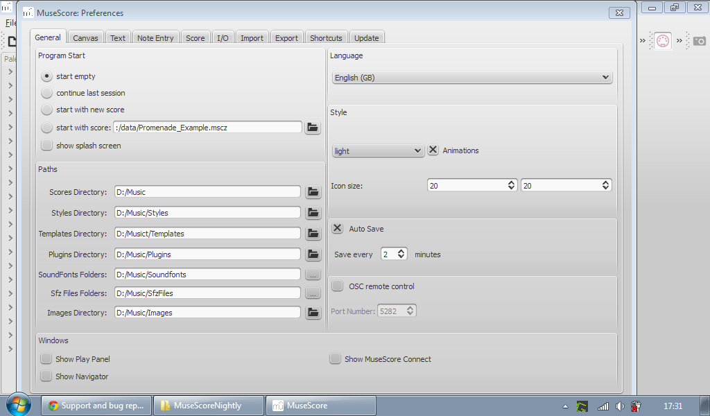
- Go to Edit → Preferences.
- The bottom of preferences window is somewhere under the taskbar.
- Resize the window to minimal height.
Expected behavior: all window is shown on the working area at the center of screen.
See attached screenshots before and after the resize.
Also all dialog windows are placed in different way. Not in the center.
For example, the window for Layout → Page settings is placed too low and its bottom side is also out of screen. See the third screenshot.
I think it would be better to set maximum height for such windows as less than approximately 560 px and place them on the center of screen.
| Attachment | Size |
|---|---|
| default_height.png | 59.78 KB |
| min_height.png | 66.36 KB |
| Page Settings.png | 73.27 KB |
Comments
The download page states the minimum requirements as 1024x768 pixel resolution...
So it isn't a bug but a feature request. Not an unreasonable though.
See also #23411: Preferences window is too tall for some netbooks
90% and growing of the users of the WWW have a resolution over 1024x768. Making MuseScore working on a smaller screen will make the experience of other users, the majority, less good. This fact needs to be taken into account whenever we change the default size and position of a dialog.
Lasconic, while I mostly agree with you, and feel that working in MS on lower resolution devices like netbooks or small tablets is a self-induced punishment, the dialog being referred to suffers no ill when made smaller (at least shorter), and it would aid those 10% who choose or need to work with MS on such devices.
I've used 1.3 on an HP tablet (XT2000), and while it works OK, 2.0 does have some aspects which steal or require too much real estate to allow it to function well on such smaller devices. This will only become more obvious if MS gets ported to more portable and/or lower-res devices.
Losing those 10% users is about the same absolute figures as losing 100% of the Mac users ;-)
As long as MuseScore Needs to get changed only in that one place, I don't see a real issue in not doing it.
From your comment Jojo, I can't tell if you think the numbers are relatively high or not, but the numbers are irrelevant. It's the mindset that everyone has lots of screen space, so lets design for that space. That is the same attitude Apple has when they drop compiler support for an OS that's only a few years old, hence MS can now only support 10.7+. That is an attitude that should not be present here.
I hope my point got through correctly, so I will make it again... Of course changing a dialog to make it usable on a smaller device is fine, espcially if it's easy BUT let's not make a dialog too small and unusable just because of smaller device. We should draw the line somewhere. 1024x768 is a good place for the time being.
Apple attitude is criticable in many ways but from time to time, sofware development needs to move forward. If not, we would all be typing in a text based browser...
Discussion over, hope to get a pull request soon :)
Maybe the ultimate answer to this is to design a specific mobile friendly UI for MuseScore. Which could be selected in the Edit Preferences dialogue, or perhaps on installation.
This could also be used in IOS, Android and Windows RT versions of MuseScore.
Perhaps something to think about after MuseScore 2 is released?
Could even be used automagically, when detecting a screen size smaller than a certain theshold (those minimum requirement 1024x786 for example). Putting it into the preferences dialog would create a "hen and egg" problem.
I think creating mobile UI is overkill, because mobile design and adaptation of everything in MS for different mobile platforms is extremely difficult task. Furthermore, mobile devices are not suitable for complex editing (I mean smartphones and tablets. Netbooks are just smaller computers and they support any desktop OS, mouse and midi input, so they do this job very well.).
In the case of dialog size adjustment the fix is just changing several numbers in forms' height parameters along with changing default position to screen center.
I'll look into this
•Edit → Preferences → prefsdialog.ui is 648 pixel high
•Style → General → editstyle.ui is 644 pixel high
•Style → Staff types → stafftype.ui is 770 pixel high
There are some more though, pluginCreator.ui is 600 pixel high, textproperties.ui has 662 pixels, timesigproperties has 644, stafftext.ui has 563 and timedialog has 577.
We (well, I, with my setup) lose 27 pixels for the window title, so stafftext.ui should be save, although we could easily make is as small as 652x398, the limiting factor being the Aeolus Register tab, which may not make it into 2.0 in the first place...

See
Oops, that dialog reveals a translation mistake if mine...fixed now.
prefsdialog.ui could get shrunk to 639x520 (but looks pretty cramped then, due to reduced width, which is not really needed)
None of the dialogs loses anything when reduced to 560 pixels in height, see PR #745
Unfortunatly it doesn't seem quite as simple as I thought, some of these dialogs revert to a bigger size once opened in Qt Creator and so would become bigger the next time some modification to them happens, even if that change doesn't affect the size of the dialog.
The dialogs editstyle.ui grows to 573 Pixels, stafftype.ui goes up to 711 Pixels, while
pluginCreator.ui, prefsdialog.ui, stafftext.ui, textproperties.ui, timedialog.ui and timesigproperties remain at their settings (of 560 pixels).
So some more work is needed to make editstyle.ui and stafftype.ui to behave properly...
For stafftype.ui the culprit seems to be the pretty busy "TABLATURE STAFF" part and the toggle between full configuration and quick presets, for editstyle.ui I think the culprit is the "Header, Footer, Numbers" tab, but I'm a) not really sure and b) lost about how to fix that...
In stafftype.ui "Full Configuration" and "Quick Presets" consume the accumulated size, but only one of them is shown at a time.

It can, however, be made as small as 792x565, including the window title:
In editstyle.ui we seem to have a different problem, all tabs but one can be manually shrunk to 734x545 (again incl. window title):

the exception is the "Header, Footer, Numbers" tab, which can get shrunk to ...

hold on....
113x28 (which is window title only)!
I know that the TAB tab (!) of editstyle.ui is "busy", but everything there is needed. Even turning the two alternative blocks (Preset & Full config.) into tabs would save little space, as the spared Preset block height would be only slightly greater than the additional height of the tab selector.
But the main problem is: it is true that this dlg can be shrunk to 792x565, but at the expense of loosing (to any practical goal) the Preview area, which is rather important in such a complex (and often unfamiliar to the user) configuration.
It would be possible to turn the two main blocks of the Full config. ("Fret marks" and "Note values") into tabs, sparing a good part of the first block height. I have no idea if this would affect usability or not; possibly not, if the preview area remains visible and large enough to be meaningful.
__________________
A note on Qt Creator designer: because of the UI styling added externally, UI elements are noticeably smaller at run time than at design time (this is particularly true if the design is under Linux, where the design font is rather large).
This means that the Designer believes that UI element are larger than actual run-time sizes and tricks it into forcing the whole dlg to a size larger than it will be actually needed at run-time.
The Designer is actually doing its job here: it is the application which is "cutting the grass under its feet" and I do not see any obvious way around it.
Thanks,
M.
You're talking about stafftype.ui , not editstyle.ui, right?
I believe I have found the culprit for the strange behaviour of editstye.ui's "Herder, Footer, Numbers" tab: the hint about macros seems to be cause it. This IMHO belongs into the manual rather into the dialog, so I'll remove it. Also in the light of additions I'm currently working on, see #21207: "Don't Show page number of first page" is ignored when loading score from 1.x
Yes, I meant stafftype.ui, not editstyle.ui, sorry.
About "the hot about macros" (it took me a while to understand what the hell it was!): it should ALSO be in the manual, but it is VERY useful there too.
I can't imagine why it is problematic; if the problem is with rich text, it can easily be converted to plain text (or even into several simple labels). The bold and italics markup is useful but we can do without, if needed. But please do not remove it: it IS useful.
Thanks,
M.
it was supposed to mean 'hint' ;-)
It is problematic for several reasons: it is richtext (which is difficult for translation alone), forming sort of a table, but using linefeeds, spaces and tabs for the formatting (which is almost impossible to get right the first time for translators) and it causes quite a mess with the sizing of the subdialogs (header is smaller than footer) and esp. when resizing the entire dialog.
And with the changes I'm working ion it'd need to get even larger.
Could be made a tooltip, that way it won't take space in the dialog, but I'm not sure it'd be useful enough then. Could be made available as a separate help dialog, maybe that'd be better. But then again I still think stuff like this belongs into the manual only. We can't explain each and every dialog in the dialog itself.
Again on the editstyle.ui Header and Footer macro list:
The rich text / translation / formatting issues could be easily solved with a table of simple labels.
In general, I still believe it should remain: it is not a matter of documenting each and every dialogue in the dialogue itself, but a matter of listing some (few) arbitrarily chosen conventions right in the place where you need to use them. The idea of the tooltip is worth experimenting, though.
M.
Here's how editsty.ui might look with that documentation in a tooltip:


Would that be OK? No, it line wraps in odd places, seems a tooltip isn't wide enough.
Let's try this, derived from the corresponding comment in page.cpp, in another of my PRs:
Hmm, OK, editstyle.ui now has that tooltip, but is still 573px high (without window title, which adds some 27px). No big deal, all relevant information and all buttons still fit a 600 pixel high screen.

stafftype.ui is different though, the big space eater is the preview window and that is really needed.
But it might be possible to make is smaller?
Quite a bit of wasted space, isn't it?
Could it be make to fit one line?
Or be shown right of the dialog rather than below?
@Miwarre: thanks for PR #763 !
Fixed in 12497a46ec
It seems the translation of that macro tooltip doesn't work properly, not sure why.
Is seems to be because it is a static Qstring.
see PR #765
Fixed in 2e8c7dd8ab
Automatically closed -- issue fixed for 2 weeks with no activity.