Text frame border radius
Based on http://musescore.org/en/node/25519#comment-100004, I decided to open a thread. I think things are pretty clear at this point, but I have long wondered, would it not be preferable to have the border radius parameter *not* be interpreted relative to the size of the frame? I find it very non-intuitive and annoying that a given border radius setting looks OK for single-letter rehearsal marks - square with slightly rounded corners - but the corners get more and more rounded the longer the text is (that's the 1.3 and current 2.0 behavior). This scaling looks strange for one-line texts, although admittedly it seems about right for larger multi-line text blocks. See below.
There is a good news / bad news solution to this. The QT function that draws the frame - drawRoundRect - has been deprecated and is now obsolete. The replacement function drawRoundedRect actually works the way I would prefer by default: a specified radius has the same effect on the corners regardless of the size of the rectangle. That's the good news. The bad news is that the units seem to work very differently in the case of relatively small rectangles at least. A "border radius" setting of 20 looked good for rehearsal marks with drawRoundRect, but that's entirely too large and produces results that look more like a circle with drawRoundedRect. On the other hand, for a larger text, drawRoundRect would have produced correspondingly more rounded corners, and actually a setting of 20 matches matches pretty well for sufficiently long texts.
So I have a proposal:
drawRoundedRect has an optional parameter that allows it to emulate the old (radius interpreted relative to frame size) behavior. We could add a new checkbox to the text style dialog to control this. I might suggest we have it default to "on" for 1.3 scores, "off" for new scores.
I realize it's hard to picture what I mean, so here are some examples:
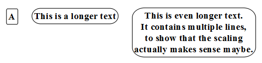
drawRoundRect, border radius 20 (current default for rehearsal marks):

I have always been bothered by how different the first two examples look - same radius setting, very different results. The third text actually doesn't bother me.
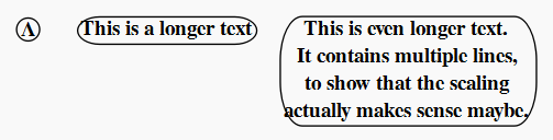
drawRoundedRect, border radius 20 (simply replacing the obsolete function call):

Here, the value of 20 is too large for the first two texts, but perhaps isn't that bad for the last, which somehow looks good with the more rounded corners.
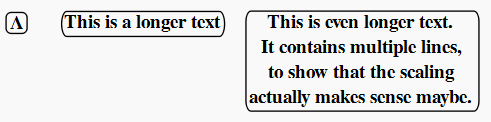
drawRoundedRect, border radius 5 (my subjective pick for a new default border radius):

I think this should be the default, and if people want larger boxes to have more rounded corners, they can either turn on the radius scaling option or just choose a larger border radius.
There also seems to be something wrong with the size calculation; not sure if that's a QT issue or something MuseScore needs to do to account for the change in rounding.
| Attachment | Size |
|---|---|
| drawRoundRect20.png | 7.58 KB |
| drawRoundedRect20.png | 8.44 KB |
| drawRoundedRect5.png | 6.41 KB |
Comments
I agree the current behavior is not very good. But I don't agree with your proposal.
1/ Options are evil :) So an option to let user decide on the way the border corner value works is a no go for me.
2/ I don't see the need of the old behavior. As you said, the user can choose which ever corner value he wants for each texts.
3/ So my proposition would be to use the value from the UI as it, for both X and Y.
In reply to I agree the current behavior by [DELETED] 5
That works for me, except for the fact that radius values used in 1.3 won't be meaningful anymore. as shown by my second example above. Rehearsal marks in particular will suddenly display as circles. I guess we'd have to come up with a reasonable radius scaling algorithm for read114, Something where we calculate the rectangle size and use that as a basic for deciding how to alter the radius setting we read. That's actually the main reason I proposed having an option - not that the user would be likely to want the old behavior for new scores, but to handle old scores without needing to reverse engineer the radius scaling algorithm.
In reply to That works for me, except for by Marc Sabatella
I guess if we don't care about reproducing the exact appearance of 1.3 scores, we could just arbitrarily set the radius value to 5 (or whatever value we end up using as the new default) if it's anything non-zero in the input. That covers the case of someone fudging the numbers to gwet slightly rounded corners in larger text boxes (something I did regularly to workaround the old behavior). And by letting 0 continue to mean 0, we preserve the behavior in the cases where users had turned rounding off completely. Only difference would be cases where the user had set some other value for radius trying to achieve some specific effect.
That's probably no worse than any of the others ways the appearance of 1.3 scores already may differ slightly in 1.3.
In reply to I guess if we don't care by Marc Sabatella
Fair enough. The radius value is still a bit of a mystery to me, in particular the unit. But for what I see when experimenting, it seems that we would need to consider the spatium size when using this value.
(Another post I missed; I should look at the fora more often... :-( ).
To my eye, the second and third examples look awful! The elliptical corners are ugly and do not match any time-honoured typographical practice, with their typical computer-generated '80 style...
From a user perspective, I have no doubt: the corner radius should be in some absolute unit; a radius of 10 should give corners twice as big as a radius of 5 (whatever 5 and 10 may mean), regardless of the pitch of the text, its length, the width and/or the height of the frame, the phase of the moon and so on. Other solutions would be incomprehensible to the user and would give unpredictable (for the user) results.
In addition, corners should be circular, no doubt about this too!
Entering in more detail, by analogy with other MuseScore units, I would understand a unit in spaces, if the text style is space-dependent; or in mm, if the text style is not space-dependent. Other units are possible, but they should be absolute units in any case.
I have no idea if this can be implemented, if it requires black magic and blood spells to convince Qt or not, but I would assume the meaning of the radius value in the Qt drawing functions to be documented somewhere.
My usual two cents...
M.
P.S.: of course, a space unit is not really absolute, as sp can change, but it would be constant across the whole score, which is the 'reference universe' of anything in MuseScore; I intended 'absolute' in this sense.
In reply to (Another post I missed; I by Miwarre
FWIW, I don't know that rounded corners are a "time honored practice" at all in the first place. So many users might want corners not rounded, and I have no problem with the default being non-rounded. But rounded corners are common in the jazz world, and actually, for better or for worse, that elliptical look is quite common and expected. The well-known "Jazz" font that is used with Finale does this deliberately for its rehearsal marks and other one-lines texts. So I do think the intended audience for this features would find #3 quite good.
In reply to (Another post I missed; I by Miwarre
For reference, here is the Jazz font set.
http://www.jazzfont.com/noframes/textchar.htm
You can see rehearsal letters are pre-composed glyphs with more-or-less elliptical sides (more irregular because it is going for a "handwritten" look. And there are special bracket characters you can use to build frames around one-line text items; the sides have the same mostly-elliptical shape as the pre-composed glyphs.
This font is pretty ubiquitous in the jazz worlds, and to my mind, this is what creates one set of expectations for how rounded corners should look.
In reply to (Another post I missed; I by Miwarre
This doesn't carry a lot of weight with me, but Apple uses a lot of rounded corners, and the following story has some popularity.
http://www.folklore.org/StoryView.py?story=Round_Rects_Are_Everywhere.t…