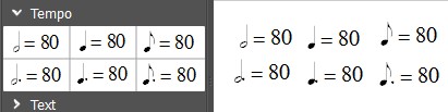
Dotted notes in the Tempo palette
Is it me, may I nitpick?!
Or do you think that the dots are overly close to the half and quarter notes (they are touching the note head and barely discernible), while for the eighth note, it seems visually pleasing and more clear?

| Attachment | Size |
|---|---|
| Dots tempo.jpg | 13.28 KB |
Comments
I think you are completely right.
In reply to I think you are completely by Marc Sabatella
I did a little comparison to substantiate this observation.


In alphabetical order:
- Finale:
- MuseScore Nightly
- Sibelius
Besides the fact that the dots are more clear in Finale and Sibelius, I also noticed that in MuseScore, the note head is smallest and really under the sign = (this is less the case for the other publishers)
Edit: thus, in terms of balance (between the notehead and its placement, and size of the figure indicating the tempo), I think I have a slight preference for Finale. And yet, it is the publisher that I dislike now!
In reply to I did a little comparison to by cadiz1
Should be better in d7e5a30ad0
In reply to Should be better in by [DELETED] 5
You will probably need to reset your palettes to see this (I did), but yes, better indeed.
Relative size of note to text is not still ideal from my perspective. And I find I can't up the size of the note in text edit mode. But I can downsize the text, then up the overall size, which accomplishes the same thing, so there is at least a workaround.
Also, the alignment is still a little off to my eyes. I'd expect the baseline of the note to be with the baseline of the text, but it's still a bit higher. And maybe more so with Bravura Text then Emmentaler Text, although that could be just differences in the glyphs themselves.
In reply to You will probably need to by Marc Sabatella
And for me, for now, I can not see the result (: There is an error message when I want to unzip the Nightly "ec344a3".
In reply to And for me, for now, I can by cadiz1
Nightly following, "69923ea" works: I do not know what happened with the previous one?
So, yes, I agree.

The position of the dots is good now :)
But the note head is too high now before the sign = (and its size a little smallest, maybe or no, I don't know really, it seems acceptable? )
Indeed, it would well achieve the result of the page 183 (Metronome Markings) of "Behind Bars". Yes, I bought it! I wanted to know what you were talking every time with this book!
In reply to Nightly following, "69923ea" by cadiz1
This is what I see. Mac OSX 25da8328df
In reply to This is what I see. Mac OSX by [DELETED] 5
Hard to say, but I think mine looks just a little different (Ubuntu Studio 14.04). I moved it down to just above the staff to make it more apparent:
It's close, which is why I didn't bother re-opening the issue, but slightly (about the thickness of a staffline) off. It actually looked further off at first, but I din't that was just an illusion.
In reply to This is what I see. Mac OSX by [DELETED] 5
The bottom line of the sign = is now exactly at the opposite of the dot, as in Behind Bars. Great.
It would be interesting to see the symbol in the context of an entire page of a score . But at first glance, it really looks very nice:-)
In reply to The bottom line of the sign = by cadiz1
I am under Windows7.
From the Nightly "25da832" (I emptied the Tempo Palette, and reloaded the symbols from the Master Palette), here's what I see (:
That is not what I expected: the note head is too high still: the top line of the sign = is in front of the dot now, in fact, as the previous (:
I do not know what to think. I made a mistake somewhere?
EDIT: And by opening the Nightly via the procedure "-F" or "special / RevertToFactorySettings", I still do see no change (:
In reply to I am under Windows7.From the by cadiz1
By changing the Musical Text Font (Style ->General) , I see a change (Nightly ae475eb, always after Revert Factory Settings)
-With Emmentaler (seen yesterday), the note head is always a little too high, but the size seems quite correct.

- With Bravura, the note head is placed lower (better), but also smaller, too small! (:
But in both cases, the dot is very well now :)
I see the same problem with regards to the position of the notehead and dot.
1. Open attached score (produced in 2.0).
Result:
Note: Emmentaler is used for both symbols and text.
Using MuseScore 2.0 Nightly Build (16c2771) - Mac 10.7.5.