MS3.3.4: Dotted notes and dot position
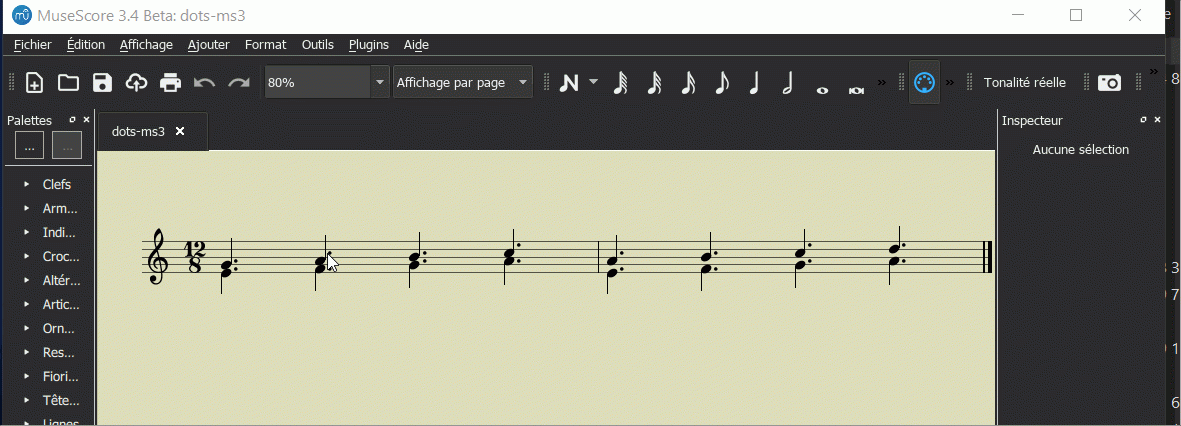
For dotted notes my preference is to have the dot vertically positioned either in the same space as the notehead, or in the spce above. When I select "Top" (rather than "Auto") for the dot position, I get the result shown in the first image.
What I want is to have the dots as in the second image.
The only way I can see to fix this is to move the dots individually. Is there a better way? Or is this a bug?
I am attaching my score with the dots in the original position. Any help would be appreciated.
| Attachment | Size |
|---|---|
| dots-top.png | 8.98 KB |
| dots-top-fixed.png | 8.99 KB |
| dots-ms3.mscz | 3.38 KB |
Comments
Hi,

I don't really see any other way than to select successively (ctrl+click) the dotst that are too high for you and to put them in the low position in the inspector
In reply to Hi, I don't really see any… by Papibois
@dhfx, move the dots individually Right click, select->more Same voice->Inspector offset?
In reply to @dhfx, move the dots… by Shoichi
No, Shoichi, I think it's not possible like that because in the selected voice 1 there are only 3 dots to be moved down.
I've been moving the dots manually, tedious as it is, both to find the misplaced ones and then to fix them. The question is, why doesn't "Top" positioning work "properly" in the first place?
I should add that in MS 2.3.2 there was a similar problem that I saw even using "Auto" positioning, that occasionally dots were one space too high, with the dot for the lower voice overlaying the one for the higher voice. This is what made me wonder if there was an unaddressed code bug. Marc S., are you following this?
In reply to I've been moving the dots… by dhfx
Even for dots that are already correctly positioned (as all of these are), it is sometimes necessary to be able to force them into non-standard locations, such as in complex multivoice clusters where is occasionally is necessary to offset some dot(s) by more than normal amount to avoid overlap. That's what these overrides are for - fixing up the complex that might require such extreme measures.
1) Reset all the augmentation dots as Auto.
2) Set all the lower-voiced augmentation dots as Top.
The result is equivalent to your fixed png:
If you're not sure how to do this: right-click a particular voice's augmentation dot, then -> Select all Similar dialogue -> then check "Voice" so it only selects of that particular voice. Then change the details in the inspector: top-voice: default, bottom-voice: top. You can also use a keyboard shortcut after left-clicking a particular element to get to "Select all Similar" dialogue box.
P.S. The attached .mscz file in the first post didn't have original augmentation positions but rather altered ones (top voice read 'top' in inspector rather than 'auto').
In reply to 1) Keep the upper voiced… by worldwideweary
Good point :)
In reply to 1) Keep the upper voiced… by worldwideweary
@worldwideweary why setting top for all dots wouldn't get the same result ? For some logical reason (that I don't get) or a bug?
The standard in music notation is to have dots above the line for upper voices, below for lower voices, an this is what MuseScore does. Unless you have some special reason to violate this standard, I'd encourage you not to. But if you do have some special reason to need to do this, I'd observe that only voice 2 will be in the "wrong" position, so simply selection all voice 2 dots (right-click, Select / More / Same Voice) and setting them to Top would presumably do what you want.
In reply to The standard in music… by Marc Sabatella
Right, I've already had at least one situation like that.
But even with Auto positioning, I would occasionally see dots mispositioned - sometimes with notes a third apart, the lower dot would be displaced vertically to be superimposed on the upper dot, and then I'd have to pull them apart manually.
My preference for non-standard positioning is purely aesthetic - with all due respect, somehow it just looks better to me that way.
In reply to Right, I've already had at… by dhfx
Indeed, the automatic algorithm isn't perfect, it does the right thing in all simple cases, but if you create enough clusters or overlaps with mutiple voices, the usual rules don't always make sense, so manual overrides are necessary and those are the cases these setting are designed to deal with.
As for personal preference in notation, I get that, and have been known t violate standards on occasion myself for purely subject reasons. But it's worth keeping in mind that presumably one of the points of notating for music is for others to read, and there is less risk of confusion if you stick to standards. And it's also worth asking yourself how important some particular preference is in terms of how much effort you really want to spend on it. That's something we each get to answer for ourselves, but since many people simply aren't aware of that such standards exist or that the defaults are actually correct, I always like to point out ways people can both save themselves time and trouble and get objectively better results.