ottava engraving issues
Reported version
3.6
Type
Functional
Frequency
Once
Severity
S4 - Minor
Reproducibility
Always
Status
active
Regression
No
Workaround
No
Project
There are several engraving issues I have encountered with ottavas.
-
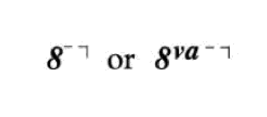
Symbol should be aligned just left of the first note it affects, not centrally (can be manually overridden)
-
Line should be vertically aligned with top or bottom of symbol depending on whether it is 8va or 8vb (can be manually overridden)
-
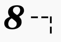
Hook should be solid, not dashed, even if line is dashed (no workaround!)
-
Hook should be shorter (partial workaround, doesn't always work with dashed lines)
(The way these things "should" be was taken from pg. 26 of Behind Bars)
| Attachment | Size |
|---|---|
| BehindBars Ottava.png | 20.52 KB |
| MuseScore Default Ottava.png | 22.36 KB |
Comments
Relates to #311175: [EPIC] Engraving issues and suggestions
deleted.
Could you explain the first in more detail? I haven't checked lately, but my recollection is the alignment of ottavas with respect to notes is "by the book".
Regarding the appearance of the hook in conjunction with dashed lines, see the "custom dashed" setting. Should be possible to emulate Gould's spacing. But it's probably going a bit far to assume that the specific way the dashes work in the software she is using are the one true dash length & spacing. I see quite a bit of variety in published music and tend to think of this much as being pretty subjective.
In reply to Could you explain the first… by Marc Sabatella
Sure, to elaborate on the first issue, Gould specifies that the numeral should be just left of the first notehead that it affects:

By default, MuseScore seems to align the left edge of the numeral with left edge of the notehead:


The numeral also does not move left when accidentals are added while Gould recommends that it be flush with the leftmost accidental:

Obviously it's possible to manually tweak the placement, but it might be nice to have these as defaults.
I did try the custom dashed line and that did produce the hook that I wanted, although I guess my personal opinion is that the hook being dashed doesn't look great as a default.
I see what you mean about the alignment. It almost works to just see the alignment of the text to right, but then the line doesn't extend all the way - unless you also set the placement to above or below (counterintuitive, and no, these fields don't work correctly either, for historical reasons that should be reconsidered as well). Anyhow, in the end, a simple horizontal offsets is the easier workaround.
The good news is that these adjustments are all preserved on adding to a custom palette, so you can easily get the desired results today, and we could easily update our default palettes as well without needing any actual code changes. That's also good if we decide we don't want to deal with compatibility issues for older scores. If we do, however, it's a little more complicated to get the coding right so older scores that were not customized to work around this look good but so do ones that were.