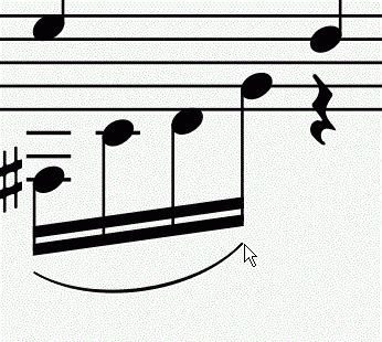
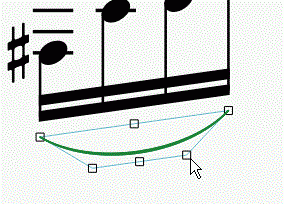
slurs—thin to fat snap!?
V2.0 beta here...
I have notice that a lot of the shorter (in terms of duration) slurs appear too thin. The long ones look fine.
Check out this animated screen-grab...

You see the way the thickness of the slur sort of "snaps" between thin and thick as I resize? Is that the intended behavior? There is no way for me to thicken up these short slurs, as you can see...

Any ideas? Is this a bug or a "feature" ;)
| Attachment | Size |
|---|---|
| 2014-09-23_16-44-28.gif | 739.63 KB |
| 2014-09-23_16-49-44.gif | 493.77 KB |
Comments
Can someone from the dev team tell me...
...is a tie and a slur calculated differently? I ask, because here's a slur and a tie side by side, with the same control points...
...as you see, the tie is thicker. Is we make it longer...
...then they become the same thickness. So, it seems like somebody somewhere has decided that a short-ish slur should be thinner...? If so, it would be REALLY nice if we could somehow disable that functionality.
In reply to Can someone from the dev team by douglas81
I can't think of a good reason for a tie to be thicker than a slur at the same length. In fact, I'm quite surprised there is any difference at all; they share much of the same layout code. File an issue in the tracker with a sample score demonstrating the issue, and I'll take a look. I worked on many aspects of the layout code for 2.0, but thickness of ties/slurs was not something I changed.
EDIT: looked at the slur code, and while much of it is highly mathematical will lots of Bezier curve calculations involving trigonometric and logarithmic function on pretty cryptic looking combinations of figures, it turns out there is one very clear place where the thickness of of the slur is cut if some particular calculation does not meet some particular threshold. It's mostly Greek to me, but I can verify that removing those two lines makes slurs thickness independent of length. So the good news is, it would easy to fix this. What I don't know is if there is a reason it is as it is. Maybe the thinning was only supposed to kick in at shorter lengths. But even so, no idea why there is no corresponding adjustment for ties.
In reply to I can't think of a good by Marc Sabatella
Yeah, it's a bizarre default behavior, right?
Perhaps it was a decision made early on by the developers. It seems to me that if the slur is under a beat in length, it is thinner. I have found some old G.Henle Verlag piano editions where both the the slurs and ties have a noticeably thinner mid-point for short (i.e. less than a beat) ties. However, and this is crucial, I can't find a single example in any editions where there is a noticeable difference in character or thickness between ties and slurs.
To put it another way... in any respected print edition of anything I have looked at, slurs and ties are treated as equals, with the exception perhaps of the shape and placement, but we are able to adjust that without problem. So, even if slurs and ties are thinner when they are less than a beat, the rule applies equally to both ties and slurs.
Good news that removing a couple of lines of code fixes the issue!
In reply to Yeah, it's a bizarre default by douglas81
Marc, are you talking about these lines?
https://github.com/musescore/MuseScore/blame/bdbaf5a27e8b45f1f193303fd3…
There seems to be there for quite some time. Long time ago, tie also used this code. But at a given moment, a conscious choice was made to differentiate tie and slur. See http://sourceforge.net/p/mscore/code/4796/
In reply to Marc, are you talking about by [DELETED] 5
From scanning that, I think that's changing the shoulder angle, but it's not changing the thickness. Looks like down around here we start dealing with thickness...
https://github.com/musescore/MuseScore/blame/bdbaf5a27e8b45f1f193303fd3…
I think it is correct that slurs and ties are dealt with differently. That makes sense because they "attach" or "point" to different parts of the notehead.
My guess is that at some point after the tie calculations have moved to their own code, modifications have been made to it, but not to the slurs. Or, perhaps, the code is not speaking to each other as expected.
In reply to Marc, are you talking about by [DELETED] 5
Actually, I meant these two:
https://github.com/musescore/MuseScore/blame/bdbaf5a27e8b45f1f193303fd3…
These lines were also there from initial GitHub commit, but I hadn't looked into sourceforge to find the older history. The comparison here is especially odd - dividing by spatium and them comparing against spatium? Normally, it would be one or the other. Otherwise you are basically comparing something against spatium squared, which is a bizarre unit. But I don't understand the math here at all.
The spot you mention might be relevant too. I suspect it's more about the depth of the curve though.
Anyhow, that's good information about the code diverging. Whatever this tinning code is meant to do, changes are it would have made at least as much sense for ties. But it should only kick in much for much shorter slurs / ties. Replacing skipping the division by spatium might do that. but again, I don't really understand the math.
In reply to Actually, I meant these by Marc Sabatella
I think we both just linked to the same bit, but I was first ;) :P
In reply to I think we both just linked by douglas81
:-). BTW, I tried removing the division by spatium, and I get a much more reasonable result - only very tiny slurs get thinned.
In reply to :-). BTW, I tried removing by Marc Sabatella
Hmm, so it sounds like this is quite an easy fix. Phew! Is there a way I can modify the code locally, or am I best waiting for a nightly?
In reply to Hmm, so it sounds like this by douglas81
There are instructions to get and build the code here http://musescore.org/en/developers-handbook#Compilation-instructions
Feel free to play with it and contribute!
If you need help to compile or contribute, feel free to join us on IRC #musescore on freenode.net
In reply to There are instructions to get by [DELETED] 5
@lasonic
I'll check out the developers handbook, thanks. I would love to contribute, if I knew how...!
I'm totally bewildered my Git. It has to be THE most impenetrable thing to understand for a complete beginner to versioning. Slightly OT, but any recommendations for a really good beginners guide to Git/GitHub?
In reply to I'll check out the developers by douglas81
http://musescore.org/en/developers-handbook/git-workflow?
In reply to http://musescore.org/en/devel by Jojo-Schmitz
I'll check it out! Thanks.
In reply to I'll check out the developers by douglas81
FWIW, while I agree it takes a while to grasp Git, you don't really *need* to understand much about it if you read the Git workflow document and following the instructions to the letter. That is, it doesn't really matter if you understand what is happening when we run the clone operation or fetch or branch or add commit or rebase or push - just the things it says to do in the order it says to do them in.
In reply to Actually, I meant these by Marc Sabatella
Just reading your last post again, Marc, about maybe the intention being that it kicks in at much shorter lengths... yeah, that was maybe the original intention. Like when you have a minisucle amount of space between two notes but, for whatever reason, you still want a slur in there. A non-graded super-slim slur might make sense in that case.
In reply to I can't think of a good by Marc Sabatella
Filed an issue in the tracker: http://musescore.org/en/node/34331
(EDIT Oops, I assigned the issue to myself. Probably I'm not supposed to do that?)