Bad font kerning in (0.9.6.2 Mac OS)
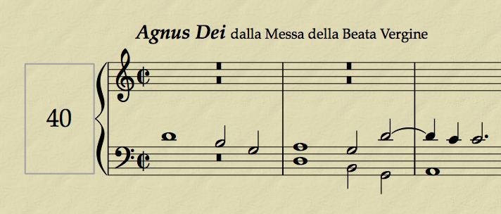
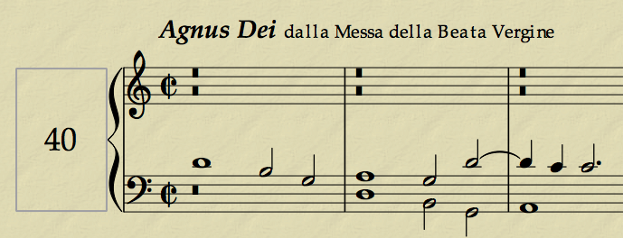
I discovered that old 0.9.5 documents opened in 0.9.6.2 show bad font kerning. This happens also if the words are rewritten anew in 0.9.6.2 documents. Please see the attached files: Image1 shows 0.9.5 layout and Image2 shows 0.9.6.2 layout. The font used is the very common Palatino 10 pt. Mac OS 10.4.11 Power PC iBook G4.
Thank you for the time.
| Attachment | Size |
|---|---|
| Image1.png | 94.9 KB |
| Image2.png | 87.45 KB |
Comments
I forgot to add that the full measure silences are not centered in the measure in 0.9.6.2 version but shifted to the left instead, as shown in the images.
I'm not able to reproduce using 0.9.5 and 0.9.6.2 on Windows 7
As you can see, your example looks very good in 0.9.5.
On the contrary, it looks very ugly in 0.9.6.2, though the font is the default Helvetica (but the title and instrument font is changed into Times New Roman and also shows kerning problems).
Thank you for the interest.
Confirmed with me (10.4.11 on G5), but it's not only with documents from an earlier version, but also with a new 9.6.2 document.
I think this bug only affect MuseScore on Mac 10.4 since Qt is using the Carbon backend instead of Cocoa for this version.
It'sapparently a bug in Qt. See : http://bugreports.qt.nokia.com/browse/QTBUG-5529
Not much we can do. We could think about dropping the support of MuseScore for Mac OSX 10.4?
I agree with your comment (but not about dropping the support of MuseScore for Mac OSX 10.4).
In any case, why the font kerning is excellent in MuseScore 0.9.5 for Mac OSX 10.4?
Thanks!
Not 100% sure, but I think 0.9.5 is build with Qt 4.4. According to the Qt bug report, this version is not affected by the bug.
According to comment #6, it looks like it is fixed upstream for Qt 4.7 and requires no further action.
It should be fixed when MuseScore switches to Qt 4.7, but Qt 4.7 isn't even released yet so it could a while.