Tempo texts are aligned incorrectly
Nightlies, July 26 (b75ef23) and (8f0d2b8) / Windows7
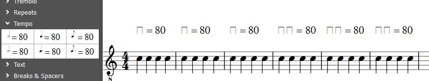
1) From a new score, or "Promenade", drag and drop the six symbols from the Palette Tempo (or Master Palette ->tempo)
-Result for the Nightly (b75ef23)

-And the result for Nightly (8fod2b8)

- This may be an opportunity to recall that, previously, in this palette, the dots were too close to the half and quarter notes (unlike the dotted eighth note). As I wrote here: http://musescore.org/en/node/27986
My personal preference is of very minor importance. A better dot placement is much more important.
| Attachment | Size |
|---|---|
| 1Tempo b75ef23.jpg | 33.37 KB |
| 2tempo 8fod2b8.jpg | 34.02 KB |
Comments
I should add that, since the same Nightly, July 26 (b75ef23), the five Ped. symbols are also affected by this wrong display.
Like this:
It's ok for other symbols in the Lines Palette.
My understanding of the changes:
I suspect other symbols will also be off. This is an expected temporary result of the move to a new system for text aymbols. If you go to Style / General, you can change the "Musical text font" to Bravura Text and all should be good. The defaults will be good once the necessary symbols are added to Emmentaler Text.
Oh, one thing will still be broken a little while: the note symbols in the tempo text won't align correctly with the text.
Looks like everything is OK now except for the alignment of the notes with the text.
Fixed in f3c034e7e8
It's better, not really ideal. i did reset my palette (-F, actually). I expect the bottom of the note to align with the text baseline. That's how most scores I see do it, and how it looks in Gould p.183.
Wow! I just see that the size of text line style is more small by default now. Size 20 was really disproportionate in comparison to the other symbols. Size 12 is perfect, and all is well balanced now.
We must not forget that there is still a bug in this part (http://musescore.org/en/node/25896), and everything will be perfect. Thanks so much.

The alignment of note symbols and text in tempo texts seems to work on Linux and apparently MacOS, but it does not on Windows. The palette looks fine (after a -F), but any attempt to add the tempo text to a score - whether by using Alt+T or by using double click or drag & drop from the palette - results in the note still being at what appears to be the its original height (corresponding to middle staff line).
The bottom of the note appears very noticeably cut off as well as 100% view, but zoomed in, that much looks fine.
I noticed something else (I kept musical text font Emmentaler). With Windows7.
When I put these three symbols of the Tempo Palette on "Promenade", the dots are placed, at equal distance, between the two lines of the = sign. And it's (almost) correct.
But if I do the same operation on a new score, the dots are higher, in front of the top line of the = sign. And it is no longer correct!
Will it has a rational explanation for this strange phenomenon?!
I think it's a mistake to focus on where the dot aligns. After all, msot tempo markings won't have dots at all. What's important is where the *baseline* aligns. And in both of your screenshots, it's way off. The bottom of the note is much to high; it should align with the bottom of the text.
The dot is only a convenient marker to judge the note height relative to the "=" in his example.
Someone else (Myke Cuthbert from Music21/MIT) raised the issue on the SMuFL mailing list http://smufl-discuss.50501.x6.nabble.com/smufl-discuss-Bravura-Text-sma…
Should be fixed in d841430587
Now MuseScore uses the unicode code points to display tempo texts.
Tested on Mac OSX and Windows 8.1
Is it really? See http://musescore.org/en/node/30861, looks as if they are a bit too low now?
Automatically closed -- issue fixed for 2 weeks with no activity.
I reopen this report because there are still problems with alignment, at least on Xubuntu 14.10 (MuseScore commit 2a67602). The note is too low:
It's too low with all three fonts.
Too low and a little too small. It's a former debate that last since several months. Several solutions have been tried. Despite many efforts to improve, apparently, the matter is complicated to solve :(
SMuFL 1.18 now has qlyphs that align better (read: higher up). Check https://github.com/musescore/MuseScore/pull/2017

example:
Fixed in 6c04a6de5a
These glyphs may be defined, but are we using them? I don't see any difference in tempo texts created after this change, regardless of whether I am using Emmentaler or Bravura.
For my part, I have seen the difference after a "RevertToFactorySettings" with the last Nightly.


Before (with the 2.0.1)
After (now):
Better, without a doubt. Thanks to Jojo (and Lasconic before, with a few previous improvements) for this effort to resolve an issue that has experienced several episodes in the time as we know!
Logically, from what I see, it's the last (episode). In any rate, for me, that's fine now.
These glyphs (met*) exist in Bravura only, since version 1.18 (or at least not in the version we were using before, 1.12), Emmentaler (Text), Gonville (Text) and MuseJazz don't have them (yet?), so MuseScore falls back to using the ones from Bravura.
Before we were using the Unicode variants and here too Emmentaler doesn't have them, (but Gonville and MuseJazz had), so it fell back to Bravura.
As far as I can tell, the new glyphs are used only when adding tmepo markings from the palette, not when using Alt+T. The latter still uses the old glyphs. The note glyphs in the Special Characters palette are also still the old ones.
So in order to really consider this issue resolved, I think we need to update the Alt+T handling, also add the glyphs to MuseJazz, and maybe consider replacing the glyphs in the Special Characters palette (unless the ones there now are perceived to be better in some other context).
Hmm, guess I overlooked those.
Indeed, mscore/menus.cpp, MuseScore::addTempo(), and several other places too (like importMidi, importGtp), will submit a PR shortly.
I won't add them to any other font though, this is far outside my comfort zone ;-)
I think we should keep the unicode* ones, for backward compatibility, so existing scores (von 1.x to 2.0.1) having used them (or in the 1.x case get the older symbols replaced by those automagically in libmscore/text.cpp, Text::convertFromHtml()) still render OK.
We could replace them with their met* counterparts automatically (see libmscore/text.cpp, Text::convertFromHtml()), but we can't really be sure those came from tempo texts only, so I think we'd better not.
See https://github.com/musescore/MuseScore/pull/2022
Once this is all settled, I'll add the appropriate MuseJazz glyphs. Probably just references to the Unicode versions, since I had already made those align as I thought looked good for tempo markings. I don't really know of any context where any other alignment makes sense in plain text.
I don't know any either, but still would want to keep them for backward compatibility
FYI SMuFL changelog says
"Added new Metronome marks range, with stem up and stem down notes intended to be proportioned for setting in line with characters from a regular text font; specifically, it is recommended that stems are shortened by 0.75 spaces from their default length."
Fixed in e878225ffa
Let's keep this open until another issue is created or MuseJazz updated.
https://github.com/musescore/MuseScore/pull/2027
In MuseJazz, the Unicode glyphs were already sized & positioned appropriately for tempo markings. So I just copied them (by reference) to the new locations.
I still think we should consider replacing the note glyphs in the Special Characters palette with these new versions. No need to remap the glyphs for older score,s but new ones should be able to take advantage of them.
Fixed in f60d17f409
Wouldn't the vest need to get adjusted too?
I didn't alter the glyphs in any way. So there should be no visible difference in tempo markings using MuseJazz before these changes versus after. I only needed to update MuseJazz to keep it from falling back to Bravura now that we've switched over to using these new glyphs.
true, but vtest/musejass-test-1.mscz is still using the unicode tempo text glyphs.
If so, that's fine, isn't it? Seems it will make a good test if we should decide to auto-correct the glyphs in the future. Anyhow, it's the same glyphs either way, so it totally doesn't matter to me which are being tested.
It is fine visually, it just doesn't test what it should be testing.
Done in https://github.com/musescore/MuseScore/pull/2031 ...
Automatically closed -- issue fixed for 2 weeks with no activity.
I'm not sure whether to open a new issue for this, but I'm finding that this is not working properly. Using c3c1b81 in its factory state on a Mac, when a score is closed a reopened, every time, the note glyph in the tempo text turns back to what it looks like in https://musescore.org/en/node/28366#comment-146781. To reproduce, create a new score and check the box for "Tempo" in the new score wizard. The tempo in the score will look like this:


Save the score, reopen it, and the tempo looks like this:
Double-click the tempo text, open Special Characters, and add in a new quarter note next to the existing one for comparison:
Close and reopen again, and you get this:
I can't reproduce. Maybe post to support forum, include the specific score you saved so we can see exactly what got saved?