regression: tempo markings' stems too short
In the latest nightly (791625f), I have noticed that the tempo markings' note stems are shorter than they were in beta2, and they appear to be too short now.
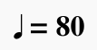
Here's beta2:

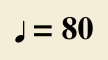
Here's nightly 791625f:

The second example just looks wrong to me.
| Attachment | Size |
|---|---|
| tempo marking-beta2.png | 1.65 KB |
| tempo marking-791625f.png | 1.76 KB |
Comments
I assume this is a result of an update to the Bravura font we use, and that it is therefore out of our control, except to perhaps fix the vertical alignment, which has been off for a long time, and perhaps change the size.
I would vote for increasing the note size. Even in beta 2, I thought the note looked a bit small.
16pt looks good to me, but I wonder if others will agree? Here it is:

With an update of the design of tempo marks - maybe another detail could be improved:
Not sure
- if the number for the bpm should be in bold types
- if this descriptions shouldn´t be in rounded brackets.
The tempo description (Adagio, Moderato, Allegro . . . . ) must always be printed in bold types.
Yes, I've also wondered about this.
There's some other text in MuseScore where I'm not sure about the font.
Published example:

MuseScore:

Pages 182-6 of 'Behind Bars' suggest MuseScore is incorrect here - the first of those pages states this: "Tempo indications are printed in bold roman type and are usually larger than other text so as to be very conspicuous."
Using MuseScore 2.0 Nightly Build fa9aaf3 - Mac 10.7.5.
I'm confused as to what you think is incorrect here according to Gould. MuseScore *does* render tempo text larger than other text, and bold.
Sorry, I should have clarified better - the brackets and whatever encompassed shouldn't be bold.
Oh, and how poetic, Marc. :)
Took me a minute to find the poetry :-)
I wasn't interpreting her comment as meaning some text *within* the tempo marking should be different font than other text within that same tempo marking. I interpreted it meaning it should be larger than *other text* - text *not* part of a tempo marking. After all, a large amount of music has the metronome marking *only* and non of the old Italian terms, and I expect it to be large and bold just as surely if I decided to include the Italian term but not the metronome marking. Only in the special case where you elect to include both would you possibly want the Italian term to be bold but the metronome marking not, but MuseScore should not be in the business of parsing this text and changing the formatting. every time you change the text. The text style is large and bold; if you choose to combine different styles of text in the same marking, that is your business.
If I'm not mistaken, this discussion has been rendered moot by #28366: Tempo texts are aligned incorrectly. In particular see https://musescore.org/en/node/28366#comment-285611.
For the most part, yes. One could still say the note glyph in this particular font is small compared to the text, but as far as I know, that really isn't MuseScore's doing - I belieave it's the open source Bravura font. I guess we could consider providing our own larger version in Emmentaler if enough people agreed it should be larger. FWIW, MuseJazz *does* provide significantly larger note symbols.
Setting the note to 15 pt font size and the text to 11 pt font size seems to come the closest to what I'm seeing in the printed scores I have here, both in proportion and size.
Here's a comparison:

Of course, different printed scores will have different fonts, sizes, etc. If you don't wish to reduce the text size, increasing the note size to 16 pt looks pretty good as well.
To me what you have labeled "default size" looks the best, but the interesting thing is that #28366: Tempo texts are aligned incorrectly made the stems even shorter—and what's even more interesting is this .