Gonville 2.0 - high quality font (only) for MuseScore
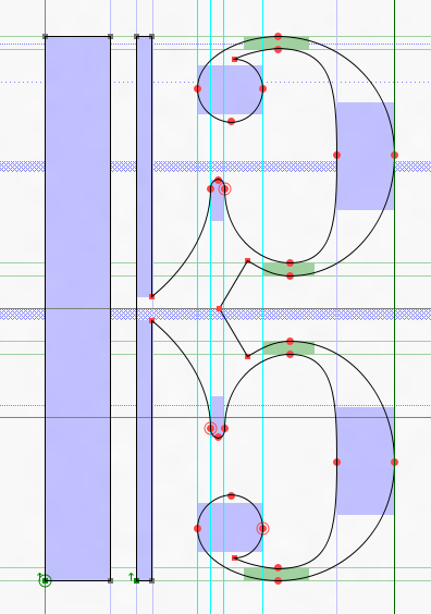
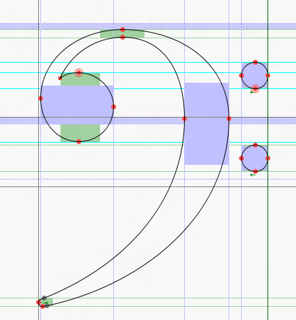
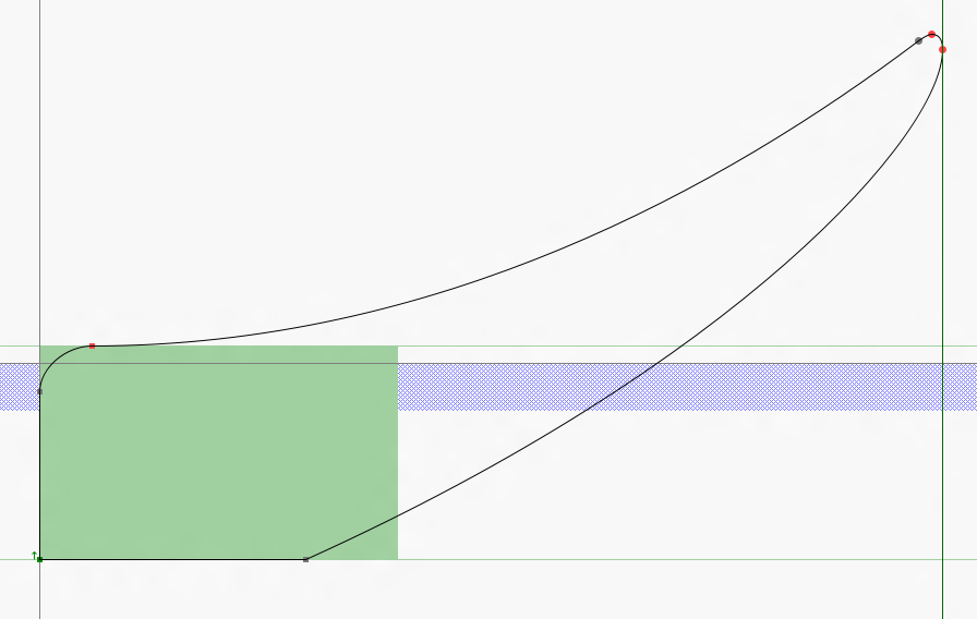
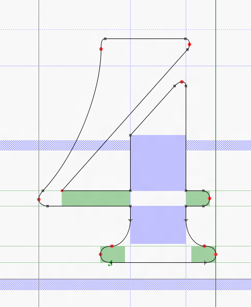
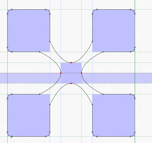
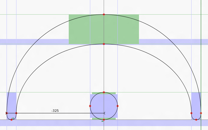
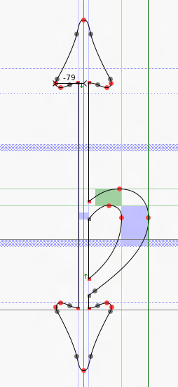
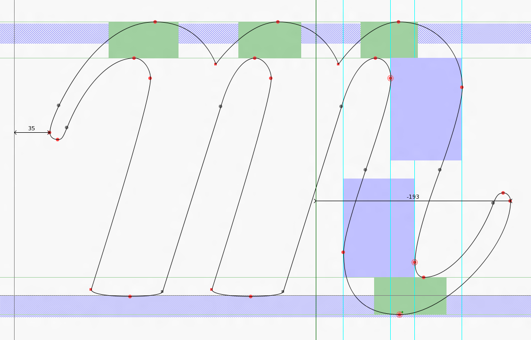
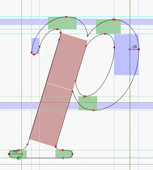
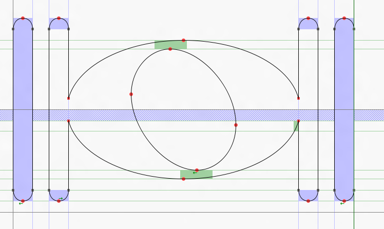
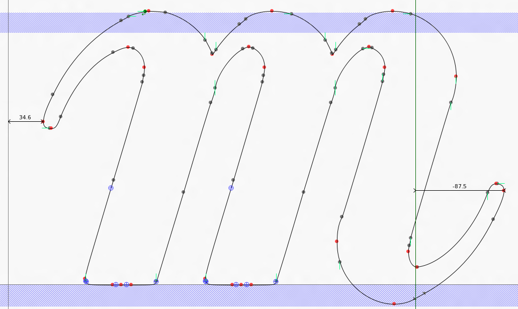
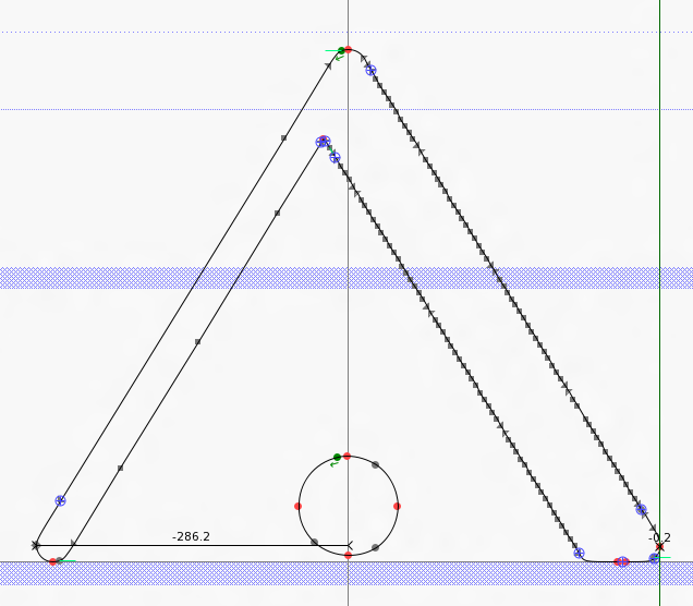
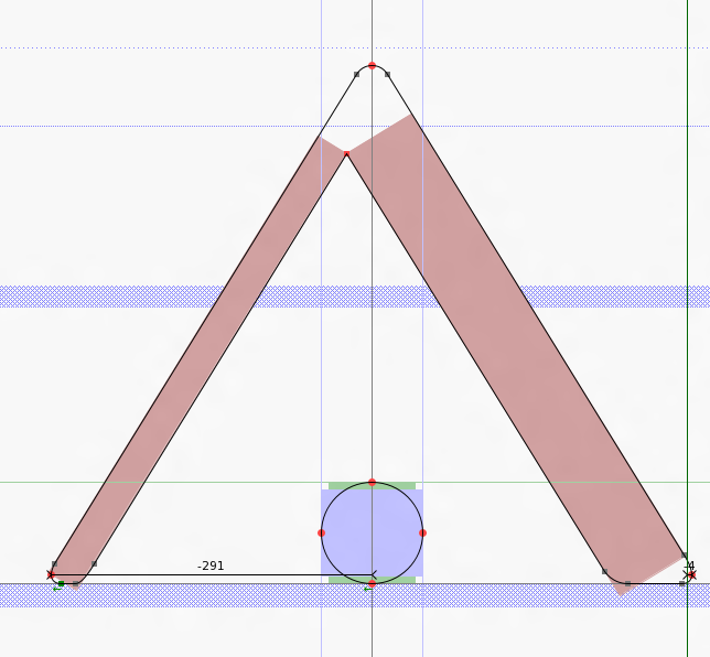
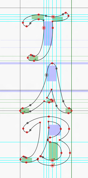
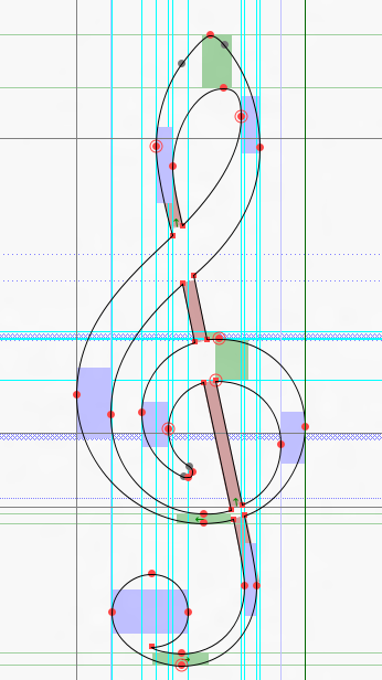
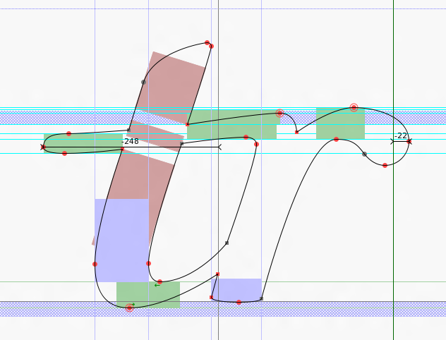
Mr Werner, Mr lasconic, Mr Thomas and others who are interested - I present a few screenshots from the Gonville high quality font for MuseScore made (changed, created) by me :) I created a few symbols from scratch - trill, digits, letter p, double sharp, etc. because in my opinion these symbols were not special, inconsistent with the canon. Please rate my work. Work in progress (70%) - coming soon :)
Screenshots with "old" are from original font - no comment. Emmentaler is high quality font, Gonville - not. I see so shapeless glyphs for the first time. Greetings for the designer :)
Full compatible with MuseScore Emmentaler font with cubic Bézier splines - coming soon.
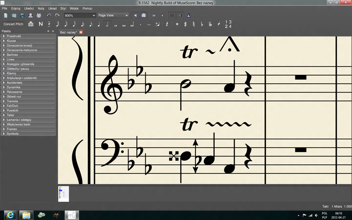
mscore_screen.png - Gonville 2.0 test in MuseScore
| Attachment | Size |
|---|---|
| alto_clef.png | 46.06 KB |
| bass_clef.png | 35.1 KB |
| brackettips.png | 35.56 KB |
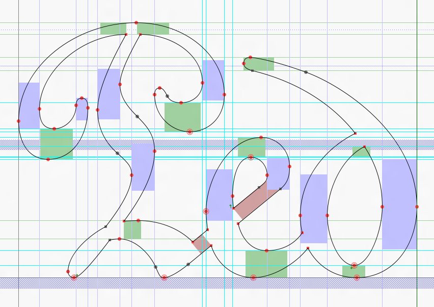
| digit_four.png | 31.13 KB |
| double_sharp.png | 40.63 KB |
| fermata.png | 42.59 KB |
| flat_with_arrows.png | 22.22 KB |
| letter_m.png | 88.31 KB |
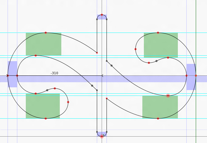
| letter_p.png | 50.29 KB |
| notehead.png | 43.2 KB |
| old_letter_m.png | 88.84 KB |
| old_short_fermata.png | 48.54 KB |
| old_treble_clef.png | 47.38 KB |
| pedal.png | 107.06 KB |
| pedal_star.png | 60.17 KB |
| reverse_turn.png | 50.67 KB |
| short_fermata.png | 52.15 KB |
| tab_clef.png | 40.55 KB |
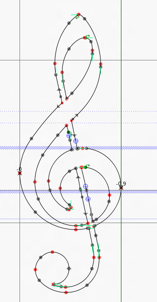
| treble_clef.png | 49.08 KB |
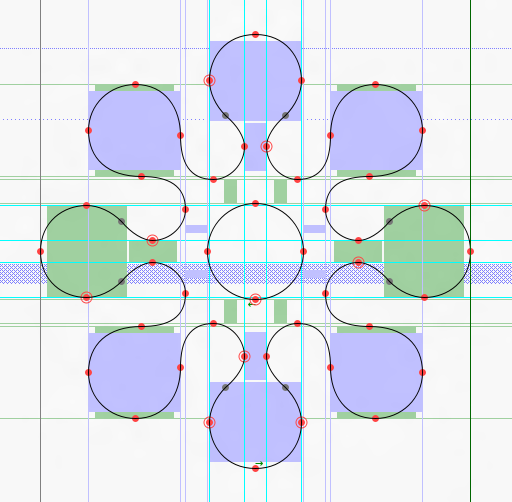
| trill.png | 47.4 KB |
| mscore_screen.png | 159.45 KB |
Comments
Good work :)
In reply to Good work :) by ChurchOrganist
Beautiful!
It's an amazing job you are doing ! Keep on the good work!
I'm not an expert in font design, but this looks like amazing work. I wonder where we go from here. Submit patches to the gonville font creator?
In reply to Amazing by Thomas
I'll inform the designer when I finish this font and I'll send him my project. I use font from [[http://www.chiark.greenend.org.uk/~sgtatham/gonville/|this site]]. Thanks everyone for your rating :)