Musescore app icon
Hi, just a minor point to consider about the Musescore 4 app icon.
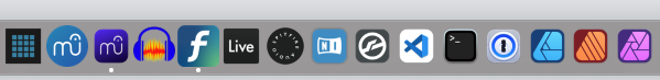
I love the new color, but the new purple icon is smaller. I'm surprised that you've shrunk the icon.
Readability is really important for brand strength. Maybe it doesn't look this bad on Windows or Linux, but it doesn't look great on Mac (see attached screenshot).
Aside from the cool color, the Musescore 4 icon seems like a downgrade. The white lines of the "mu" letterforms and fermata shape are so thin. It almost seems like a mistake. It's much less readable than the Musescore 3 app icon. The fermata component of the icon isn't easily read as that.
Notice how Finale, Ableton Live, and Native Instruments probably have the highest readability among the letterform-based icons. Musescore 3 isn't far behind. Musescore 4 is IMO the worst of the bunch. Spitfire is a little better, but not by much. At least it looks like an audio control knob, even though you can't read the text.
The Musescore logo itself is great (memorable, recognizable, readable). However, when you put it on an app icon, you need to do some redrawing for a small size, with fattened white strokes, and all the thicknesses need to look uniform (optics is more important than actual measurements).
Better still...maximize the size of your icon so you have more control over what the user can perceive from such a small object.
| Attachment | Size |
|---|---|
| Screenshot 2023-04-02 at 11.27.28 PM.png | 33.36 KB |
Comments
Thanks for sharing. That's some amazing work.