Falls, scoops, doits and plops
Hi!
Recently I've been running into a hinderance while writing horn charts for pop music, and that's the difficulty of making good looking fall, scoop, doit and plop symbols. The curved ones found under the "arpeggio and glissandi" palette look really weird, and non-standard. They're too long and really hard to edit, since they have four "edit points" (sorry, don't know what they're called), and the other three do not react at all when you move one.
The glissandi looking long fall are possible, but cumbersome. Since you can't put in a glissando without a target note, the only way to achieve it is to make an invisible note in another voice, but doing this is quite clumsy and slow.
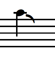
There's symbols for falls in the master pallet that I've resorted to since they're the best looking ones which are named "lip fall short/medium/long" and "rough fall short/medium/long" They're fine but not very customizable, and their placement isn't correct and has to be adjusted manually. Falls are the only articulation for which you can find these symbols, since there are no such symbols for the other effects. Is there a method I missed for getting these symbols that looks good? They're quite common in big band and pop horn writing, and if there is no way right now, I would really love musescore to improve on this!
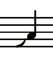
I've attached images for what kind of result I'm looking for.
| Attachment | Size |
|---|---|
| Fall example long.PNG | 1.24 KB |
| Fall example short.PNG | 1.3 KB |
| Scoop example.PNG | 1.04 KB |
Comments
FWIW, the publishers I'm most familiar with do use the longer symbols, but others do use shorter ones, so in MuseScore 4, they've been shortened by default. Feel free to try a nightly build (or way a few days for the Beta) and see if you like them any better.
Meanwhile, once you've customized one fall to look as you prefer, you can add it back to your palette via Ctrl_Shfit+drag for easy reuse. Also, for invisible notes as glissandi targets, instead of using a note in another voice, try grace notes (before or after as appropriate).
In reply to FWIW, the publishers I'm… by Marc Sabatella
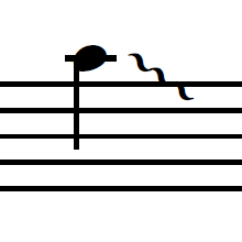
The customized fall/scoop/etc symbol is fine, but at least for jazz font it kinda looks too narrow and smoothed. in the image you can see the difference, the customized musescore fall is on the left, and the lip fall symbol from the master palette on the right. Good to know it's been worked on though, excited to test the beta when it comes out! Thanks for the tips as well, they're gonna definitely be timesavers for me!
In reply to The customized fall/scoop… by Saku Nikkanen
They work on the Solo brass instruments but they also need to be updated to work on the Section brass instruments.