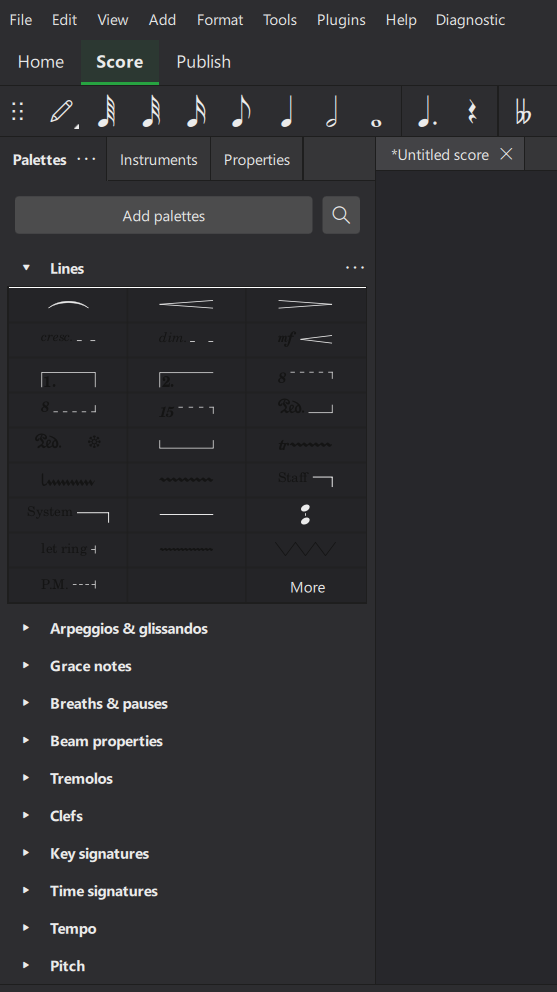
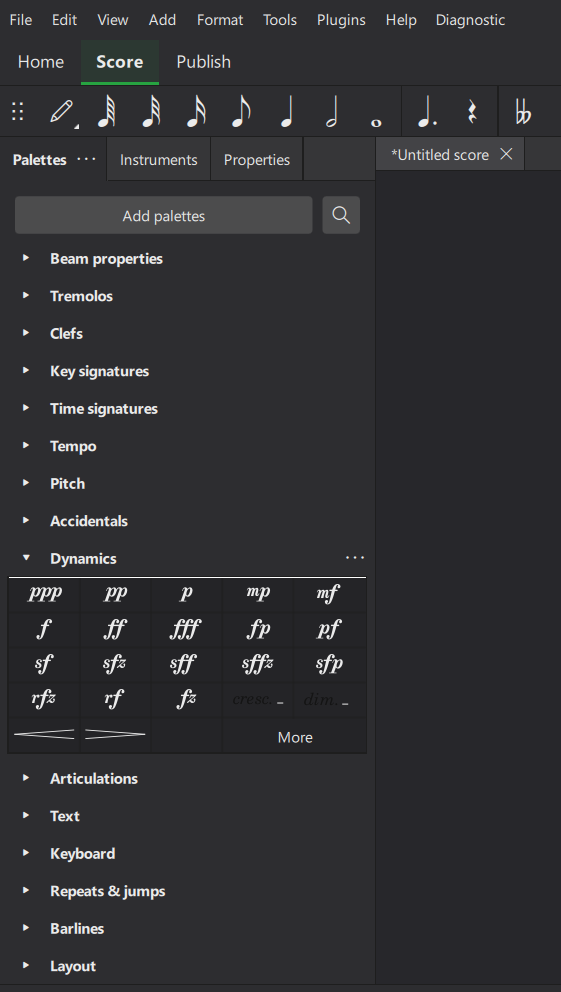
Dark Mode Contrast Issues In Palettes
OS: Windows 11 Version 2009 or later, Arch.: x86_64, MuseScore Studio version (64-bit): 4.4.1-242490810, revision: 0b3dd00
I just updated MuseScore, and I've noticed in a couple of the palettes menus that some of the things are way hard to see, at least in dark mode. I don't know if it's always been like this, but I just noticed it in like all of the "Lines" menu. Parts of the icons are white as they should be, but other parts are just slightly darker than the menu background itself. This causes all sorts of problems with seeing what the icons are, which of course gets in the way of writing music. I will attach images below to show what I mean.
| Attachment | Size |
|---|---|
| Screenshot (2).png | 74.01 KB |
| Screenshot (3).png | 80.43 KB |
Comments
I've encountered yet another area where contrast is a problem in the UI, in dark mode. This time, it's where you're creating a custom key signature. You might be able to make out the treble clef and double flat in there, based on where they intersect with the staff. As you might guess, they are the exact same color as the background (as here, the background is white even though I'm in dark mode).
Does the problem persist when you click the '...' button on the palette and choose "Reset palette"?
In reply to Does the problem persist… by cbjeukendrup
Yes, it does