Musescore 4 Design Input
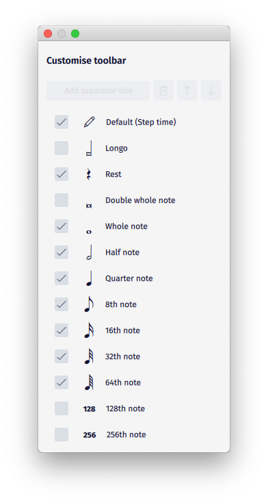
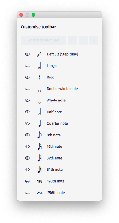
So, the design in Musescore 4 is absolutely incredible, but one thing about it really bugs me. The eye button rather than a normal check box. It's just really weird and it's unclear at first glance what it actually does. Why not use normal check boxes? It looks way better and it's super clear what it does, so it's not as easy to overlook by mistake
| Attachment | Size |
|---|---|
| MusescoreToolbarCheckBoxes.png | 82.24 KB |
| MusescoreToolbarCurrent.png | 86.81 KB |
Comments
I agree.
Some design people like change solely for the sake of changing something. It keeps them on the payroll... ;-)
Microsoft is famous for this.
(Pretty lame looking eyeball, to boot.)
P.S.: Better to post at the Development and Technology Preview forum:
https://musescore.org/en/forum/687
I think the "eye ball" icon is more suited base on the context that it is presented compare to the current Musescore 4 UI. It visually and clearly tells the user which instruments are presented on the score and which are not. The check box has a visual arbitrary meaning; a user may believe that an unchecked instrument will be muted on playback, which is not the case.
In reply to I think the "eye ball" icon… by SketalDaz
Possibly for instruments. I don't think it makes any sense for the note input toolbar. The eye is very odd looking though. It definitely at least needs refinement, it just feels kinda wrong, if you know what I mean.
In reply to Possibly for instruments. I… by L'Moose
hmm I don't want to be judgemental about the Musescore 4 UI choices right now because, one, it is still in development and as far as I know they may be experimenting with multiple options for logical reasons, and two, I may not like something simply because I am not used to seeing it or I haven't seen it in its completed context; but, if I was to float on your boat, I would suggest to widen the inner circle of the eye to over lap the lid a bit so the icon would look more like a relaxed eye:
and less like this:
..... I'm just saying .....
In reply to hmm I don't want to be… by SketalDaz
That would definitely be an improvement. I still think the whole eye thing needs to be reconsidered, though. Maybe those changes would fix it entirely though.