Musescore iPhone app weird formatting
I found a piece that I really enjoy playing, but there seems to be some weird formatting issues, like some stray rests that cause a single bar to take up the entire page.
I decided just to download it and fix it myself, and privately repost it for my own use. Instead, I find that the issues are only present on mobile.
In the desktop app, online, and as a PDF from online, it is perfectly normal.
On mobile and as a PDF from mobile, it's all weird.
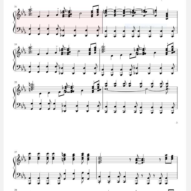
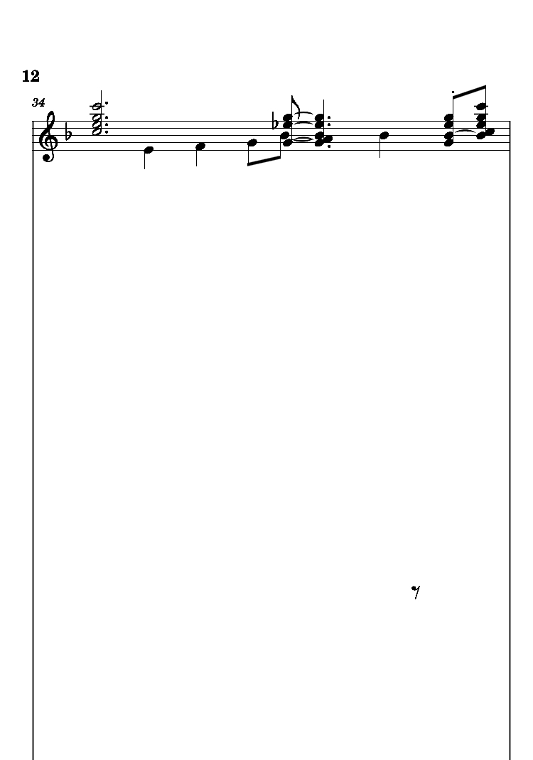
Attached are screenshots from the musescore website and from my phone.
How do I fix the issues?
This is the piece here:
https://musescore.com/rodgerc26/ant-man#comment-6167918
The issues are from bar 31 to bar 36.
| Attachment | Size |
|---|---|
| Online.PNG | 77.18 KB |
| Phone.jpg | 58.37 KB |
Comments
The mobile apps are dealt with on musescore.com, exclusively
With the above being pointed out.
The score stems from MuseScore 2.1; opening it in 3.5.2 (the current version, which is also used by the backend and likely the mobile apps) shows similar displacement issues.
First off you'll notice the title frame having a text collision, next off you'll see dragged off rests (instead of being made invisible) starting from bar 31 which indeed lead to those systems taking up full pages due to collision avoidance (which didn't exist back in MS2.1). Bar 39 is even pushed almost outside of the page area due to a rest being displaced upwards.
Here's a trick that should work in MS2.1 as well. Select bars 31 through 41 and press Ctrl+R to reset everything in there to its default position. Now if you have the need to hide rests, mark them invisible (V) instead of dragging them way off page.