Unable to add Horizontal Frame into vertical frame
Reported version
4.0
Type
Functional
Frequency
Few
Severity
S3 - Major
Reproducibility
Always
Status
won't fix
Regression
Yes
Workaround
Yes
Project
In MuseScore v 3.6 we were able to add one or more Horizontal Frames inside the Vertical Frame, providing the ability to split a Vertical Frame into several beautiful and equally sized columns. In Musescore v4 this feature no longer exists. Is there a way to split a vertical frame into columns?
| Attachment | Size |
|---|---|
| 5B0A19AF-9B1F-4B11-ACF3-9123B2E66820.jpeg | 618.13 KB |
Comments
I see this question is a few months old. I was also able to insert a horiz frame into a vert in MS3 for the purpose of creating a two-column appearance, which let me place text and translation side-by-side. In MS4 I came up with a simple workaround to get the same effect:
1. Create the vertical frame.
2. Add a text box and populate it as desired.
3. Add a Composer box and populate it.
4. In Properties, left-justify the Composer box. This moves the text to the left in the box AND moves the box to the left within the frame.
5. Use the right arrow or CTRL-right arrow to move Composer into position on the right and the up-down arrows to place it as desired.
6. Note that Composer is attached to the bottom of the vert frame, which means if you adjust the height of the frame, Composer moves up and down with it while the text box stays stationary. Aligning the two text areas takes some fiddling, but it's pretty easy once you see how they work with the frame.
In reply to I see this question is a few… by Hitchcock1939
Addendum to workaround: Composer can also be vertical-justified to the top of the frame so that it stays in place when the height of the frame is adjusted.
Is is s serious regression
See https://github.com/musescore/MuseScore/issues/12930
In reply to See https://github.com… by Jojo-Schmitz
Thanks for the link to github. Appears I'm Johnny-come-lately to this issue. Marc Sabatella does what I suggested above using whatever boxes are available. I agree that the horiz-in-vert was a strange feature. In MS4, I was just trying to be practical to get the look I wanted. Seems like a process for marking up a page with text areas needs a big step-back and re-think from scratch.
The simpler solution to create a two column layout is to simply add the two text elements directly to the frame and position them as desired. Way simpler than messing with frames within frames. Ultimately of course it would be nice to just support two column layout more directly.
I’m not aware of anything one could do with nested frames that cannot be done more easily without them. If there is something, then it would be good to see an example and see if there is perhaps a better solution that doesn’t rely on awkward workarounds like frames within frames.
In reply to The simpler solution to… by Marc Sabatella
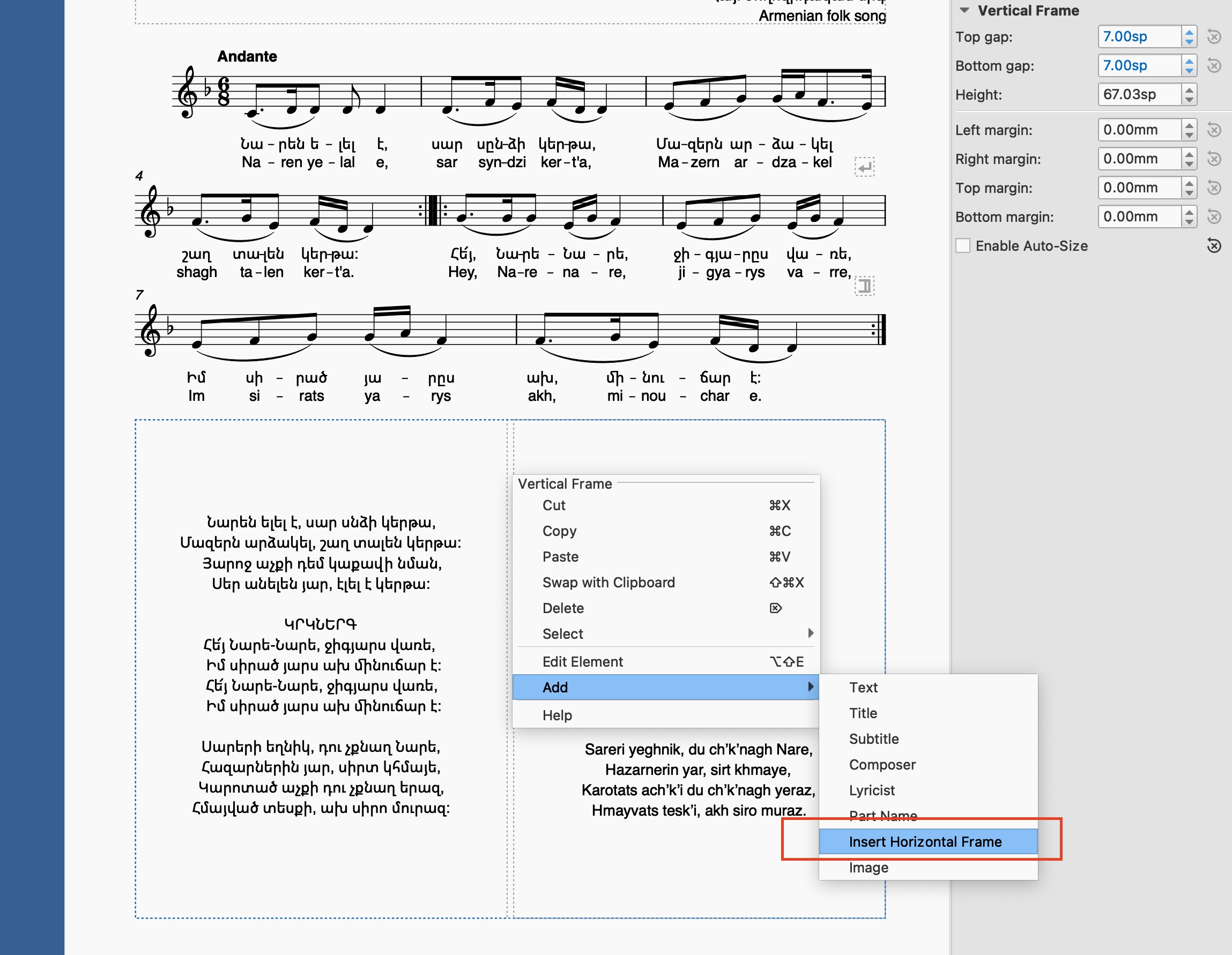
Thank you, everyone, for your workarounds and comments. Indeed it was a weird feature until we have found a good use for it. :))) As you can see from the attached screenshot, we have used this feature because controlling the width of the horizontal frame in previous versions allowed for consistent layouts. This was especially important for us as we create lengthy, 200+ page books using Musescore. We have been unable to locate a feature in v4 that allows for control of frame or any box width. In v4, we still need to manually position elements. While a two-column layout would be ideal, the ability to control box width would suffice in the meantime.
That's completely doable with two texts, and more easily as I said. Just always assign the same X offset to the second text each time you do this, just as you are currently assigning the same width each time. You could even make that a custom text style to make it easy to update them all later if need be - so again, considerably easier than with nested frames, which would lack that capability.
In reply to That's completely doable… by Marc Sabatella
Will try it out. Thanks!
In reply to That's completely doable… by Marc Sabatella
Just took a look at it. The solution you have offered will not work, as the width of the text for each song differs, so the horizontal offset each time has to be different. Works a bit better for left aligned text, but is a nightmare for a text that needs to be center-aligned.
? You previously said you make the widths of the frames the same for consistent layout, so I assumed you that is what you wanted. If you want different column widths, just use different offsets - you don't have to always set it to 50. I just thought that was what you said you wanted. It's exactly the same concept. As far as I can tell, literally every single thing you can do using three steps with nested frames, you can do in only one with offsets.
If you believe you have an example of something you can't do this way, please attach a sample score and explain what specifically you are having trouble with.
You can add those frames in Mu3, they will show in Mu4.
But there's no way to manipulate them (delete, move, resize, add text or image) in Mu4, so we do have a serious compatibility problem here
I've added this to MuseScore 3 features not (yet) implemented in MuseScore 4
In reply to ? You previously said you… by Marc Sabatella
Horizontal offset sets the distance from the left border of the frame and yes it is possible to align things this way. If the text is to be left aligned, you are right, using the same offset value each time will do the trick. But it won't work if the text is to be center-aligned. You have to play with the offset value each time to properly align things and still they will be eye-aligned. Yet, better way to do things is to have two equally sized columns within the vertical frame and then align the text within these frames as needed (grid system). Here is an example how it works on the web: https://getbootstrap.com/docs/5.3/layout/grid/
It's only a compatibility problem if you need to edit these frames, and easy enough to recreate them as needed. But it would be good to just auto-convert on open as is generally done when replacing other features.
Regarding center aligning of text in columns - as far as I can tell this still works as I'd expect. The centering is from the beginning of the frame, which is of course always at the same position. So if you want a consistent set of columns all aligned to the same center, you need the same offset for each. I just tried it and it works exactly as I'd expect.
So again, as far as I can see, there is nothing that you can't do more simply using offdts and than nested frames. I'm not saying there isn't some contrived case that one could possibly come up with where somehow the nested frames might save a click, but again, it would help to see an actual real-world score demonstrating this. So that if it does turn out there is indeed some corner case where offsets require slightly more effort, it's still a huge win for the vast majority of cases. And if that case turns out to be at all common in real world usage, I'd still rather see a proper column facility designed to handle it.
In reply to It's only a compatibility… by Marc Sabatella
I apologize for dwelling on this issue for too long. After experimenting with positive and negative offset values, I have discovered a method to achieve the desired result using only offsets as you were mentioning. However, this approach still requires some degree of subjective judgment to align the elements correctly. I agree that if this feature is to be developed further, a proper grid system would be a more optimal solution.
It's definitely good to have these discussions, to understand if anything is truly being lost, and what would be necessary to address it. It's also definitely worth further discussion (better suited for the forum though rather than this defunkt issue tracker) to come up with a reasonable set of requirements for any future text formatting improvements.
Of course, the big elephant in the room here is word wrap. That's the thing that would actually require a specific way of setting widths on frames and/or columns, and would probably set the overall direction for any further development of text formatting. But also, things like paragraph formatting within text frames, and lots more.
FWIW, regarding your example, the picture helps me understand what you are doing, but it's still not at all clear to me what is more subjective about choosing appropriate text offsets as opposed to choosing appropriate frame widths. It's still basically, eyeball/guesstimate a value for the thing on the left (whether offset or frame width), then the same for the thing on the right (again, whether offset or frame width). But once you have those two values determined, again, making it a user text style setting is huge win for the offset approach. Because then if you change your mind about how you wish those columns positioned - you want the left columns a little further from the left side of the page, for example, because you later create a block that needs more space to avoid bleeding into the margin - you only have to change one thing and instantly 100 different text frames get the exact same alignment.