Can I enforce a constant staff spacing on a whole score?
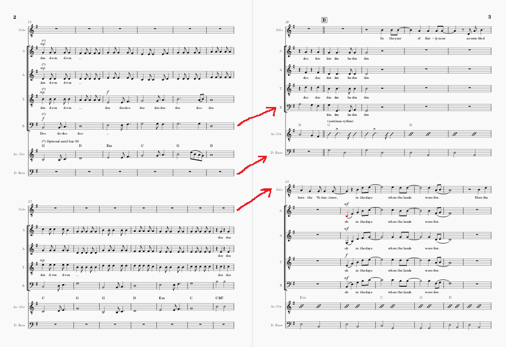
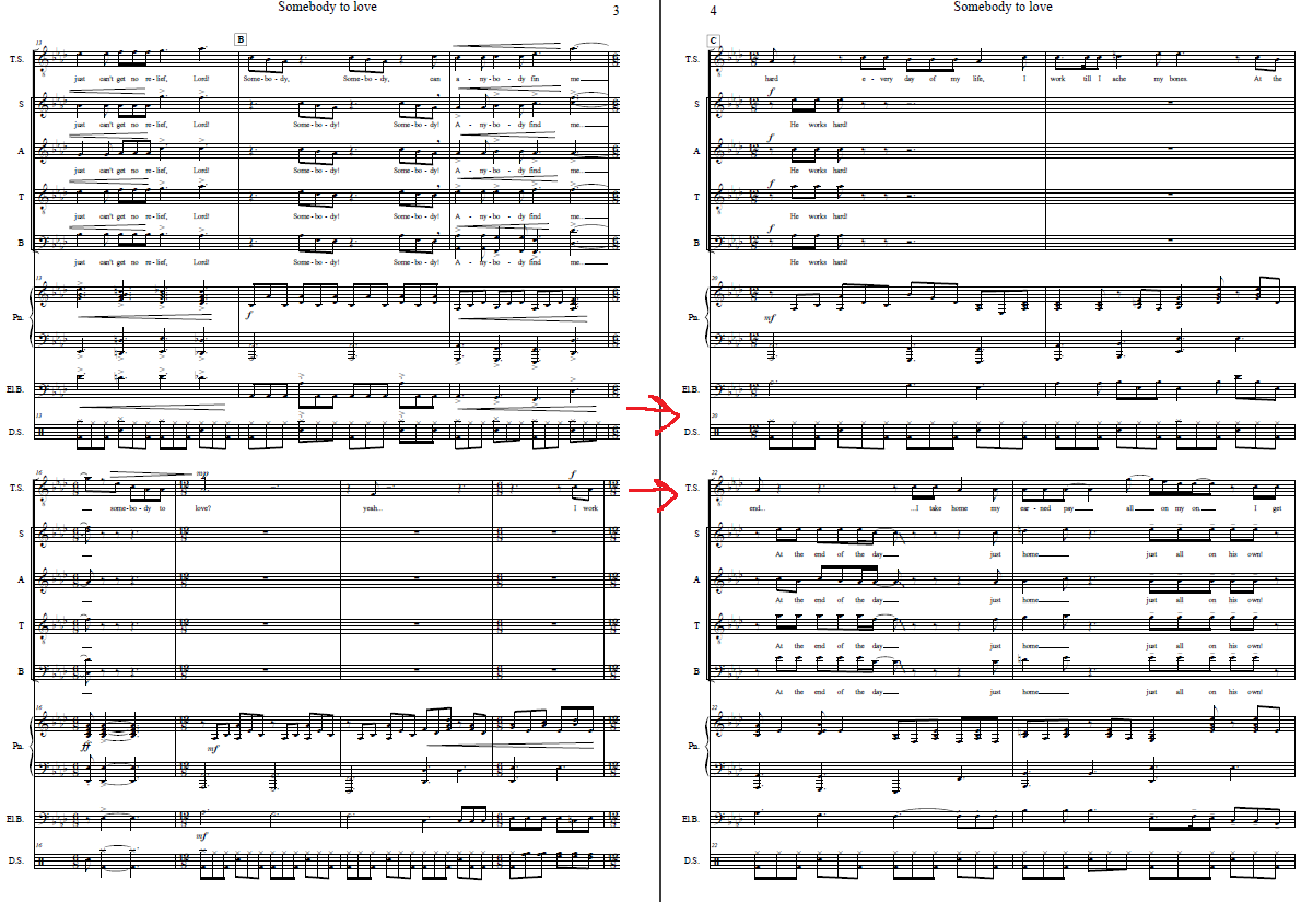
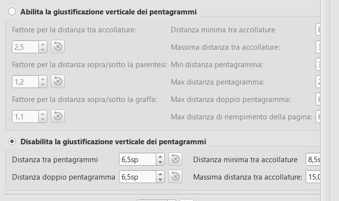
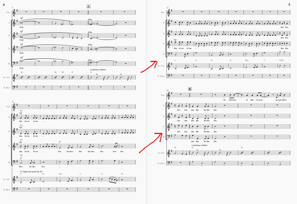
Automatic staff spacing is one of the key features that made me completely fall in love with Musescore 3.6, as it's a huge time-saver. However, an obvious consequence of such feature is that the same staff will not appear at the same height on two adjacent pages (Image 1). While this is a perfectly fine (or even desirable) layout, I can think of situations where one might want to have all staves at a constant page height, either as a readability feature (e.g. a conductor's score, where finding the instruments at the same height facilitates a quick reading) or as an aesthetical choice. I've attached a (very bad looking) example from Finale to clarify what I mean (Image 2). I've tried disabling vertical positioning (Image 3) but that doesn't do the job, and actually makes it quite worse (Image 4). Any advice?
Best,
Michele
| Attachment | Size |
|---|---|
| Image1.png | 102.54 KB |
| Image2.png | 106.15 KB |
| Image3.png | 31.59 KB |
| Image4.png | 100.63 KB |
Comments
There are multiple different things going on, so you'll have to decide what you are willing to sacrifice - you can't get around the laws of physics here. That is, obviously. if you have many verses of lyrics on one system, it's going to need a lot more space between staves, so if you allocate enough space for all those verses and want it consistent from page to page, you'll have a ton of wasted space everywhere else. That's why professional engravers seldom worry about that sort of consistency page to page - it's inconsistent with the realities of notated music in many cases. But if you have a score where you are pretty sure you can make it work, just go to Format / Style / Page, disable vertical justification, and set a staff distance value large enough to guarantee that no system has any collisions that would require more space.
Realistically, though, you'll also want to go through your score and make manual adjustments to eo,initiate the sources of the collisions that would otherwise occur. For example, in your image, the marking you added require extra space above the guitar staff on the first system. Had you added the text marking below the staff instead of above, you wouldn't have that problem. You'll probably end up needing to make similar choices lots of other places, moving any marking that would otherwise require additional space, in order to get a layout that is consistent and has no collisions.
If you're OK with collisions, BTW, you can allow that by setting a negative value for the minimum vertical space on the Score tab of that same dialog.
If you need further assistance, please attach your actual score rather than just an image, so we can understand and assist better.
In reply to There are multiple different… by Marc Sabatella
That helped, thanks for the great insights!