The treble clef glyph
It surprises me that no one has raised this topic here. I've heard two or three times that people have disliked my scores written with MuseScore, because of how the treble clef looks like. They say the long stem should be straight, not curving to the right as it does. Personally I'm very fond of the over all look of a typical MuseScore print. The look of the treble clef is just one thing that makes the whole score look a bit different, a bit fresher. It appeals to my tendency to seek diverging points of view in everything. I play in a big band and we have lots of scores written in Finale. They look somehow boring, like everything was evened out according to some mathematical distribution formula, not according to an artful typographic eye. Same thing with Encore, which I still use mainly to maintain hundreds of scores I've written before I started with MuseScore. Encore does have some function called "Engraver's spacing" that does pretty good job.
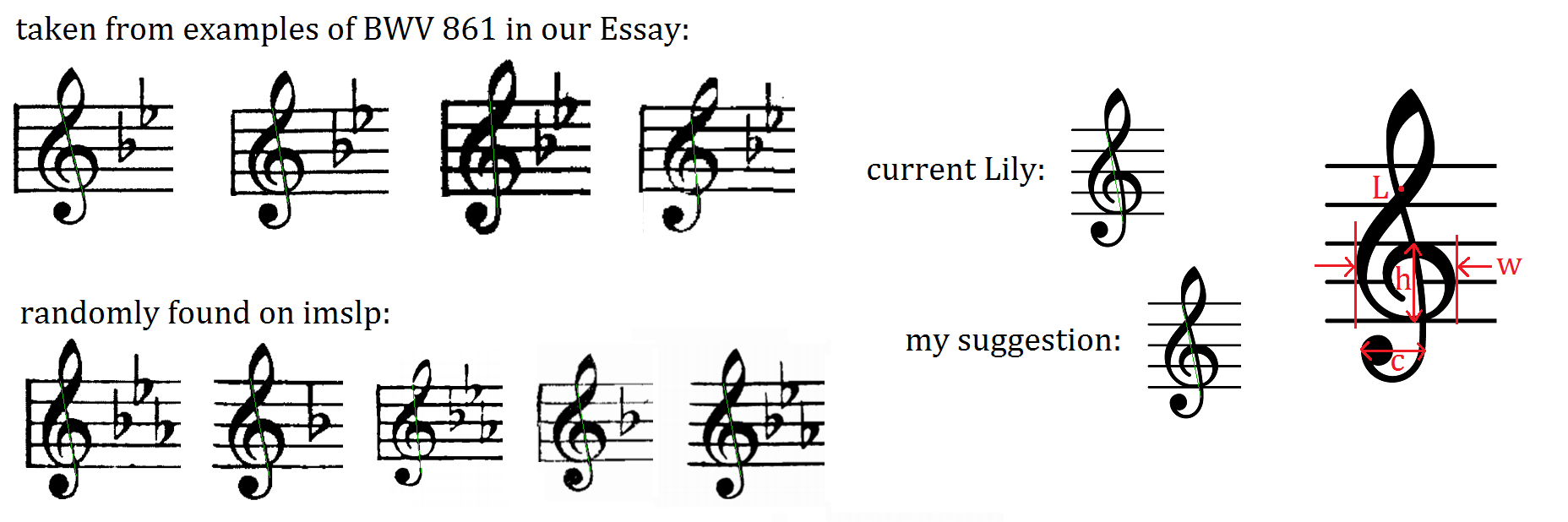
But this thread was about the treble clef. I only want to ask if somebody has heard similar complaints about their sheet music. And has anyone replaced the whole music font with another in their copy of MuseScore? Is it even possible - not that I'd do it? This image I found on some Lilypond forum:

I've added green lines to each clef to point out the stem, that my whining complaining friends want to be straight, not curved. I assume the "current Lily" is the one that MuseScore uses in the default font.
| Attachment | Size |
|---|---|
| clefs.png | 153.88 KB |
Comments
There is no way to easily substitute the font in MuseScore 1.2.
The clef glyph will be different in MuseScore 2.0 and users will be able to switch the fonts (currently with only two options).
From left to right, treble clef in MuseScore 1.2, Treble clef in MuseScore 2.0 (Emmentaler), Alternative treble clef in MuseScore 2.0 (Gonville)
No, I have not heard such a complaint before, and have no idea what theycould be talking about. Are these people who actually know about music typesetting, or are they just random opinions? When I compare the treble clefs from MuseScore to various printed scorss - jazz or classical, created with Finale, Sibelius, or a professional engraver - I see a very wide variety of slightly different shapes, and nothing about MuseScore's stands out as unusual. Some curve more, some curve less. Some slant more in terms of the overall angle, some less.
Is it possible the people who expressed this opinion are familiar oly woth the Real Book and think of that as the standard for how a clef is supposed to look? That's the only publication I can think of that has a very significantly straighter (and more vertical) clef. But that's definitely the exception, not the rule.
In reply to No, I have not heard such a by Marc Sabatella
Well, check this!
Sure it's just a google search and contains a lot of other graphics than just printed sheet music. But anyway, you see almost only treble clefs with a very straight stem. And the first one with a more curved one is the Lilypond one (the "before and after" thing).
In reply to Well, check this! Sure it's by jotti
My guess is that those images mostly came from Finale or Sibelius, since that's the easiest way to generate such graphics. But looking at actual engraved manuscript tells a somewhat different story. Lilypond - from which MuseScore borrowed its fonts, I gather - deliberately goes for a more "traditional" engraving. And indeed, although I said I saw clefs that were pretty varied in their curves and angles, I would say the trend over the past century or so has been toward straighter and more vertical. So the curvature of the Lilypond/MuseScore clef is a bit of a "throwback" to classic engraving. I can see why L:ilypond might have made such a choice, but would agree it probably makes sense for MuseScore to consider a more modern look here.
Hard for me to get too worked over this, though - unless some choices that more obviosuly affect readability (beam angles, ledger line thickness, etc), small details in the shape of a clef can't possibly matter at all.