Updated App Icons
Propose application icons are updated to:
1- Adopt minimalist design trends
2 - Improve readability at smaller sizes
3 - Unify brand experience across platforms (desktop, mobile, web)
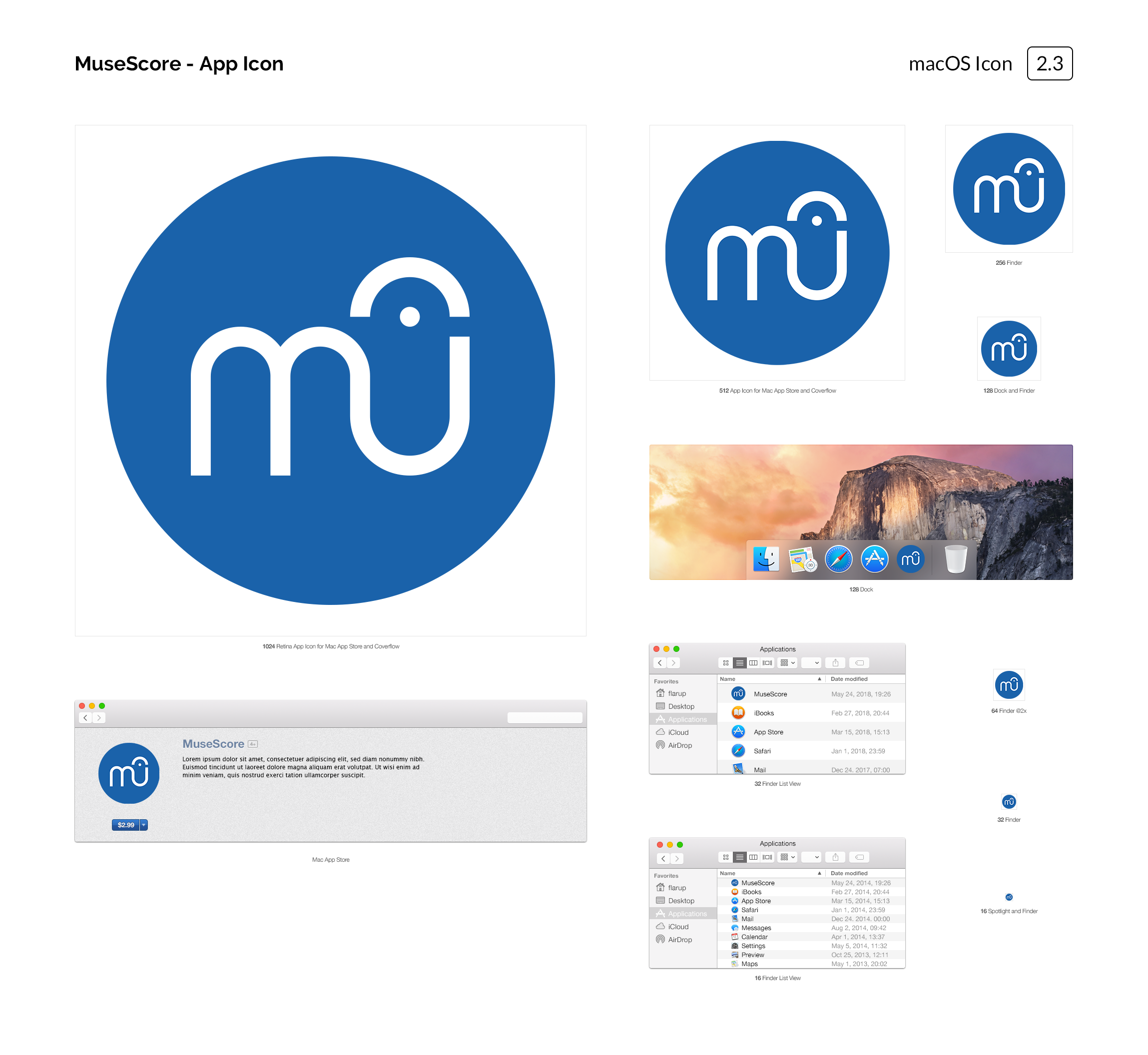
Design concepts attached (missing Linux).
Propose that line thickness of MU logomark be increased to:
1- Improve readability at smaller sizes
2 - Become more cleary identifiable as logomark
Modified logomark attached (SVG).
Previously discussed in pull request #3269 - https://github.com/musescore/MuseScore/pull/3269
| Attachment | Size |
|---|---|
| musescore_2_3_icon_macos.png | 980.74 KB |
| musescore_2_3_icon_windows.png | 239.78 KB |
| musescore_mu_mark.svg | 1.19 KB |
Comments
The icons attached are different from the one in the PR right ? Which one do you prefer?
Personally, there is already a lot of blue in my macOS docker (Finder, AppStore, Safari, Telegram, Skype to name a few). A blue circle doesn't really stand out and I feel both icon proposal are just not special at all. I do like the smaller size though.
In reply to The icons attached are… by [DELETED] 5
Yes, these were created after reviewing those in the pull request.
There are not many pink icons out there... so, could be an option. :-)
In reply to Yes, these were created… by Daniel
I definitely agree with the thicker mark. With regard to the color: MuseScore's branding has been established as blue for quite some time—even in the current, cream-colored icon, the mark is blue within it. Blue is very common in computer environments, but I don't think it's a problem for MuseScore to fit with this trend—selections are highlighted blue in most programs, and blue in MuseScore; links are blue on most websites, and blue here. People use blue because it looks good on-screen.
The particular shade of blue in Daniel's experiment here, though, is very dull and fails to attract the eye. I thought the final result in Liam Rosenfeld's PR was quite good, especially with the glossy effect produced by the gradient.
If something that's not MuseScore's logo inside a circle or square—something more "special"—is desired... have you considered making the "mu" mark the logo on its own, without a background (perhaps with a shadow or border to define it)?
I prefer the current icon. It's MuseScore.
I have added PSD files here - https://drive.google.com/drive/folders/1kSCRp1wJdzZH5IG5GEVhcRRY6t55adD-?usp=sharing