Mixer patch list scroll bar
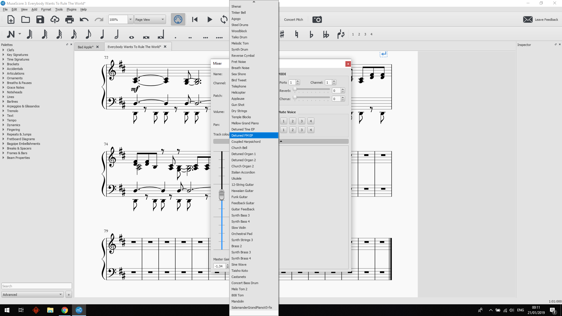
Please can you return the mixer patch list back to a standard drop down menu with scroll bar? While this new design for the menu may look cleaner, the lack of a scroll bar removes a lot of basic functionality from the menu. I only have 3 soundfonts installed and the menu fills the entire screen. It takes me 31 full scrolls to reach the bottom of the menu, the little scroll buttons at the bottom are extremely slow, and there no way to quickly identify where in the list I am, or quickly select a position in the list. I like to mix and match soundfonts, and having to scroll for 20 seconds to find the next flute patch is tedious, whereas before I could whizz through the menu by just dragging the scroll bar.
| Attachment | Size |
|---|---|
| musescore3menu.png | 228.84 KB |
Comments
While I do agree that a scroll bar would be nice, you can use the keyboard ↑ and ↓ keys or the scroll wheel (or similar gesture on a touch pad, like two-finger swipe) to speed up the scrolling significantly.
In reply to While I do agree that a… by Louis Cloete
When I say 31 scrolls I am referring to the use of the scroll wheel on my mouse. I know there are multiple ways to scroll through such a menu, and I am not saying that the menu is unusable. The problem with the new menu system is that it is less functional than the old menu, and that is not what you want from a design upgrade. The main priority of UI design should be usability, and the priority of a UI upgrade should be increased usability, not just change for the sake of change.
In reply to When I say 31 scrolls I am… by BambiTrout
FWIW, you can also just type the first couple of letters of the sound name.
In general I find the new design far more usable than the old, but agree this paticular aspect is a slight regression.