Chord symbol font change spacing
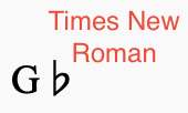
I'm trying out different fonts and I've noticed the spacing between letters and symbols changes if I don't use FreeSans or FreeSerif (I admit I haven't tried every font). For example, if I write the chord Gb (G-Flat) in FreeSerif the flat is nice and close to the G. In Times New Roman the flat is a space away from the G. Is there a way to shorten the space between the letter and the symbol? I've attached a couple pictures to illustrate the issue.
Thanks!
-Lewis
| Attachment | Size |
|---|---|
| Gb Times New Roman.png | 9.18 KB |
| Gflat FreeSerif.png | 7.37 KB |
Comments
I reported this as issue #295659 back in November.
Since then I've become a contributor to MuseScore as a developer, and I've started work on fixing this problem.
In reply to I reported this here back in… by Spire42
For auto-linkage purposes: #295659: Extra whitespace around flat symbol in chords when using custom fonts
(type as [#295659])
In reply to For auto-linkage purposes: … by jeetee
great thanks!
The short answer, thoughm is that you get good spacing if the font you are using includes that symbol and provides good spacing. You get bad spacing if your font doesn't do its job properly. Hopefully in the future we'll be able to handle fonts that lack the proper accidental symbols, but meanwhile, best to stick to fonts that actually do contain them.