In the editor, the highlight colour for selected text can be difficult to see
Reported version
3.5
Type
Graphical (UI)
Frequency
Once
Severity
S5 - Suggestion
Reproducibility
Always
Status
active
Regression
No
Workaround
No
Project
Musescore 3.5.2, on Windows 10.
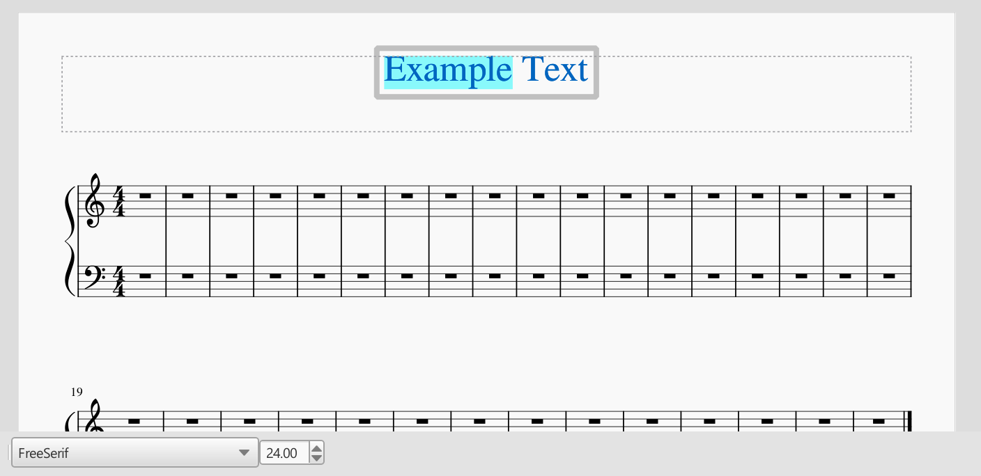
The highlight colour for selected text is pale, and I find it difficult to differentiate from the editor's white background. Because it's a similar hue to the text itself, I find it particularly difficult to differentiate between a "completely selected" text item, and a "completely deselected" one. This is a particular problem when editing small items (e.g. dynamics, chord symbols) while zoomed out.
The fix would be to imitate the text highlighting behaviour of most user interfaces: render the highlight colour in a dark shade, and render selected text as white.
I would also suggest making the highlight colour slightly darker for text-field controls - for example, those in the "Preferences" dialog.
| Attachment | Size |
|---|---|
| text_highlight_screenshot.png | 40.29 KB |
Comments
Check Edit > Preferences > Advanced whether you can find and change the 'culprit' color setting
As far as I can tell, this colour can't be customised.