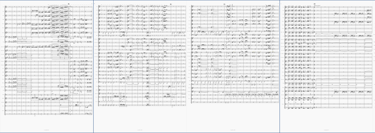
More "even" looking score
Hello to you all : I'm sure this has been answered a lot of times, but I can't find something similar to my issue 
| Attachment | Size |
|---|---|
| spacingmusescore.PNG | 192.24 KB |
Hello to you all : I'm sure this has been answered a lot of times, but I can't find something similar to my issue
| Attachment | Size |
|---|---|
| spacingmusescore.PNG | 192.24 KB |
Do you still have an unanswered question? Please log in first to post your question.
Comments
You can try increasing the minimum sizes of Style settings under the Page category so that they hopefully don't expand, see Layout and formatting -- particularly staff distance.
If the sizes don't do it, you might have to use spacers, see Breaks and spacers. You'll have to do it manually for every page though.
It's easier to assist if you attach the actual score rather than just a picture. But most likely this was a score started in an older version of MuseScore that didn't have the ability to even that out automatically. Assuming you've updated to 3.6.2 by now, you simply need to update the score to use this new capability, by enabling vertical justification in Format / Style / Page.
In reply to It's easier to assist if you… by Marc Sabatella
Thanks a lot that's exactly what I needed. I wasn't quite sure if just showing the score was enough, but I'll attach it next time. Thanks again :)