time signatures
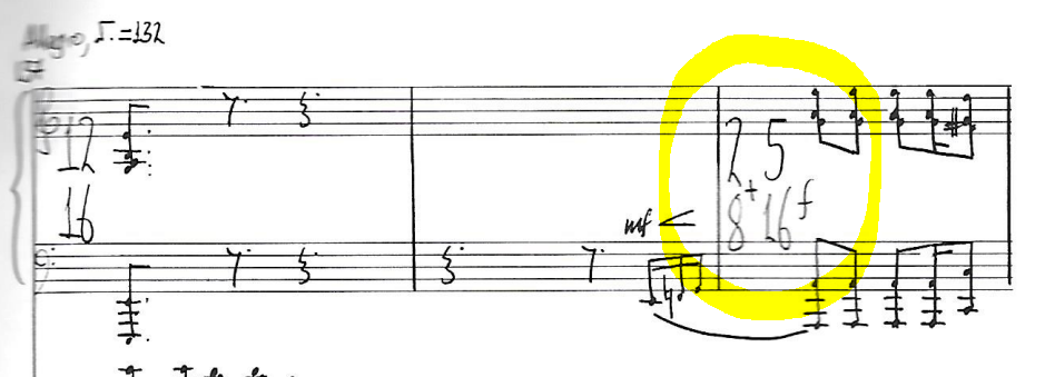
Hi. How do I show this time signature on musescore (see the snip attached)
thanks
rachel
| Attachment | Size |
|---|---|
| snip two time signatures.PNG | 153.48 KB |
Hi. How do I show this time signature on musescore (see the snip attached)
thanks
rachel
| Attachment | Size |
|---|---|
| snip two time signatures.PNG | 153.48 KB |
Do you still have an unanswered question? Please log in first to post your question.
Comments
See https://musescore.org/en/handbook/3/time-signatures#additive-meters
Depends on how closely you wish to match the holograph.
MuseScore handles additive meters very well, as long as the denominator stays the same--so, your measure could be marked "2+2+5/16" (m. 1 in my example). I've seen some people adjust the text of the time-signature (under its Properties), to something like "2+5/8+16" (m.2), but to me the result looks really clumsy
The best, but alas, the most tedious, method is to assemble the time signature yourself from the glyphs found in the symbols palette (bottom of master palette, Shift-F9). For instance, in m.3 I set the time signature as "2/8", but the measure to an Actual Duration of 9/16 (Measure Properties). The glyphs, or at least the first one, needs to be pinned to an existing note or rest, so the next step is to enter the musical material into the measure. In m3., I selected the first G, and created the plus-sign, which as you can see, is superimposed on the notehead. Adjust its position by dragging, or (MUCH MORE PRECISE) using the offsets in the F8 inspector. In m.4 I continued by adding the "5" glyph (pinned to the "+" glyph), and then the "1" and the "6", in each case adjusting the offsets relative the glyph which came before). You'll also need to become friends with the Automatic Placement check-box on the F8 inspector, as well as the Leaidng Space adjustment (under Segment) when you select the note head. It takes a little fiddling; but then, you're a violist, aren't you?
Also very important--when drawing glyphs off the Master Palette, make sure that they match the font you're using--in m.5 the "2/8" is in Leland, and the "+5/16" is in Bravura--notice how they don't match?
What I haven't figured out how to do is to create a time-signature centered in the middle of a grand staff, as is the case in your holograph--Anyone?
(As I was working this out, I noticed that the "+" glyphs in Leland are so thin as to be almost invisible, when the cross-bar is superimposed on a staff line; which is why I offset it by half a space in my example. Design crew?)
Hope this helps.