Additional Stave Text Line
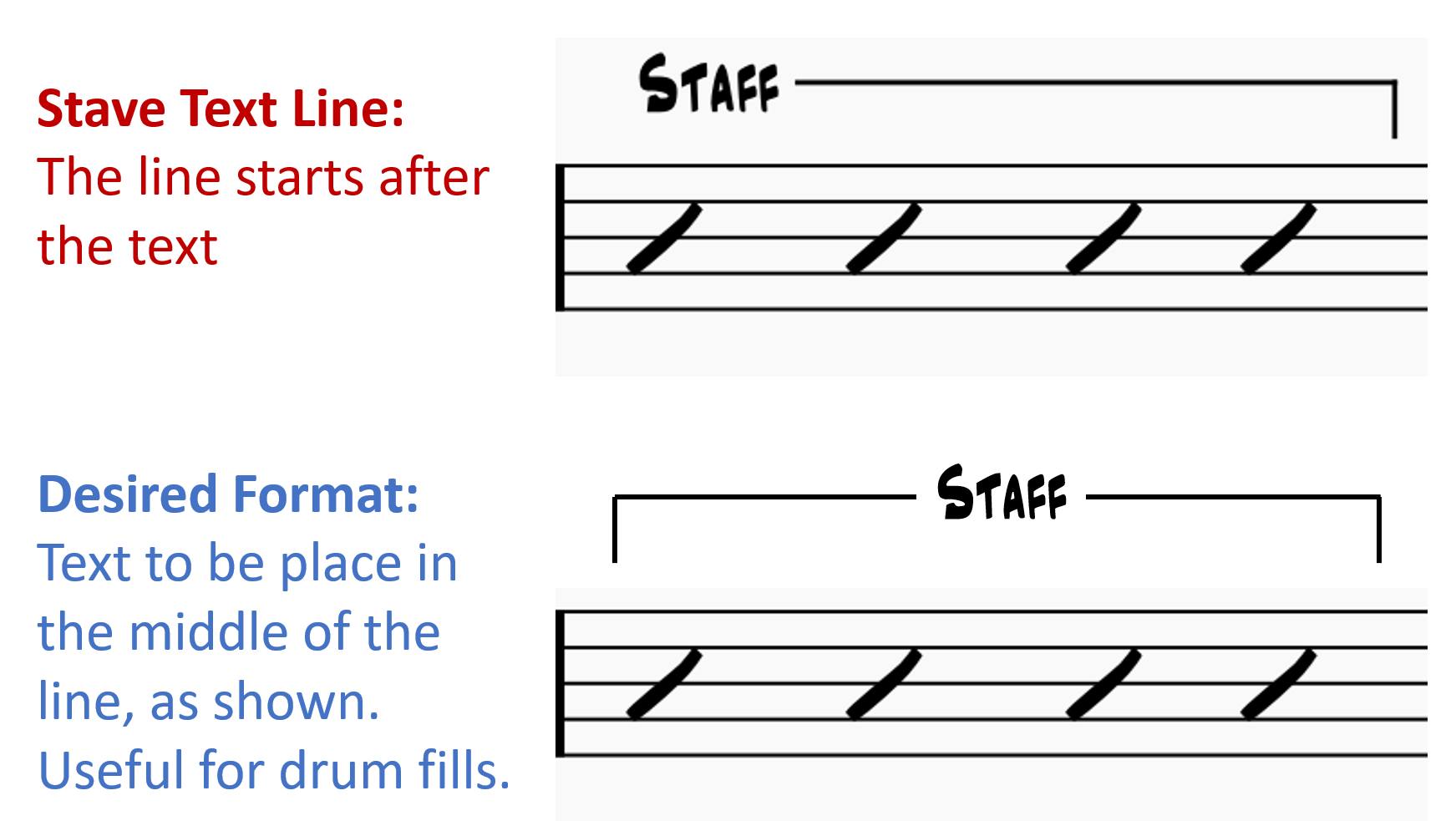
I'd like to be able to reformat a Stave Text Line so that the text appears in the middle of a line with beginning and end hooks, as shown in the second mock-up below. This would be useful for indicating where a drummer should play a fill.
Is this possible to achieve, using a setting that somehow I've missed? Or would this require a new feature?
I'd be grateful for any assistance. Thanks.
| Attachment | Size |
|---|---|
| 278289752_10160132795109042_3245116387006502735_n.jpg | 93.33 KB |
Comments
Seems not possible, currently.
In reply to Seems not possible,… by Jojo-Schmitz
Thank you for looking into it for me.
In reply to Thank you for looking into… by satchmo67
You can get the look using two lines, one with a start hook and no text for the left end and the default with start text and end hook for the right end. But the alignment if the two halves can get out of whack and need adjustment.. That is best left to be a final formatting job.
Are you saying that moving the text to the middle of the measure is intended to indicate where a drummer should play the fill - that the fill is meant to start on the "and" of beat 2 instead of the beginning of the measure? That's not at all how I'd interpret this, the line itself makes it looks like you want the fill at the beginning of the measure. If you want the fill to start on beat 2&, the line should start there too - and with it, the text. Or, if you mean the fill to start at the beginning of the measure, best not to confuse the drummer =by placing the text over a completely different beat.
In reply to Are you saying that moving… by Marc Sabatella
Thank you.
In this example, the intention is to show that the whole bar, selected by the opening and closing hooks, requires a drum fill. The hooks (I would normally call "brackets") could indicate any number of beats, though. Without the left hook, it's not as apparent where the fill should start.
Writing fills this way was fairly common when I was handwriting charts a few decades ago. Just looking to see if I can emulate it.
In reply to Thank you. In this example,… by satchmo67
The standard with lines & text is to just use the text to show the start. This does indicate the start location clearly as well - it begins with the note directly under the text.. It's the same for dynamics, chord symbols, octave markings, and all sorts of other text, actually. This is so universal that when one sees text in the middle of the measure, one might naturally assume the text doesn't apply until there, because normally, text goes right over the note it affects. Worse, what if the fill is two measures instead of just one. Would you still want the text centered? That would place it over the next barline, making it seem like the fill doesn't happen until the following measure.
I'm not saying it can't be done the way you show, but it's actually less clear than the way music is usually written when printed professionally.
So while these workarounds would allow you to recreate that look, I wouldn't recommend it doing this, even if a native feature were added for this someday.
You can fake this by using a normal line and add the hooks (no text).
Then add a "Fine" and horizontal align it, increase its stacking order and give it a frame with a non-transparent background (highlight) and the desired margin (perhaps make the frame itself 0sp or the same color as well). Best to also change the label of the Fine so it won't affect default jump instructions playback.
In reply to You can fake this by using a… by jeetee
Thank you, this solution is very a good workaround. Although I've had to revert to Stave Text instead of "Fine" text to prevent it from appearing on other instrument parts.
In reply to Thank you, this solution is… by satchmo67
If you use regular stave text you lose the automatic horizontal centering which Fine gives you. You can just mark it invisible in the other parts.