Support for Real Book "RealScore" Font
Hi, I'm new to this forum and I couldn't quite find this topic. My apologies if you've seen it here before.
It would be great to be able to use NorFonts - Real Book "RealScore" font so that we could create professional accurate Real Book layouts for publishing. I just found this gem and man - it's stunning!
https://www.notationcentral.com/product/realscore/
Like most of you, I stopped using Finale and Sibelius a long time ago. Support for this font would make me never look back.
Do you know if there is any chance of that happening?
Thanks in Advance!
-Chris
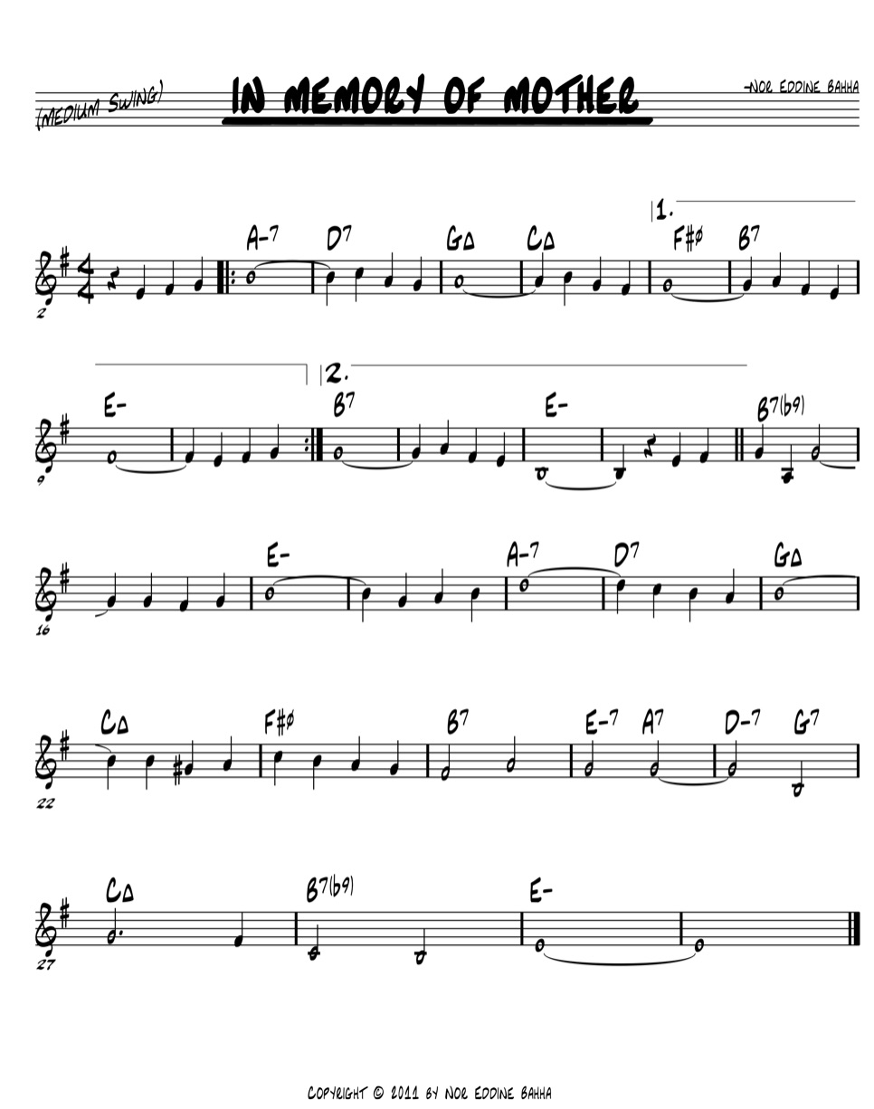
Also - here's a screen shot of the "RealScore" font in action.
| Attachment | Size |
|---|---|
| realscore.jpg | 142.29 KB |
Comments
If it's free / open source, then have the developer contact the MuseScore developers about it's inclusion.
If it's not free / open source, it would have to wait until such a time that MuseScore allows loading third-party fonts of unknown license status.
Meanwhile, of course, there are other handwritten fonts available with MuseScore, including MuseJazz, Petaluma, and with MuseScore 4, Finale Broadway. Petaluma in particular matches up pretty well with the style used by some pretty major publishers.
In reply to If it's free / open source,… by Marc Sabatella
Marc, thanks for the reply. I'm using Petaluma now. It's the closest one I can find to the Real Book style at the moment. It's odd that the chord extensions (7, -7(b5), etc., are so big. and it doesn't make them smaller and offset them higher like MuseJazz does. Do you know if there is a way to make the chord extensions smaller (and offset them higher)?
Thanks in advance! I illustrated an example below to show you what I mean.
In reply to Marc, thanks for the reply. … by Pladd Dot
The Jazz style for chord symbols uses MuseJazz, hard coded in the corresponding chord symbols style file. When not using that style but only changing the chord symbols text style (and then together with the standard chord symbols style) it won't render chord symbols the same way.
In reply to The Jazz style uses MuseJazz… by Jojo-Schmitz
You are correct. I've found that to be true.
In reply to Marc, thanks for the reply. … by Pladd Dot
See the scaling & offset options for extensions and modifiers in Format / Style / Chord Symbols.
BTW, if you're concerned with getting "publication-quality" results, probably best to skip the old-style "-" symbol for minor and use the modern standard "mi" that almost all jazz publishers these days use, as per Brandt/Roemer.
If you are working with a specific publisher that has their own special house style you need to emulate, it could work best to create your own customized chord description XML file that tweak sizes/ positions of each symbol as needed. That's how the default Jazz style does it.
In reply to See the scaling & offset… by Marc Sabatella
Marc,
Your feedback is much appreciated.
I have to admit, seeing an "E-7" in a dark bar is easier for me to read than EMI7. Since Jazz fonts are all capital letters anyway (for better reading), there's no chance of confusing the "-" with an upper or lower case (or MI) "M". So I've gotta stick with that one for my purposes. Also, I'm finishing a new book with Real Book style chords and I'm publishing it with the "-". My version of the real book uses "-7" for minor 7 all of the time.
How would I go about creating an XML file to tweak the sizes and positions? I realize that there might be a long winded reply on the horizon, but I'm willing to do it.
Again, I truly appreciate your help.
In reply to Marc, Your feedback is much… by Pladd Dot
Custom chord description XML files aren't officially "supported", but they work, and you'll find a decent amount of advice here in the forum on creating them if you do some searches. There is documentation within the default files themselves. See the "styles" folder in your MuseScore installation (eg, under C:\Program Files\MuseScore 3" if you are on Windows) and check out chords_jazz.xml for an example. make your own copy in your own Styles folder (under your Documents/MuseScore3), customize it, and load it via Format / Style / Chord Symbols.
It's fine to have a personal preference for "-", but since you specifically talked about publishing, it was worth mentioning that major publishers almost never use that. It's true that the old illegal Real Book - which was produced by amateur college students with no real music engraving experience - used "-" for minor chords, and "maj" for major. They made a lot of other rookie errors too. The legal Hal Leonard version - for which I was one of the editors - choose to fix the worst of the mistakes in the original illegal version (actual wrong notes / chords etc), but for the sake of consistency, they chose to keep keep the "-" and "maj". In other words, we did it precisely to look less professional, and more like the old amateur fakebooks. But, virtually all other Hal Leonard jazz publications use mi and ma, as do virtually all jazz charts from most other publishers. So if the goal is a professional published look, really, it's best to look to how the major publishers actually do things. on the other hand, if the goal is to mimic the old illegal Real Book, then indeed, there is some "sentimental value" in going with the "-" as Hal Leonard did for those editions only.
In reply to Custom chord description XML… by Marc Sabatella
I have to admit, when I first saw "-" as minor, I didn't like it (nor did I know what it was). I had to read through a melody and figure out what the heck was going on. But then after using the original real book (and now the Hal Leonard) for so long, it's one of those things that I just adapted to. Like I said, I can now see the value in the "-" because when I pull out a chart under stage lights (or in a darker bar), it's harder to misread. So now it has more value to me than just nostalgia.
I actually use quite a bit of intentional diversity in my charts with regards to chord symbols to give students the most amount of experience when learning to understand charts. So yes - I do us "mi", "m", Maj, M, -, ∆, and everything I can find.
Very cool that you were an editor on the Hal Leonard Real Book! We sell them at our store (I own a music school and store) and I use them every day. I appreciate your work!
I did find where I could load my XML data yesterday but I didn't know how to edit the files. I'm assuming just open it up in a text editor and go to town?
Thanks again!
In reply to I have to admit, when I… by Pladd Dot
Yes, any plain text editor should do
In reply to Yes, any plain text editor… by Jojo-Schmitz
Thanks!
Here's a Musejazz screenshot:

In reply to Here's a Musejazz screenshot… by Jm6stringer
Yeah. I've used it quite a bit. It's not my favorite for creating Real Book charts. But thanks for the reply.
I would say that support for this font is probably not possible any time soon, based on information from the website you provided. The font claims to be compatible with Finale and Sibelius, which signals to me it likely is not a SMuFL font, which is the font format required by MuseScore. Finale supports SMuFL fonts but Sibelius does not, hence why it is unlikely to work in MuseScore, even if the ability to load custom notation fonts were added.
In reply to I would say that support for… by dragonwithafez
According to SMuFL.org, NorFonts are supported. See the attached link: https://www.smufl.org/fonts/
It's the 8th one down on the list (after Finale and Music Type).
Norfonts RealScore does indeed have a SMuFL but all Norfonts appear to be commercial products, (as you mentioned), and you have to pay to use them.
See https://norfonts.ma/en/product/realscore-smufl-font/
In reply to Norfonts RealScore does have… by yonah_ag
Thanks for the reply. Do you think they would be compatible with MuseScore?
There are some fonts that I really like. I just don't know if MuseScore would allow me to install them. I've found all of the True Type Font files for MuseScore (and their corresponding folders), I just want to make sure they'd work if I installed them.
In reply to Thanks for the reply. Do… by Pladd Dot
MuseScore does not currently have the ability to load custom music fonts, only text fonts. If the ability to load custom fonts were to be added, then these fonts would most likely work, but that is currently not planned for any time soon.
In reply to MuseScore does not currently… by dragonwithafez
Thanks!
NorFonts here, thanks a lot for your interest in my fonts. Yes, it'd be better if MS would, support 3rd party SMuFL fonts like Dorico.
Finale v27 can now use SMuFL fonts such as Bravura and Petaluma. my NorFonts are almost SMuFlized except LeadSheet and NorPen fonts which are still WIP.
Basically, you can use any SMuFL font if your music software can handle 3rd party (SMuFL) music fonts.
In reply to NorFonts here, thanks a lot… by NorFonts.ma
Thank you for your reply. I ended up buying FontLab to create my own handwritten chord style fonts. Since MS supports Petaluma, I was able to add a few of my own handwritten styles to the mix. I do look forward to when MuseScore supports your fonts. Thanks again - your fonts look amazing!