Bravura dotted tempo bug: dot is too close to tempo marking when using Bravura font
Reported version
4.x-dev
Type
Graphical (UI)
Frequency
Few
Severity
S4 - Minor
Reproducibility
Always
Status
needs info
Regression
No
Workaround
Yes
Project
-
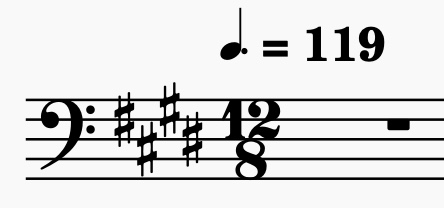
Use a time signature with a dotted tempo such as 12/8.
-
Use the Bravura font
Workaround: insert a space between note and tempo marking (tho it looks kinda bad)
| Attachment | Size |
|---|---|
| Image 12-19-22 at 7.00 PM.jpg | 24.69 KB |
Comments
I can confirm that the dot is too close to the tempo marking in Bravura. A better workaround is to use the unicode "hair space" symbol, pasted here between two brackets for your convenience.
] [
Is this really a plain 4.x only? As far as I can tell Bravura hasn't been changed.
Also I can't reproduce with the tempo texts taken from the Tempo palette (those do use a space between note and dot BTW)
In my installation, the text in the tempo palette has no space, but when opening the "more" button there's another version of the text that does have a space. Possibly this is the source of the issue, as I was unable to reproduce it in 3.x.
Maybe reverting to factory settongs fixes your palette?