Fields in “New score” window are inaccessible with keyboard
Reported version
4.x-dev
Type
Ergonomical (UX)
Frequency
Few
Severity
S4 - Minor
Reproducibility
Always
Status
active
Regression
No
Workaround
Yes
Project
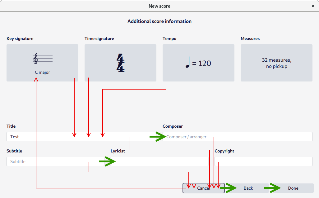
“New score” window has many fields, most of them are inaccessible with Tab ↹ key. When Tab ↹ key is pressed focus moves through Key signature area → Title field → Cancel button → Key signature area. Next item after any input field is Cancel button — these routes are drawn as thin red arrows on attached scheme.

Order of fields should be changed, some (not all) proposed ways are drawn as thick green arrows.
| Attachment | Size |
|---|---|
| musescore-new-score-tabindex.png | 47.4 KB |
Comments
I find that this screen does in fact tab as per the diagram. You can use the up/down arrow keys to get to the other fields, in addition to tab, but that doesn't seem as intuitive to me.