horizontal beam: shortcut
Since I bought Marc Sabatella's handbook (and 'Behind Bars, wow!) and received it last week I discovered some new things. For beams: the 'horizontal' check box in the inspector. Much easier than manually correcting some (incorrectly!) sloping beams. It would be nice to asign a shortcut to this check box.
At other places this horizontal is called: flatten beams, confusing...
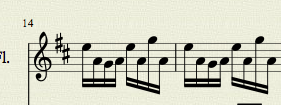
Example of incorrectly sloping beam:

There is no reason at all (I think?) for the second group in each bar to have a beam going down, this happens more often.
I am very happy with 'Mastering Musescore'! It would be nice to have a much more complete index so for instance I could find back 'local layout', now not under local nor layout. Nevertheless I found it by reading the book;-)
Comments
I second the motion for a horizontal shortcut, especially if it could be done without leaving the Palettes tab. Is there a way to define a shortcut for something not on the Shortcuts list?
In reply to I second the motion for a by jwpratt
If it's not on the shortcuts list, a shortcut cannot be defined/customized. It has to be implemented internally as a separate command, not just one setting in a dialog.
I would prefer to have a better beaming algorithm by default if necessary. The flatten beam option is not really intended to be used every 2 groups of notes.
Should we change that "Horizontal" in the beam inspector to "Flattened" or "Flat" or the "Flatten all beams" in the edit style dialog to something else (what?)
In reply to Should we change that by Jojo-Schmitz
I guess you weren't asking me, but answering as a user, I prefer horizontal as a word, but then I'm a mathy type. Flat has other connotations. Of course they are irrelevant, and flat can mean only one thing applied to beams. Once you realize, it's all the same.
I find I often want to flatten (nicer verb than horizontalize) beams, especially those with several notes in a non-monotonic sequence. I think a minimum slope option would save a lot of time, whatever form it took, especially in the absence of a shortcut.
I now see why I was confused, at least on my Mac (up to date) the letters are grey(ed out) so it looks as if you cannot use it...
![Schermafbeelding 2015-10-09 om 18.36.25.png Schermafbeelding 2015-10-09 om 18.36.25.png]()
strange? But you CAN check the box!
In reply to I now see why I was confused, by SRH
I believe it is grayed out to indicate that the value of this settings actually comes from the Style setting in effect. That's how the Inspector works in general.
I have tried out all the examples in "Behind bars" pp 17-23, everything is correct apart from the repeating triplet pattern (page 22), the beams should be flat (horizontal;-)
![Schermafbeelding 2015-10-09 om 19.46.26.png Schermafbeelding 2015-10-09 om 19.46.26.png]()
![Schermafbeelding 2015-10-09 om 19.46.33.png Schermafbeelding 2015-10-09 om 19.46.33.png]()
![Schermafbeelding 2015-10-09 om 19.53.07.png Schermafbeelding 2015-10-09 om 19.53.07.png]()
And most of the angles are too steep (sloping too much):
Better looking:
Everything could be manually corrected but I think Musescore could do better in this respect.
In reply to I have tried out all the by SRH
As long as I seem to be in this thread, I will comment that I think that beams are very often about half a space nearer the note heads than looks right to me. It is very clear in 8th-note scales and repeated notes, where the stems including the beams are shorter than quarter-note stems would be. I don't change it because it is consistent and there would be too many. There may be a reason for it, but possibly there should be an option. I don't agree about the steepness of the angles in the example, btw.