Font issue with many instruments
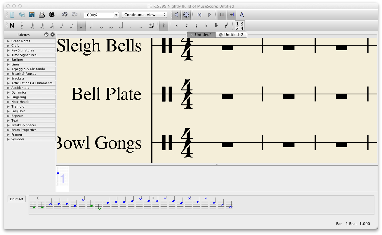
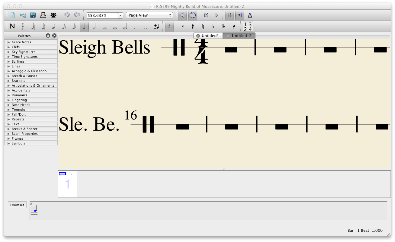
I added nearly all the instruments of non-pitched percussion - the font appears ragged if you compare to a score with only one instrument (see the PNGs).
I exported PDFs and I think it's fine there.
Using MuseScore 2.0 Nightly Build (5599) - Mac 10.7.3.
| Attachment | Size |
|---|---|
| Many Instruments.png | 110.91 KB |
| One Instrument.png | 110.89 KB |
| Many Instruments.pdf | 516.69 KB |
| One Instrument.pdf | 20.09 KB |
Comments
I think it's because your "One instrument.png" file is at 600% while the other is at 1600%. I would not call it a bug... who will print a screenshot at 1600% ?
If you have One Instrument at 1600%, it will not have ragged text. If you have many instruments (not necessarily the amount I had), you are likely to see this ragged text.
I had both scores at a different view, so you can see them at nearly the same size in comparing how it should look.
In reply to If you have One Instrument at by chen lung
As far as I can tell, this has nothng to do with the number pf instruments, and is just a matter of the actual font size you used when adding lots of instruments was much smaller than the font size you used when addi just one, and thus you needed to zoom in more to see it the same size. Or am I missing something? Posting the actual scores would help, but I have a hard time imagining how those examples could have been created with the same font size.
I just realised that I excluded a crucial detail and what is actually causing it: decreased scaling in Page Settings.
1. Create score (doesn't matter how many instruments).
2. 'Page Settings'.
3. Decrease the scaling entirely.
4. 'OK'.
5. Change Zoom to 1600%.
Result: Font looks ragged.
Using MuseScore 2.0 Nightly Build (5600) - Mac 10.7.3.
I filed an issue: #24201: Font appears ragged after decreasing scaling