Slurs, melismas, printing and more
I have been typesetting Victoria's O Magnum Mysterium, based mostly on the following score, to make a score that fits inside a Salabert funny page size (Poulenc's Christmas motets):
http://www.free-scores.com/PDF/victoria-tomas-luis-de-o-magnum-mysteriu…
There are a number of problems I can't solve, and would be grateful for help with. It may just be that I didn't find the relevant bit in the Manual, so any pointers would be appreciated.
1. Melismas (zero search results!): Is there a way to make a series of hyphens for a long melisma?
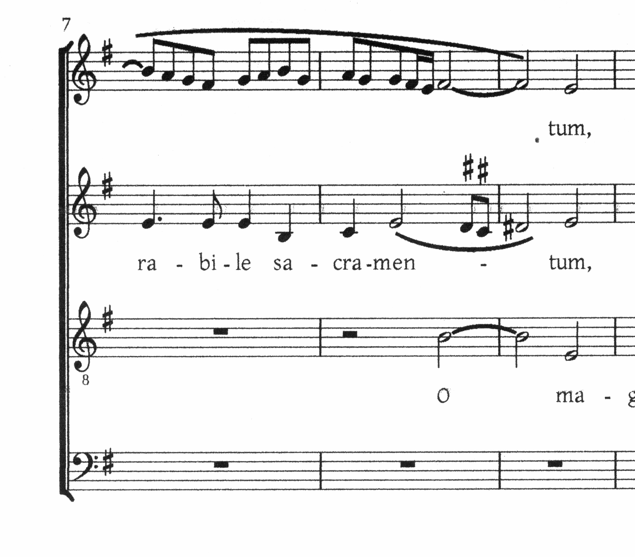
2. Slurs (very odd). The phrase marks look fine on the screen, they look fine on the (attached) PDF, but when I print the PDF they come out far too thick (see scan attached). Since one of the few reliable facts about software is that PDFs always come out right, this is a bit of a shock.
3. Accidentals over notes (not important; in fact I'm going to revert to modern notation): it this era it seems performers were left to decide a lot of the notes themselves, but editors wrote suggestions with accidentals over the staff. I got the sharps you can see in the right place, but (a) couldn't resize them, and (b) realised this was a huge time consumer doing this manually. Is there any quick way to move accidentals like this, or is this perhaps a feature request?
4. Printing: First I made the score with an odd "page size" to match the Salabert score. But this left a few problems with PDF printing. So I changed the page [i.e. sheet] size to A4, and made the margins appropriate. I had to fiddle with page number positioning, but got everything into place except the copyright line at the bottom. It is centred on the printing sheet, not the (actual) page, and I can't find a way to (either) print the copyright line on the first page only (or) position differently on odd/even pages. I suppose this is a feature request: it would be nice to be able to print with a "page" within the physical "sheet" -- in practice odd-sized scores will have to be printed on standard paper sizes and trimmed (and since I don't have an A3 printer, photocopied into position on A3). It would be even nicer to have rudimentary "outside page" functions like crop marks. I guess these would be easy to add within the context of generating a document, but trying to find easy ways of modifying a PDF has not been fruitful. (I might be wrong here: does Musescore produce an SVG file at some stage which could be changed with standard utilities??)
That's all for now. Thanks!
| Attachment | Size |
|---|---|
| victoria_a4.mscz, | 15.77 KB |
| victoria_a4.pdf | 92.37 KB |
| victoria.png | 437.9 KB |
Comments
1) For melismas, use '_' at the end of the melisma first syllable, then enter just another '_' for all other notes; the underscores will combine in a single melisma line.
2) No answer right now; I'll try to investigate.
3) For editorial accidentals in ver. 1.2, I settled for regular size symbols; not very nice but acceptable; you may move them in the right position above the note either dragging them with the mouse (quick but not very precise) or by entering edit mode (double click on the accidental) and nudging them with the arrow keys (slower but more precise). I suggest to use a large zoom factor in either cases. The forthcoming ver. 2.0 has small accidentals and very precise positioning using the so called 'Inspector'; for ver. 2.0, I have made a pair of scripts which reduce in size and position all accidentals not lined up with their note. (note: also added naturals use to be marked as editorial; for instance, I suppose the natural G in measure 13, suprerius part, is one of those cases, but a check on the source is required.)
4) Also for this point, I do not have an answer ready. I supposed margins affecting the printing area should affect copyright position too. Again ver. 2.0 will have more flexibility in this area (but not crop marks).
You may download and try a nightly version of current ver. 2.0 state using the "Download" link in the menu at top right of the page (in the menu right under "Search", not the big green button!). But keep in mind that it is development software, unstable and not suitable for production.
Hoping this helps for the moment,
M.
Zero results for melisma? I don't think so: http://musescore.org/en/search/apachesolr_search/melisma.
'Melisma' is not mentioned in the handbook, but the method how to enter them is described there: http://musescore.org/en/handbook/lyrics
In reply to Zero results for melisma? I by Jojo-Schmitz
Just added melisma in the handdbook page.
That's an odd looking slur to be sure. I've never seen anything like that.
Regarding the accidentals, if you want them smaller, you can enter them as text, which is resizable. Just hit F2 while entering text to bring up the Text Symbols palette. A nice bonus: you can copy and paste the whole thing, so once you've created, sized, and positioned on accidental this way, just click it it, Ctrl-C, then select other notes and hit Ctrl-V. You'll probably still need some manual repositioning (it will paste at exactly the same vertical height as the source, when maybe you want it relative to the notehead) but at least most of the work is done, and you get the size you want.
For the copyright, I'd just create a vertical frame manually and place my text there, to get the different first page. As mentioned, 2.0 has some improvements with regard to headers and footers. As for software to manipulate PDF's, this definitely does exist. I have no real experience using anything but basic annotation tools, so I don't know which tools might allow moving elements. But FWIW, if the main issue is headers and footers for odd and even pages, I'd do it by generating the full PDF's of each versipn (eg, one with all headers and footers as appropriate for odd pages, one with all headers and footers as appropriate for even) then uses a tool like pdfsam (split and merge) to combine the odd pages from the first with the even pages from the other.