Discussion on the new look of system/page/section breaks
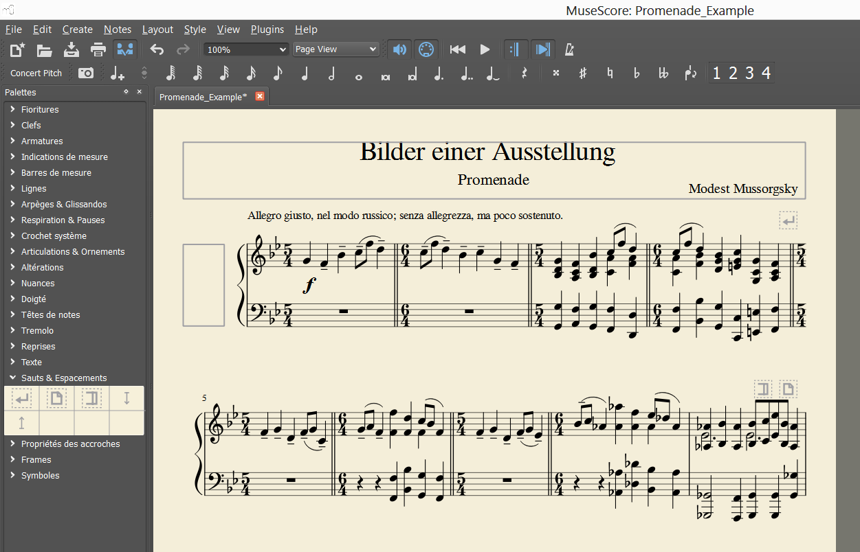
In MuseScore d07988843e, I implemented a new look for line/page/section breaks as designed by Mirek aka Timan. The former symbol were green, thick, and large. The new look wants to make them less outstanding.
Mirek's proposal

Implementation
I kept the design but remove the blue color since it's the color of selection in MuseScore. I also made the symbols a bit larger than proposed. Feedback welcome. On these symbols only please, use other posts to discuss the rest of the design.
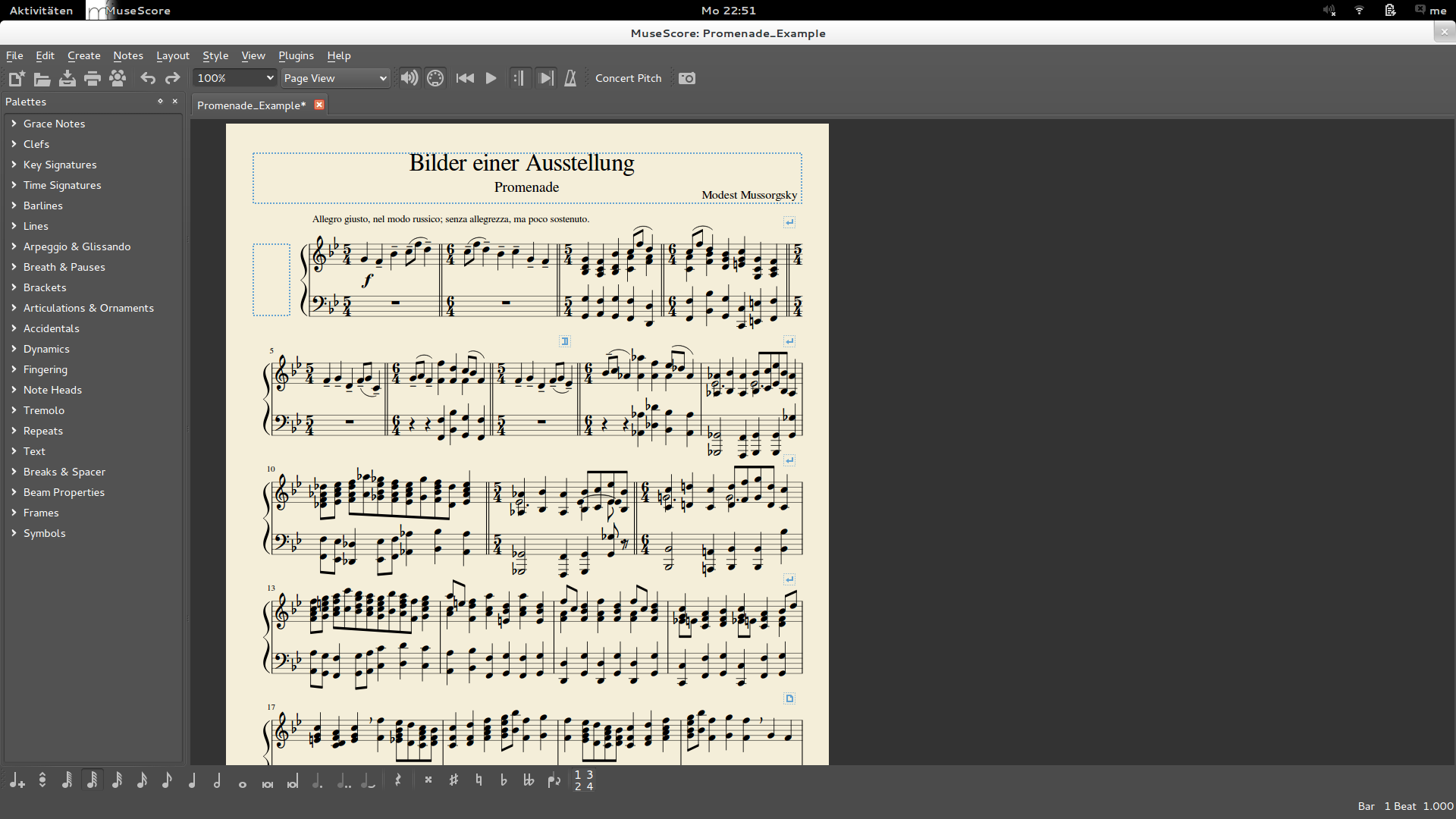
Palette

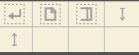
In score

| Attachment | Size |
|---|---|
| hidden.png | 291.44 KB |
| shot_130515_142003.png | 1.93 KB |
| shot_130515_142551.png | 122.86 KB |
Comments
They were never blue, but green. Or am I missing something?
In reply to They were never blue, but by Jojo-Schmitz
It was Mirek's proposal to make them blue. I personally support his color change proposal. The proper shade of blue should be much better on the eyes with the default wallpaper than the present green hue.
In reply to It was Mirek's proposal to by schepers
Indeed - the green has always made me want to vomit :)
Blue would be much nicer.
In reply to Indeed - the green has always by ChurchOrganist
The trouble is when selected they are blue. The proper on/off contrast colors will have to be chosen.
In reply to Indeed - the green has always by ChurchOrganist
yeah, the green wasn't the nicest colo(u)r ;-) but blue woulnd't work either. And they don't need to be that prominent, so I like lasconics grey
In reply to yeah, the green wasn#t the by Jojo-Schmitz
Ah, I see what mistake I made. I assumed the color change was already committed but it was still green. Yes, I like the grey as well.
In reply to Ah, I see what mistake I by schepers
I thinki it has been comitted, but there's no new nighly build since 2 days (at least not for Windows)
In reply to I thinki it has been by Jojo-Schmitz
No, I think this is discussion only for now. My latest custom build still has the green icons.Nope, you're right. I had to do a factory reset to see the grey icons.
The color discussion aside, what about dropping the dashed line around (break) symbols? Less is more?
In reply to Drop dashed line by Thomas
I'd rather see it live first. Which isn't possible currently, as there are no nigtly builds for Windows since MuseScoreNightly-2013-05-13-1613-acfd98a.7z
Edit: a new nightly just showed up.
they are stll green, up until after a factory reset....
And yes, I'd agree that the dotted lines around them doesn't seem neccessary
pressed vs. depressed (?) buttons are still (too) hard to tell apart (but that doesn't belong here)
In reply to I'd rather see it live first. by Jojo-Schmitz
I think the line around is very helpful. It lets the user know that it can click in the full zone to select the break. If the line break wouldn't have the box, it would be hard to select except if create an hollow box around it. It's better if this hollow box is visible on the screen.
In reply to Drop dashed line by Thomas
General change: I agree with many other that the change is in the right direction; in particular, I welcome the squared design and the dashed frame.
I wonder, however, is it isn't a bit too much in that direction.
Break symbols were standing out way too much before, but they tend to go unnoticed now, more than other 'invisible' items: frames are usually larger and invisible musical items usually step on the feet of something else. So, I would suggest one or more of the following:
1) increase the size (3 sp at least; currently they are 2.5sp large)
2) make the dashed frame line thicker (as thick as the internal drawing) or make it continuous (which would be a pity, though)
3) make the grey darker
Colour: The original colour was too bright, no doubt. Blue would have been nice, but distinguish it from the selection colour would be difficult. Grey has the advantage to make them similar to other 'invisible' elements. So, after a (short) period of adaptation, I agree with the choice.
Frame: @Thomas: less is often more, but in this case, we are already in the less side. Without the frame (which I even suggest to make thicker), they would be utterly lost in the void, particularly the line break symbol which is less squared in itself. And lasconic note is right: the frame turns them into an 'area' of some sort (which actually is an active area).
Thanks!!
M.
In reply to General change: I agree with by Miwarre
To have a graphical comparison. Here are the break with 3sp and same thickness for the frame than the symbol. It feels too much "bulky" to me.
In reply to To have a graphical by [DELETED] 5
That dotted line isn't thicker than the solid frame, so I don't see a problem
In reply to To have a graphical by [DELETED] 5
@lasconic: Thank you for spending time in tests and trials!
Well, I understand we are entering an area of personal likes and dislikes, but I find the example given above perfectly fine.
I agree that the symbols might look a bit bulky in the palette, but in the score itself they are fine: they do not stand out and at the same time remain easy to locate and can be 'felt' as active elements when needed.
So, for what is worth, I vote for this solution.
Thanks!
M.