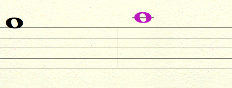
Whole notes too wide
Hello. I have been using MuseScore a lot lately, and I have noticed a few things that differ from Finale, Sibelius, etc, and one of those things is the whole note size. I will try to post pictures of both kinds, to show you what I mean. I would like for the whole note design to be smaller, relatively the same size and shape as those of most other notation programs. Can this be done?
| Attachment | Size |
|---|---|
| MuseScore Whole Notes.png | 13.13 KB |
| Finale NotePad Whole Notes.png | 88.69 KB |
Comments
Have a look here:
http://musescore.org/en/node/1615
The music font used by Musescore is hard coded, meaning you can't change it. Future versions of Musescore will offer additional font choices.
But FWIW, just because Finale does something differently doesn't make it better or even right. The font used in MuseScore - which is based on the one used in LilyPond - was very carefully designed to mimic how actual professional music engravers have done things for the past several centuries, and in particular to be an *improvement* over how Finale and Sibelius do things. See for example http://www.lilypond.org/doc/v2.17/Documentation/essay/engraving-details.
In reply to The music font used by by Marc Sabatella
Duly noted. However, after looking at most sheet music printed via Finale and Sibelius and NoteFlight (one I hadn't mentioned earlier) I find myself used to looking at the smaller sized noteheads. It would also seem that in most of the music I have bought online (musicnotes.com) and gotten from my piano instructor use the same smaller whole note. I'll have to look back at some of the engraved sheet music I have and compare. It might just be my personal preference.
In reply to Duly noted. However, after by jayiscool
That's probably because these online music publishers like musicnotes.com tend to use Finale for music engraving, although some use Sibelius.
The MuseScore semibreve shape is, however, more consistent with the piano primers I learned from (and taught from).
In reply to That's probably because these by ChurchOrganist
Here is a scan of the last page of Morten Lauridsen's O Magnum Mysterium. Notice that in the lower left hand corner, it shows the name of the engraver, and on the last measure, you see a number of whole notes which seem to be smaller than those of LilyPond and MuseScore, and more toward the size of the note in Finale and those others mentioned. I don't know if this is more modern, if it was in fact done by a computer and made to look like an engraving, or that it was actually engraved. Either the engraving process has changed, or my personal preference is the smaller whole note. I'll have to save my pennies for Finale or Sibelius, which my aunt (who is a music teacher) suggested. But for now, I'm just gonna stick to MuseScore so that I don't have to pay 300 dollars yet. :)
In reply to Here is a scan of the last by jayiscool
Well as Magnum Mysterium was written in 1998 it was almost certainly engraved with Finale.
Metal plate engraving went out when Letraset engraving came in in the 1960's.
Finale first made it's appearance in 1988, and by 1998 was well established as the music engraving software of choice by most music publishing houses because of the fine degree of control you had over final printed output.
So this setting of Magnum Mysterium would not have been hand engraved.
In reply to Well as Magnum Mysterium was by ChurchOrganist
Aha. Well, then, let it be said that the whole notes are not too wide, but instead, that my personal preference is in fact the smaller note size. If, in the future, there is an option to choose which note font to use, I will probably be changing it to the smaller Finale-style whole note size. Until then, I'll stick with what I've got, because it's already a miracle that I found something of this caliber that works great and is free.
In reply to Aha. Well, then, let it be by jayiscool
You should also consider whether you intent to forever create music pnly you will ever read, or if there is any possibility others will ever want to read your music. Min which case, you really need need to put certain personal idiosyncracies aside in favor of what has been time-tested and proven over the centuries to work best. Also consider that in the grand scheme of things, this about about 1,347th in importance when choosing one program over another. You might find you prefer Finale's marginally narrower whole notes better, but prefer virtually everything else done the more traditional way. Or you might find you prefer the use model of MuseScore over that of Finale, or the fact that it requires comparatively little in terms of computer resources, or the much more responsive development team, etc.
In reply to You should also consider by Marc Sabatella
Well, apparently Finale has been time tested as well, seeing that it's been here for 25 years and most music publishers use it to create their music; I'm not sure how much thought went in to choosing Finale's note font, but for those 25 years of it being prominent, people have chosen it over others. And if, in fact, my music is published, it will most likely be published using Finale, if not any other high end program using the "Maestro" font. So, I'm done talking. I'm not sure how to close forums, so someone will have to do that for me.
In reply to Well, apparently Finale has by jayiscool
I don't know that "most" publishers use Finale, but even if so, that decision may be based more on expediency than on concern for what is actually best. And I don't know if you read the article I pointed you to or any of the others on that topic there, but one of the points made is that many of the decisions made in most software are also made on the basis of expediency, not on what actually is best. In particular, it can be easier to get more music to fit on a page if you use artifically thin symbols rather than using the more traditional thicker symbols. Using the thicker symbols requires more sophistication in the spacing to pull off well. I'm not saying MuseScore actually is as sophisticated as it could be. Just that, again, it would be a mistake to assume that just because Finale does something with one of the several fonts they provide as options mean that the choice they made in that particular font is actually the best. There are many considerations at play here aside from personal preference just looking at symbols in isolation. Perhaps Finale's other fonts dom't have such artificially thin whole notes. And I as I mentioned, future releases of MuseScore will indeed provide more options for fonts. 2.0 will include one called Gonville, which also has somewhat narrower whole notes.
Again, the bottom line is that having options is good, and musScore will provide more in the future, but it's important to have perspective and not assume tht just because one of e several fonts Finale provides happens to do things a certain way means it is best and other ways (potentially including the other fonts provided with Finale) are worse.
In reply to I don't know that "most" by Marc Sabatella
Once again, I agree with you, and I don't want this discussion to escalate into an argument. I stated in my last comment that I'm done. I've given you my complaint, you replied by saying that it wouldn't be solved until later, I pushed for Finale, and you told me that other music fonts would be available in the future. Seeing as the discussion should have ended a while ago, I assume that the next step it to end it now.
Yes, other people are part of the equation; I didn't think about other people's preferences, I stayed focused on my own; which means that I am lacking a little perspective. And I admit that at times I don't see the entire picture. No, Finale is not the best simply because they have the music font that I want; I admitted to that a while ago (I think. The comment editor doesn't let me see any other comments than your last one.) No, MuseScore is not as sophisticated as it could be, but it probably will become that in time. I suppose I'm just impatient. I skimmed the articles you gave me, because at that time I didn't want to open myself to other opinions than my own (no perspective). And I don't think I ever assumed that what Finale does and did is best. I just stated that because it has been chosen by some (not necessarily most) people for so long now, that it would be the preference for those people, which I admit might have been wrong, because apparently the font chosen by MuseScore is based on what engravers have used for so long, before Finale came about; in which case Finale's music font style is not the preference of the majority of music writers. If it has been done a certain way for hundreds of years, which means that it has been time tested and probably considered "the best," then why change it now? (Personal preferences aside for now.)
So, let it be said again: the narrower whole notes are my personal preference; and maybe my personal preference is not enough to bring about a program-wide change such as the one I suggested earlier, and I may have erred in my convictions as to "what's best." I am sorry.
I'm done. I don't think I will respond to any other comments on this thread, especially if they continue the argument.
Feature request => Music Font Choices.
That's it. God bless.
In reply to Well as Magnum Mysterium was by ChurchOrganist
Publishers used other software in the last 30 years or so but Finale. In particular, SCORE http://en.wikipedia.org/wiki/SCORE_(software) has been used by many publishers before and after the rise of Fin/Sib.
In reply to Publishers used other by [DELETED] 5
Okay, okay, I get it! I said that I was done. All you're doing is making me mad. So if someone could please close this dag nab forum down so that I don't have to deal with it anymore.
Yes, there are hundreds of score writing programs! Most of which have come about in the last 25-30 years. I knew that, you knew that, and yet you made a point of telling me so. So please, JUST STOP!
Alright, I just needed to get that out. I'm not going to reply to anymore comments on this forum. You all can shout at me if you want to. I'm starting to doubt the helpfulness of these forums.
Goodbye.
PS. Mr. Sabatella, thank you for helping me.
Some people want their music to appear a certain way. There are already font editors available for those who wish to modify existing fonts or create their own. Personally I've always thought that the tails of quavers are too big (in any music program).
Feature request - allow selection of different music fonts.