[MIDI Import] Quatization and swing menus do not look like dropdown menus
Expected behavior:
The dropdown menus in the MIDI import panel should match the standard look for dropdown menus.
Actual behavior:
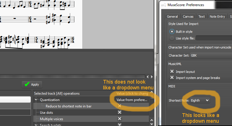
The dropdown menus in the MIDI import panel looks like plain text, and it is not obvious to a user that they can interact with the text. (see Capture.PNG attached)
Discussion:
The exchange on IRC (Aug. 21) between a tester (who insisted that there was no dropdown menu in the MIDI panel) and the developer (who insisted that there was in fact a dropdown menu for the exact feature under discussion) exemplifies the need for using standard UI for dropdown menus.
As a result of the discussion extra wording was added to the column heading. However this is suboptimal for the following reasons:
- In the default window size the heading is cut short. It reads "(click to chang"
- It takes the user longer to read and interpret this instruction than to immediately recognize the standard UI for a pulldown menu
- Even if the user sees and reads the instruction it is still possible for the user to assume that the instruction only applies to the checkboxes (since those are the only things that look clickable)
MuseScore version: 839b2dc
(Operating System: Windows 7)
| Attachment | Size |
|---|---|
| Capture.PNG | 70.01 KB |
Comments
Lasconic reported on IRC that this might be difficult to implement inside a Qt table (Aug. 24, 2013)
fixed 4bb0887967
The arrow is better than no arrow. However, the menu still lacks the shading that makes a normal dropdown menu look like a clickable button. (UI affordance).
Well it's because it's not a normal combobox. Maybe it would be better to drop the tabular representation and use a grid layout and normal widgets?
Normal widgets are always preferable. Of course this is minor priority.