A gui redesign and a new dialog.
Following:
http://musescore.org/en/node/24089
http://musescore.org/en/node/24074
I made a re-design of instrdialog.ui and a mockup of instrproperties.ui (new).
Are just visual examples, they need to be updated and extended (if needed).
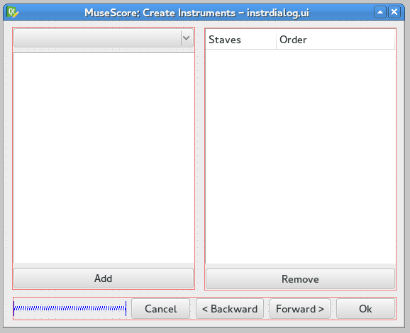
instrdialog.ui, second step (original):

re-design instrdialog.ui, second step:

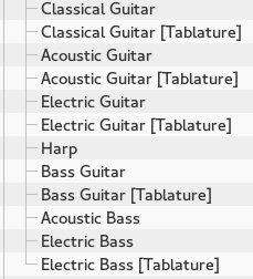
No more duplications for instruments list:

You will find only "Guitar", "Bass" and "Ukulele" here. No more n Instruments x n Types x n Staff configurations.
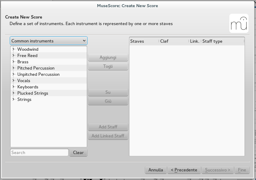
When you select an instrument and clic "Add", it appears a new dialog for basic configurations.
On the left side you will find the list of Instruments's parts added. I left two fields, name and order, but the second one could be dropped. Drag'n drop to change order.

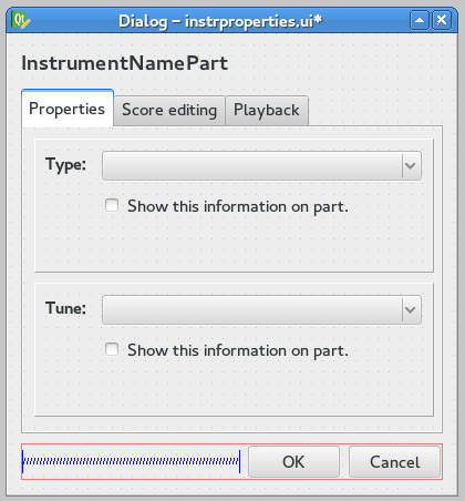
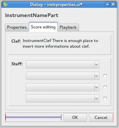
Basic information on instrument. Sub-type ("acustic guitar", "electric guitar") and tuning info (if available for the selected instrument).

Clef is a textual description. Staffs listbox show all the configurations available for that instrument: staff, tablature, ecc.. The checkbox is for linked staffs.

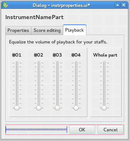
Some sliders to set volume on playback.
When you clic "Ok" the instrumentPart configuration appear in right-side of instrdialog.ui.
The instrproperties.ui should be called with right-mouse-menu on instrument-part, every time you want.
| Attachment | Size |
|---|---|
| guitar-bass.png | 20.13 KB |
| instrdialog1.png | 18.99 KB |
| instrdialog-original.png | 55.06 KB |
| instrproperties1.png | 26.78 KB |
| instrproperties2.png | 29.48 KB |
| instrproperties3.png | 26.82 KB |
Comments
I have at times also though breaking the instrument dialog into multiple lefels might be a good idea. But in the end, i realized all this does is add an unnuecessary extra layer of complication. Why would users rather go through all these additional dialogs when right now, all they have to do is select from the list you showed at the beginning of your post? To me, the change you suggest makes the UI *less* usable, not more. Currently, one click is all that is usually needed tod efine everything that needs defining about an instrument, and you can immediately go one woth adding more instruments.
Now, if instead of being *forced* to deal with those additional dialogs, you had the *option* of making these sort of settings, that seems fine. But I'd still wantt hte full list of the different variations on each instrument, so that most users would not need to actually use that option. Only that small percentage of users who are defining custom tuning or otherwise doing something out of the ordinary would need to go there.
That's the important principle to me here: provide defaults that work for 90% of cases, so most of the time you never need to deal with any additional customization.
In reply to I have at times also though by Marc Sabatella
It's a free world.
In reply to It's a free world. by dm474
Hey Daniele, thanks for stepping in on the design. However we need to postpone any effort on this side as we are currently working towards the release of MuseScore 2.0. Thanks for your understanding.
I think we probably could abandon the 'Up' and 'Down' buttons and just use drag instead. I like that 'Add' and 'Remove' have been moved to below each section.
I also agree about removing some of the duplications (see this , if it's what you mean).
Just two things:
1. I don't see the the 'Add Staff' and 'Add Linked Staff' buttons. Would they be positioned next to 'Remove'?
2. Where would InstrumentNamePart be?
Screenshot and .ui files here:
https://github.com/dmedri/MuseScore_design/tree/master/usability/dialog…