In MuseJazz, staccato dot should be smaller than duration dot
According to Elaine Gould in "Behind Bars: The Definitive Guide to Music Notation", in Chapter I, Section 4 "Dynamics and Articulation", the staccato dot is to be smaller than the duration dot as specified at the bottom of p.116, underneath "Symbol design".
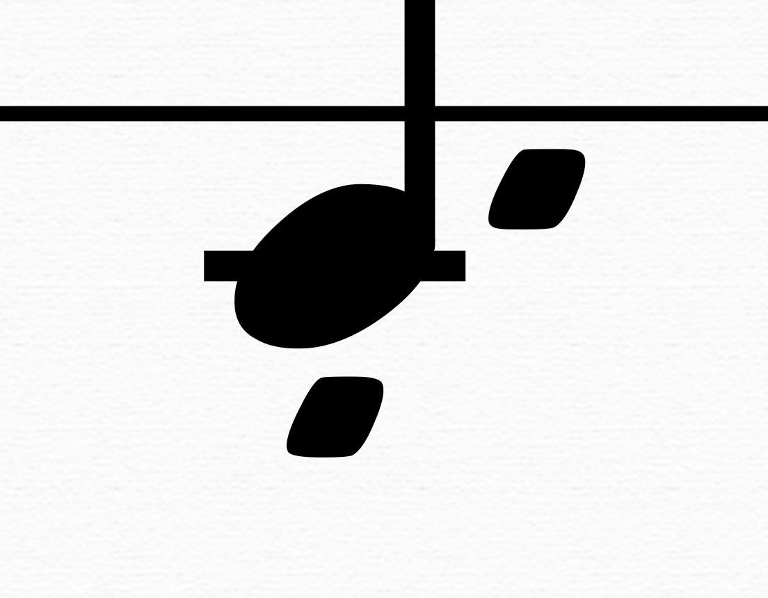
While this is true in MuseScore 3.2 for Emmentaler, Bravura and Gonville, it is not true for MuseJazz (see attached) without adjusting the size of all articulations via Style -> Articulations and Ornaments. Furthermore, as this is the expected behavior in "Behind Bars: The Definitive Guide to Music Notation," it should be the default behavior as well, as it is for the other fonts.
To reproduce, create a new score using MuseJazz for the Musical Symbols font. Then, create a quarter note. Then, add the duration dot (.) and the staccato articulation (Shift + S). Zoom in real close, and observe that the two dots (rounded parallelograms) are of identical size.
| Attachment | Size |
|---|---|
| staccato vs duration dot.png | 191.52 KB |
Comments
Good issue, well presented.
I agree, although I will note that maybe handwritten fonts might deliberately try to mimic certain aspects of how handwriting normally looks, and I will bet the majority of handwritten charts uses dots of pretty much the same size everywhere (eg, also repeat bar dots). Doesn't make it right, but it could have been a semi-reasonable deliberate design choice.