GSoC 2016 - Week 6 - Improving the User Interface
This was my sixth week working on note entry with MuseScore for Google Summer of Code. In previous weeks I made good progress with the underlying algorithms for the new note entry modes, but I had yet to submit anything for inclusion in MuseScore's main code repository. This week I went back over my work from the previous weeks, tidying and improving the code in preparation for the first pull request.
This week’s summary:
- ToolButtonMenu
- Menu styles
Still to do:
- Restructuring realtime note representation
ToolButtonMenu and menu styles
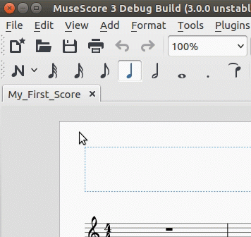
The addition of lots of new Note Entry Modes could cause some serious clutter in the Note Input toolbar so, rather than adding a new button to each mode, I have instead added a drop-down menu of modes to the existing Note Input button. Clicking the button enables Note Input, while clicking the arrow brings up a list of alternative Note Entry Modes. The Note Input icon changes to reflect the current Note Entry Mode.
Preview of the ToolButtonMenu

I have changed the text and icons slightly since creating the above animation. Please let me know which you prefer.
Alternative icons and text

I created a rough version of the ToolButtonMenu in my first week, but you had to hold it down to access the menu rather than just clicking on the arrow, and it didn't show the icons or change the main icon to reflect the current note entry mode. The improvements I made this week involved completely rewriting the ToolButtonMenu implementation to make it as generic as possible, and updating the MuseScore's internal GUI styling rules to allow icons to be shown in the menu.
These changes make the ToolButtonMenu available other things besides switching Note Entry Mode, so you might start to see them being used elsewhere in MuseScore's GUI. ToolButtonMenus are ideal for grouping related features together to save space in the toolbar. Some examples of where this could be useful:
- Augmentation dots
- Note durations
- Voices
A ToolButtonMenu for augmentation dots would allow the user to choose how many dots to add, with the default being to add a single dot.
Comments
I think real-time is hyphenated. That really looks good, though.
In reply to I think real-time is by Isaac Weiss
You're probably right. I stopped hyphenating it because otherwise I would have had to call my project semi-real-time MIDI, which looks really weird ;). Anyway, I've decided to drop the "semi" in the GUI for consistency with other programs, so I suppose I can put the hyphen back in "realtime".
I like the metronom icon better than the stop watch, and I don't quite get what the last icon (real-time manual) is supposed to be, a foot pedal?
In reply to I like the metronom icon by Jojo-Schmitz
Hmm, somehow your post got in before mine - I guess you started typing first.
The advantage of the stopwatch is that it doesn't conflict with the icon for having a metronome during playback, but if people agree with your preference then I can change it back.
Yes, the manual real-time icon is supposed to be a pedal. Obviously I don't want to spend too much time drawing icons, but if you can think of a way to improve it then I might have have a go. Of course, you are also welcome to draw something yourself.
In reply to Hmm, somehow your post got in by shoogle
I wrote mine first, but had to correct several typos later ;-)
![pedal.png pedal.png]()
IHMO the metronom conveys the meaning better. The pedal icon, not sure and I'm lacking better ideas.
Edit, maybe something like this:
In reply to I wrote mine first, but had by Jojo-Schmitz
Interesting. I had considered adding a foot or a chord to the pedal but I didn't think there was room without making it too small. However, this icon appears reasonably clear. I would need to adapt it though because it appears to show a car pedal rather than a piano pedal.
In reply to Interesting. I had considered by shoogle
That's why I wrote 'something like' ;-)
I found it searching the web for 'icon foot pedal' and indeed it is a break pedal
I redrew the icons yesterday to make the files smaller. (I drew them in Inkscape first time around but Inkscape doesn't optimise the SVG code very well so I wrote the code manually this time.) I took the opportunity to add hyphens to the text as suggested by @Isaac, and to create a new icon for automatic real-time mode to avoid confusion with the playback metronome icon. I put a preview image next to the animation in the blog post. Let me know which you prefer.
I also included a new "double-arrow" icon for Step-time mode to replace the existing "N" icon. I don't intend to use this icon for the time being (unless people want it) because I think it is good to keep the icon people are familiar with. However, at some point it might be useful to have separate icons for Steptime mode vs Note Input in general. For example, we have an option to make the button to enable or disable note input completely separate to the menu for choosing note entry mode.