getting a bolder look
Hi folks!
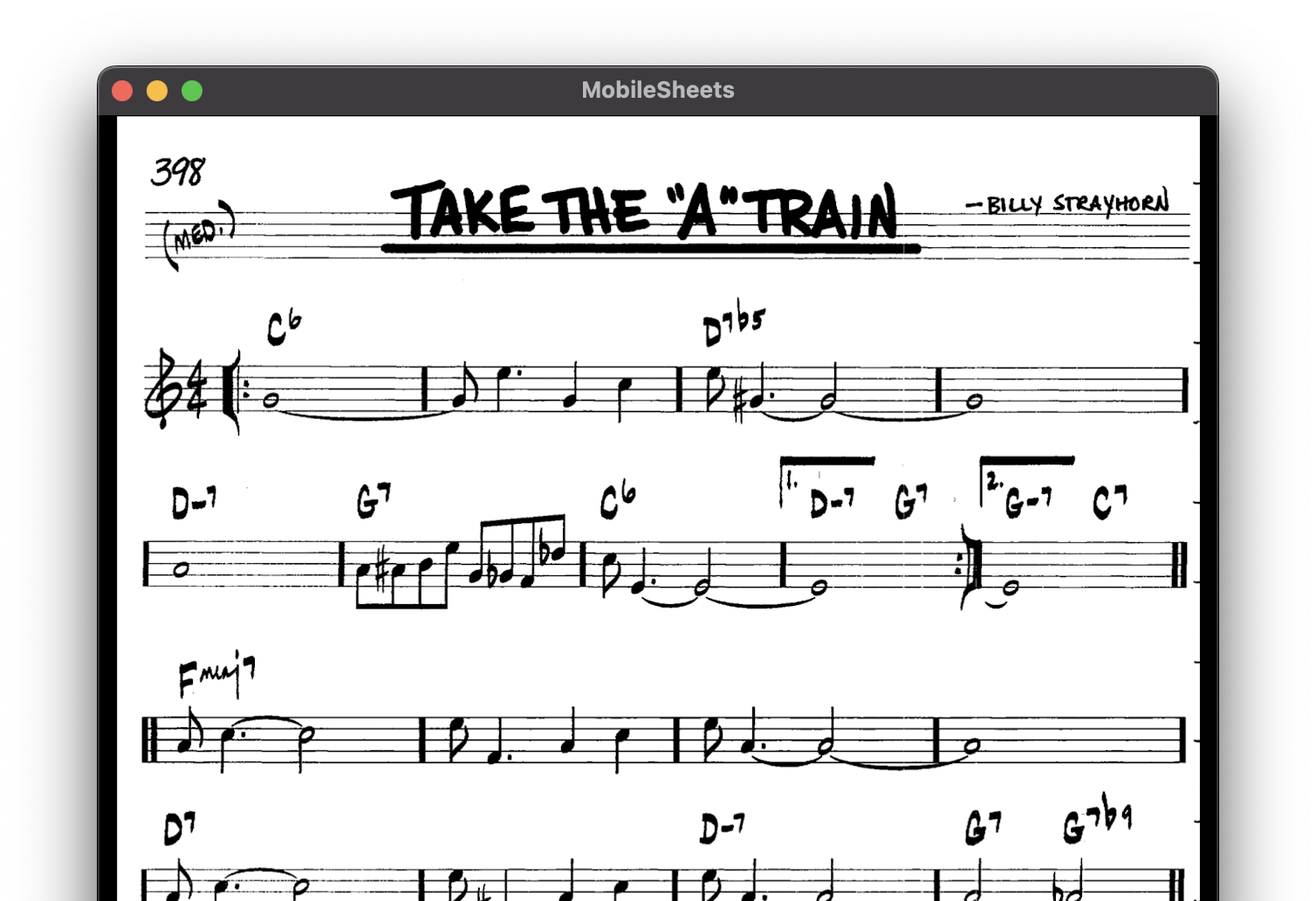
I'm not sure entirely how to ask this question. But look at this example. Here is an original score from a real book:

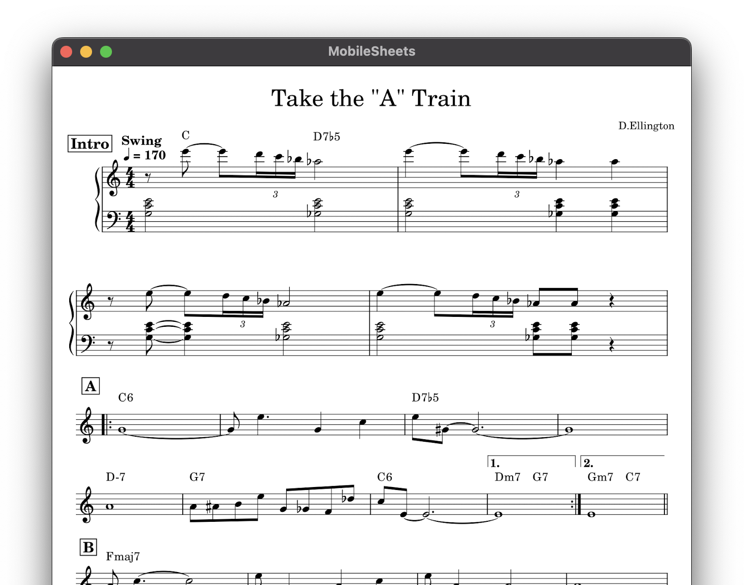
and here is my MuseScore produced score to add the intro:

Mine is just harder to read from any distance. I know there are 1000 tiny adjustable settings in MS, but I don't really know which to tweak. And I don't want it looking like Frankenstein. I know the UI team has taken great care to make a very professional look with the defaults.
So what I was hoping was that there might be "well-managed" set of rules for getting a bolder, more readable (but still professional) look, either as a short list of steps of what to tweak and how much, or perhaps a convenient one-click feature in MS.
Thanks in advance!!
| Attachment | Size |
|---|---|
| their chart.png | 426.15 KB |
| my chart.png | 399.58 KB |
Comments
It's not using the Jazz style at all, that's why I guess
In reply to It's not using the Jazz… by Jojo-Schmitz
Thanks for the replies!
Here are the changes I made:
1) Format > Style > Score > Musical Symbols Font > MuseJazz
2) Format > Style > Chord Symbols > Appearance > Style > Jazz
3) Format > Style > Text Styles > Chord symbol > Size > 16pt.
The result is below. Does it look any bolder to you? I don't think it does. Unless there's something more managed, I'm going to start messing with staff line thickness, note head size, etc. I was trying to not have to reinvent a wheel...
In reply to Thanks for the replies! Here… by reggoboy
It it isn't big enough, increase Format > Page settings > Space
In reply to It it isn't big enough,… by Jojo-Schmitz
Yes, thanks!
I saw this suggestion:
https://musescore.org/en/node/276284
So I changed:
Format > Page Settings > Scaling > Staff Space > 1.95mm
And I think this is now getting the job done.
Put MuseJazz style in the Style directory and load it via Format> Load Style
MuseJazz.mss
EDIT: Or via Format>Style>Score set Musical symbols font & musical text font
In reply to PutMuseJazz style in the… by elsewhere
Or just load the standard one that comes with MuseScore
In reply to Or just load the standard… by Jojo-Schmitz
Yes, it was already there.