Use unequal "optical" note spacing
Reported version
3.2
Type
Functional
Frequency
Many
Severity
S5 - Suggestion
Reproducibility
Always
Status
active
Regression
No
Workaround
No
Project
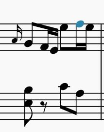
This has been an issue for awhile for me, and I don't think it would be too difficult to fix. Whenever stems are next to each other, and going in opposite directions, the first stem up, the second down, they are spaced too closely. See the attached screen shot to see what I mean. This can be a real problem too with grace notes (stem up), and the following note (stem down) — though this is not illustrated on attachment. The default spacing is used, in Gonville.
Thanks.
| Attachment | Size |
|---|---|
| Screen Shot 2019-07-09 at 1.09.55 PM.png | 12.03 KB |
Comments
The minimum distance between notes can be controlled via Format / Style / Measure / Minimum note distance. Normally notes will be further apart than this anyhow because of the natural "stretching" of measures to fill systems, but if you've deliberately filled systems more than the norm, you can indeed reach that minimum. So don't crowd the systems so much, or increase that setting.
If you have a score where you feel this is happening in places it shouldn't please attach the actual score, not just a picture.
In reply to The minimum distance between… by Marc Sabatella
I generally don't have a problem with the default note spacing, only when the stems butt. There is no setting singling out this particular situation, unfortunately. As MuseScore is making great strides toward minimizing manual adjustments, I figured pointing this out might be helpful. Also, I sometimes wish there was a separate setting for the spacing of notes on ledger lines, but I work around it a bit by shortening the ledger lines themselves. Not ideal, but manageable.
Thanks
Are you saying you want MsueScore to have unequal spacing - more space between notes with opposing facing stems than in other cases, and less space between notes on ledger lines (or more to the point, less space between the ledger lines)? There is some precedent for that in the industry, but it's complicated because that would produce either incorrect alignment or incorrect spacing on other staves. But I'll leave this open as a suggestion for future consideration. Maybe we could special case music of only one staff and do it then only.
In reply to Are you saying you want… by Marc Sabatella
I just think these things should be part of the optical spacing equation. This is not the same as offsetting the position of notes, but having it be a part of the programming, so the spacing is more pleasing. Everything should still line up between staves.
The point is, though, you can't have it both ways. Right now the spacing is equal, it just looks uneven because of the optical illusion caused by the stems. So, if the spacing were fudged to look more even, it would either not line up with the notes on other staves, or else the other notes would have to be moved to also be uneven, and that might not be appropriate if they don't have the same stem illusion going on.
In reply to The point is, though, you… by Marc Sabatella
This doesn't seem to be true. If I manually adjust the spacing of one note, by adding a leading space, the rest of the staves adjust so everything lines up. And, in both text and music, optical spacing is preferable to equal spacing. I think, that if the program does not have optical spacing algorithms built in, at least give users the options to adjust things like this globally, rather than having to fiddle with every occurrence.
Well, yes, if you adjust leading space, then the staves line up, but now since it isn't equal on the staff you adjusted, it isn't equal on the other staves either. That is, if you artificially add more space between the two notes to work around the optical illusion that it wasn't already equal, now all the staves have unequal spacing. So now you've made one staff look better but the others worse, unless they just happened to have the same optical illusion happening at the same spot. That's why I am pointing out that there would need to be limits on how the feature worked to avoid problems like this.
Of course, but you can't deny the attached layout is much better, even though you say the other staff is "unevenly spaced", the adjustment being so minor. It just seems that, if you want Musescore to be as automated and adjustment-free as possible, there should at least be settings to address issues like this. Also, the ledger line issue, which, in a run of notes, on the staff to far above it, can look very unevenly-spaced indeed.
Sur,e but there aren't sixteenth notes in the other staff, Fill it with sixteenths and it's objectively worse by the exact same amount as the original staff is better. This sort of thing really is trick and will often require human ingenuity, but as I keep saying, we can certainly consider the suggestion to do this in an appropriately limited way.