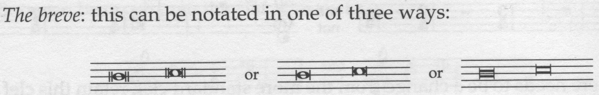
Different breve noteheads
I'm not sure if anything can be done, but I noticed that MuseScore's breve notehead looks different to an example in 'Behind Bars' and LilyPond's (see the vertical bars at the side).
Behind Bars (page 10):
.png")
LilyPond 2.16.1:
.png")
MuseScore 2.0 Nightly Build (b1aa490):
.png")
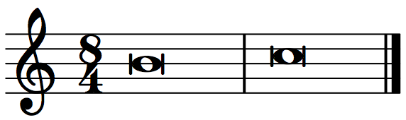
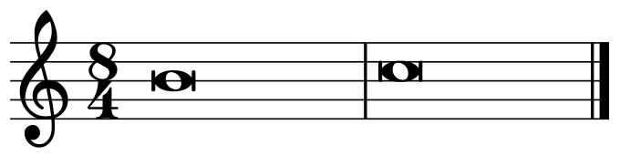
(The attached score was produced in 1.3).
| Attachment | Size |
|---|---|
| Different breve noteheads (Behind Bars).png | 144.71 KB |
| Different breve noteheads (LilyPond).png | 13.74 KB |
| Different breve notehead (MuseScore).png | 12.75 KB |
| Different breve notehead.mscz | 1.37 KB |
Comments
Emmentaler or Gonville or both?
In reply to Emmentaler or Gonville or both? by Jojo-Schmitz
Emmentaler was used for the topic (I didn't think about it, sorry).
Gonville looks similar to the first set in the image from 'Behind Bars'.
In reply to Emmentaler was used for the by chen lung
And Emmentaler is (supposed to be) the LilyPond font, isn't it?
@ Jojo-Schmitz: Yes, Emmentaler comes from Lilypond Feta font, but it has been customized in several details and this might be one.
@ chen lung: I think this is an aspect of notation less standardized than most other aspects. And, surprise, I do not entirely agree with Ms. Gould indication and image.
1) I'm not sure that the shape with 2 bars on each side is surely a shape for brevis. I think it has been used in the past for longa as well. I personally try to avoid it as possibly ambiguous.
In fact, I do not think it is easily available as note head in MuseScore: it exists as symbol but I don't know how to use it as a note head (which doesn't mean it is not possible, but may mean that it is not easy to do!).
2) The length of the side bars in the rounded shapes is mostly a matter of font style. Extending them is a quick and easy change. I personally feel bars in Gould's example and in Lilypond design to be a little bit too long. But perhaps Emmentaler bars are a little bit too short: the round cap which does extend beyond the line but not completely may look like a drawing mistake.
If any kind of consensus can be reached (to avoid going back and forth by trials and errors), I can easily update the font.
3) The squared shape as pictured in Ms. Gould's example looks XIX-early XX c. style. Original design (when this shape was commonly used, i.e. in XV - XVII c.) was definitely squared rather than rectangular (look at any XVI c. print); also designs of the second half of XX c. (but before the advent of computer-aided engraving) are often less elongated. In between, there is the gray area of (approx.) mid-XIX to mid-XX, when the revival of ancient music raised engraving issues, not always solved in a definitive (or consistent) way.
Current Emmentaler design is a more or less perfect square including the side bars. It can be accessed by setting the "Head group" parameter in the Inspector to "alt. brevis".
_____________
In summary:
Changes of glyph sizes are rather quick and easy and I can volunteer to implement them; I would welcome some sort of consensus before actually making them, tough.
Thanks,
M.
In reply to @ Jojo-Schmitz: Yes, by Miwarre
I just noticed and wanted to post incase there was something amiss.
I don't have much opinion on it and you clearly know what you are talking about, so I'm happy to go with whatever :).