Mixer view options
Apologies if this is a duplicate post, I wasn't able to find anything similar but I easily could have missed something.
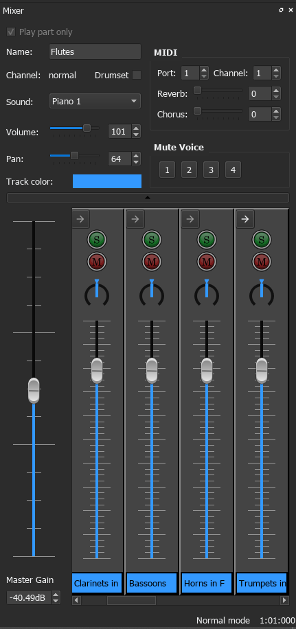
I would like to have the option to view the instrument list in the mixer as rows rather than columns. It can get a bit inconvenient to scroll horizontally through a lot of instruments to find the one I need, and longer instrument names don't fit inside the "name box". For example, if I had Trumpets in C and Trumpets in Bb in the same score I wouldn't be able to tell the difference without clicking to see the full name.
While I like and have used the upgraded features in the MS3 mixer, I personally prefer the layout of the MS2 mixer, where it's much easier to see the names, change the sound, see which is muted/soloed, etc. for many instruments at once. I may be in the minority here, so I wouldn't ask for the default layout to change, but it would be nice to have an option that makes the lower half of the mixer laid out similarly to the MS2 mixer.
In theory I could pop out the mixer and expand it horizontally, but I much prefer using the sidebar so I can still see my score (and that doesn't fix the "name box" issue).
| Attachment | Size |
|---|---|
| Screenshot 2020-09-24 100308.png | 41.12 KB |
| Mixer_en.png | 39.17 KB |
Comments
The mixer is being totally redesigned for version 4. I haven't seen any mockups yet so we'll have to see what happens.
In reply to The mixer is being totally… by mike320
Good to know! Thanks!