Uneven Music Font
Reported version
3.6
Type
Graphical (UI)
Frequency
Once
Severity
S4 - Minor
Reproducibility
Always
Status
active
Regression
No
Workaround
No
Project
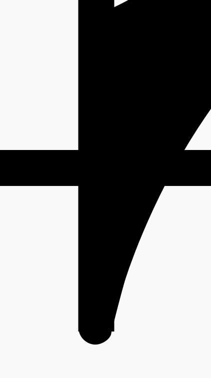
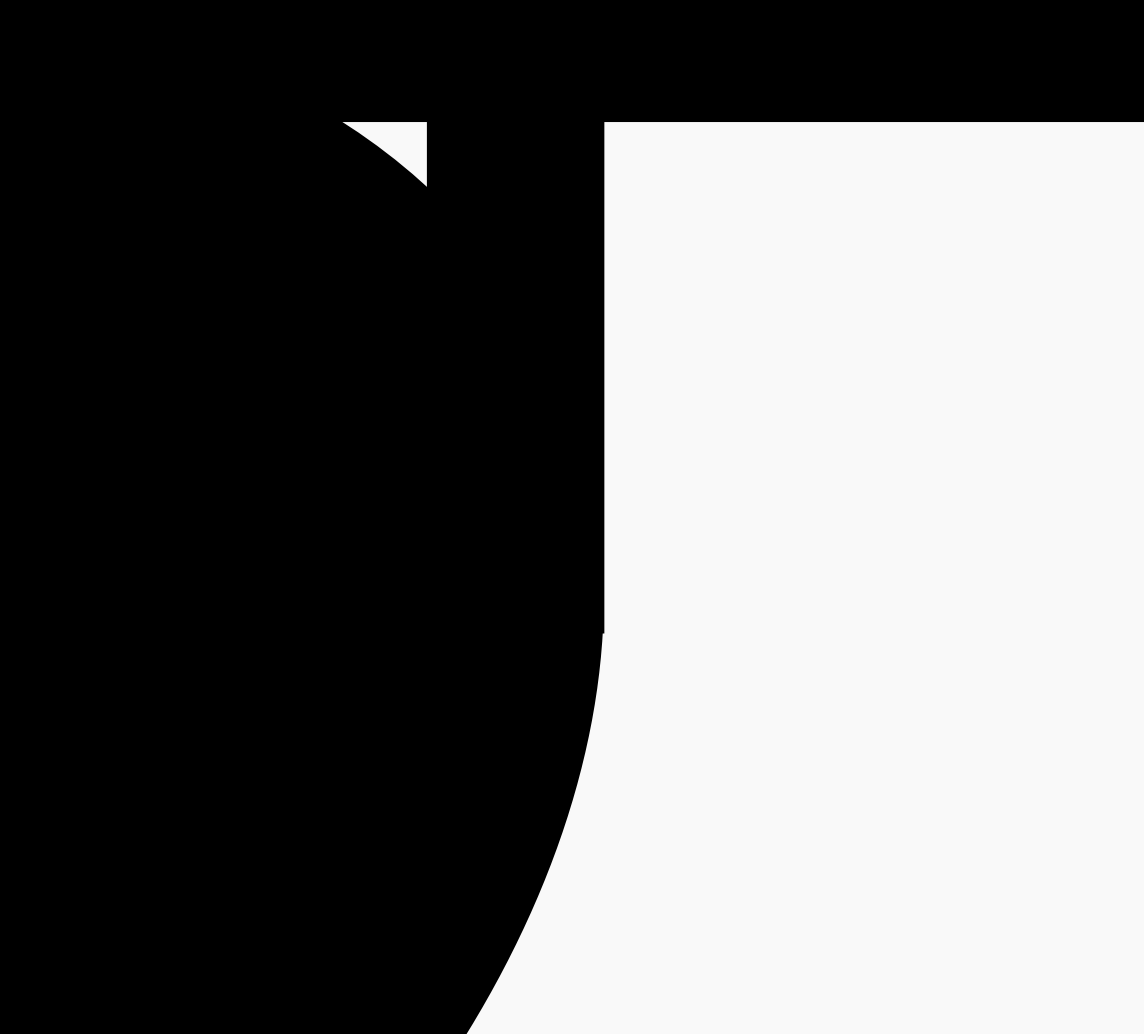
I love the new MuseScore font, but when you zoom in on the noteheads, there's an imperfection on each one. There's a sharp corner that sticks out like a sore thumb where the note head turns into the stem, and I imagine this isn't intentional. I've attached screenshots of what I'm talking about. Everything else about the Music font is great though!
| Attachment | Size |
|---|---|
| Screen Shot 2021-03-08 at 12.07.07 PM.png | 19.74 KB |
| Screen Shot 2021-03-08 at 12.06.45 PM.png | 7.41 KB |
| Screen Shot 2021-03-08 at 12.06.40 PM.png | 53.12 KB |
| Screen Shot 2021-03-08 at 12.05.55 PM.png | 35.48 KB |
| Screen Shot 2021-03-08 at 12.05.41 PM.png | 68.98 KB |
Comments
Yes, but on my 24“ monitor I have to zoom to 1984% on the quaver tail and 11404% on the crotchet stem/body intersection before I notice it. Does it cause a visual problem when printing at normal size?
In reply to Yes, but on my 24“ monitor I… by underquark
It doesn't, although I can spot it at 1100% on my 13-inch screen. It's totally a minor problem, and I haven't noticed it when printing. The only reason I bring it up is that I know Martin Keary (Tantacrul) made a video on the process of designing the music font, and I know he's striving for symmetry and balance, etc. This is definitely at the bottom of the priority list, I totally get it! I just wanted to share the observation, and you guys can do what you want with it :)
Although a small detail, it's definitely the sort of thing we care about! My guess is this looked good originally, but then relatively late in the process we switched from rounded stem caps to square ones, and that's why those extra bits come from.
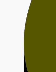
And it is not just Leland being affected, actually Gonville for example is too and much worse. MuseJazz and Petaluma too