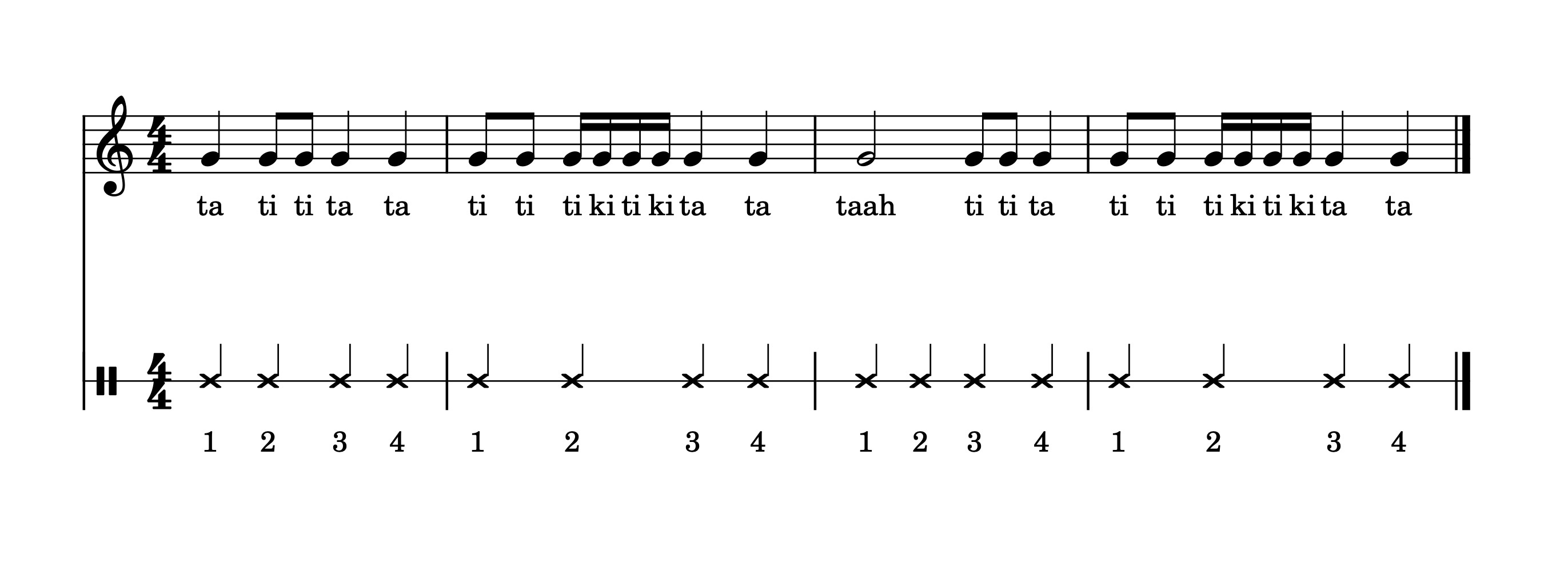
Forcing regular placement of notes in a measure
Hi - I'm trying to make an illustration for my students to show that a "beat" is regular, unlike "rhythms" which are made up of changing note values. I've created a double staff, treble clef on top and percussion on bottom. I inputted regular quarter notes on four measures on the bottom staff, and then various rhythms on the top staff.
Is there ANY way to force the score to align to the regular notes on the bottom staff? It's kind of hard to explain to children that the beat is regular when it keeps shifting its spot to keep up with the rhythms on top!
| Attachment | Size |
|---|---|
| Rhythm_vs_Beat_both-1.jpg | 168.03 KB |
Comments
If you have fewer bars (measures) on each line, this will stretch it out a bit to more what you want. But traditional music engraving does not maintain a constant distance between the longer notes (beats): the space per beat always adjusts, depending on how many shorter notes have to fitted in for a given beat.
In reply to If you have fewer bars … by DanielR
I do realize that I'm asking for something that's a bit out of the box. Most of the online resources I've found don't use actual notation to show the difference between rhythm and beat, but I don't like dumbing things down for my students... I'll just have to play around with the spacing, see how close I can get things.
In a way, I don't care that it's not the way it's usually done; I just want to show things visually. I could just do an illustration with fruits or something, or make a manual illustration using notes with a drawing program, I guess. Always open to ideas!
In reply to I do realize that I'm asking… by lingvemulo
One rather fiddly way would be to use voice two the fill measures with, in your example, 16th notes. Make them invisible. Use voice 1 to add the rhythms you want. Save as a PDF. May not be what you want because it's only useable as a PDF or other print out. Not as something you can use in MuseScore.
I see someone else suggested this whilst I was creating a file - add hidden notes of the shortest duration and this forces everything to space out evenly. It does spread things out a lot, though, so to counteract this you can make those notes Small and set the Leading space to -0.9.
You don't have to add notes, however, since rests take up space too. This gives you a couple fewer steps in making things invisible. You can tidy it up a bit by removing the first system indent and leaving the Leading space at 0 for the first 16th note in each bar.
In reply to You could add hidden notes… by underquark
Oo, thank you for the files! And thank all of you for your input. I wouldn't have thought of using invisible notes. I'm going to play now... :-)
In reply to Oo, thank you for the files!… by lingvemulo
This is one of the very few exceptions (if not even the only one) where hidden elements do have an effect on the layout.
In reply to You could add hidden notes… by underquark
Could also be (invisible) rests (of the shortest duration), in that case you don't even have to make them silent and it is less elements to make invisible too (heads, stems, beams, flags)
Edit: I see (now, need new glasses) that you mentioned that and even provided a sample score
And I think I have it. I put the four measures across two lines (2 per measure) so it's not so crowded. I'll make an image file, and manually move things closer. For some reason reducing min. or max. staff distance doesn't seem to do anything...
This has been a great way to learn more about MuseScore... :-)
In reply to And I think I have it. I put… by lingvemulo
Format > Style > Score > Disable vertical alignment of staves
In reply to Format > Style > Score >… by Jojo-Schmitz
Thank you!! I moved the word "beats" below the percussion staff and it's actually better that way. Yay! Now to put it on my website for the kids. :-)
In reply to Thank you!! I moved the word… by lingvemulo
Better make it staff text
In reply to Better make it staff text by Jojo-Schmitz
Yes, that's logical. I was just not sure what kind of text to use; I'll remember that for next time. For this particular project (4 measures ending up as a jpg) whatever works goes - but I do write lots of arrangements and I'll need to know how to do things the right way. I used to use Finale but it's a bit overkill for my current needs!
In reply to And I think I have it. I put… by lingvemulo
There is a bug where the system distance settings are not interpreted correctly with vertical justification enabled. Since there are only two staves in this example and on ly a single page, it's not a big deal to simply disable it, but in general, that's a last resort. The better way to prevent filling on a single while not giving up the advantages of justification elsewhere would be to add a spacer or frame below the last system.
Also, you shouldn't have disabled autoplace on the "Beats" text. that causes collisions. Instead of disable autoplace, and instead of dragging the text, simply flip it below the staff with "X". Except that here, as mentioned, you really shouldn't have attached the text to top staff to begin with - it should be staff text attached to the bottom staff. But still, for future reference - disabling autoplace is also something that should be a last resort and is pretty much guaranteed to cause problems, there are almost always easier and more effective ways to do whatever it is you want.
In reply to There is a bug where the… by Marc Sabatella
Is there an issue (in the issue tracker) for that bug?
In reply to Is there an issue (in the… by Jojo-Schmitz
I don't think so. As I recall this was discovered almost immediately upon release of 3.6.2 and is fixed as part of some broader changes implemented in the weeks afterwards. Not sure of the status of this exactly, and I can't find the relevant PR either. @njvdberg might recall.
In reply to I don't think so. As I… by Marc Sabatella
Maybe https://github.com/musescore/MuseScore/pull/7853 (for 3.x, with a counterpart of master/4.0)?
Or https://github.com/musescore/MuseScore/pull/7713 (for master/4.0 only)?
In reply to There is a bug where the… by Marc Sabatella
Thanks again for your detailed help. In principle, I never mess with any of the automatic options in any program until I know what I'm doing, and in future I'll be more careful!