Design of solo/mute icons on mixer
Hello everyone!
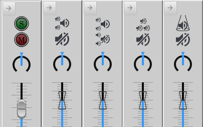
Last day I stumbled upon a pull request made by @SolarGranulation, where, among other things, new icons for the mixer were provided with "familiar visual cues to illustrate button functions". Currently, the icons for "solo" and "mute" are their first letters (first part of images 1 and 2).
@SolarGranulation suggested replacing the "M" button with a slashed loudspeaker (the standard sound icon), and the "S" button, with a slightly smaller sound icon which has two little slashed sound icons on the left (second part of image 1).
I really liked that proposal, but some objections were arised. I've come up with a few variations with the hope that the idea will be still considered.
The first variation (third part of image 1) is an attempt at making the two icons resemble a lot, which results in a lot of loudspeakers, which is exactly what @mkruselj didn't like.
The second one, an attempt at reducing visual clutteredness by using three little slashed loudspeakers for the solo button. The context is provided by the other button -big and one for this instrument, small and a few for the others-.
The last variation is the one I like the most. Instead of using slashed loudspeakers for the solo button, which refer to the other instruments, it shows a loudspeaker illuminated by a spotlight. The icon could also be taken for an isolation tube, another valid interpretation. It's kind of the same concept used by soundtrap (pointed up by @anatoly-os in the PR comments), but I think it delivers it brighter and clearer.

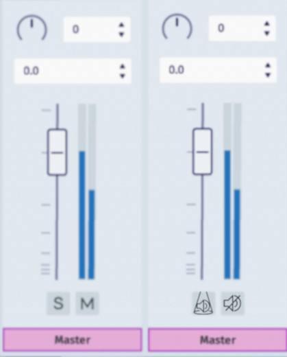
The second image was made from the mixer v1 of MU4 @Tantacrul showed us, contrasting it with the last variation I suggested.

The pros? People who don't speak English and/or don't have experience with mixing programs will have it -presumably- easier to understand the meaning of the icons, aligning with the intuitiveness aimed for the next versions of MuseScore.
The cons? First, and it's a very valid concern, it goes against the industy standard of using S and M. For people accustomed to this, it could end up being more counter-intuitive than some other icons, if those were not well designed! Second, I'm not very experienced in graphic design: the icons I made need some polishing if they are going to be used. Namely, the "solo" button is still a little bit visually overcharged.
All in all, I think a pictogram is more universal than a letter, because a person shouldn't need to be familiar with the latin alphabet to be able to make music. I think we should push for that change.
Anyway, that was it. What are your thoughts on the matter? How could these icons be improved?
| Attachment | Size |
|---|---|
| image 1.jpg | 31.49 KB |
| image 2.jpg | 29.88 KB |
Comments
I agrees that S and M are not good, esp. for other languages, and that icons could convey the meaning better
In reply to I agrees that S and M are… by Jojo-Schmitz
Yes indeed :-)
Thanks very much for this. I agree that 'S' and 'M' have to go and I'll make sure to redesign our icons to be universal - taking some inspiration from this work.
Thanks again!
In reply to Thanks very much for this. I… by Tantacrul
Thanks for the consideration!
Earlier this morning I was thinking about the 'solo' icon, and it has ocurred to me that the spotlight/isolation idea could be made simpler by drawing a circle around a loudspeaker. That circle could even be made to resemble an 'S', like having a negative diagonal slash, to appeal to the users who like the letters.
I'm very glad you'll redesign the icons and I'm looking forward to the result! :)
In reply to Thanks very much for this. I… by Tantacrul
Designing a "mute" icon seems straightforward enough, "solo" is probably tougher. I wouldn't complain if it were this:
In reply to Designing a "mute" icon… by Marc Sabatella
That gets my vote. No translation necessary.
In reply to That gets my vote. No… by mike320
And then the questions come in: What does the "Han" button do?
In reply to Designing a "mute" icon… by Marc Sabatella
I'm afraid that the weapons law in Germany does not allow this ;-).
In reply to I'm afraid that the weapons… by kuwitt
You can always put a walkie-talkie there
In reply to Designing a "mute" icon… by Marc Sabatella
That is mute to me though ;-)
In reply to Designing a "mute" icon… by Marc Sabatella
Hey! Not everybody is a Star Wars fan >:(
In fact why even expect all people to know those movies, or not dislike them XD
My two cents and my personal opinion:
I could live with the first or second variation, but the small loudspeaker symbols should be placed below the bigger one side by side, that means in the same as the order of the instruments.
The third variation, three small slashed loudspeakers, I'm not sure if they would be obvious for a solo setting for users.
For the fourth one I could good live with it, but I don't know any other application, which is using this symbol - concerning the recognition factor.
As suggested in the pull I also could imagine a head speakers symbol for it, after a short research Garage Band seems to use this symbol. Maybe a head speaker with a loudspeaker in it? But maybe this could be ambiguous.
Further I also think it's important, that selected buttons get colored - green for solo, red for mute - to keep quickly an overview about the adjustments.
And last but not least, I'm not sure if transparent sliders is the best option.
How about having just one loudspeaker icon and let the sound waves coming out of it turn on or off?
In reply to How about having just one… by [DELETED] 20089696
My two humble cents:
coming from DAWs and physical mixers, I would argue that the defacto standard is "Solo" (or just "S") and "Mute" ("M").
So well established that anybody not speaking english still gets it ;)
I see no value in having the entire user interface in icons only just for the sake of it...
In reply to My two humble cents: coming… by Vincent_Wong
I completely agree. The M and S (sounds like MuseScore;) are so heavily used that almost anyone can understand it.
Plus, solo comes from an italian root, and italian is already all over the place in music. Knowing that solo means one player only is the same as knowing that adagio means don't go too fast. For other languages, I'd rather have an icon that they'll at least find consistent with DAWs and other scoring programs than a random and farfetched icon.
disclaimer: I do not speak these languages. These results were obtained with a translation service.
German: Klarinette solo
Greek: κλαρινέτο σόλο
English: clarinet solo
Spanish: clarinete solo
Finnish: klarinetti soolo
French: clarinette solo
Italian: clarinetto solista
Romanian: clarinet solo
Icelandic: clarinet Solo
Kazakh: кларнет соло
Malay: clarinet solo
Slovenian: klarinet solo
Arabic: الكلارينيت منفردا
Estonian: klarnet soolo
Persian: سولو کلارینت
Irish: aonair clarinet
Croatian: klarinet solo
Korean: 클라리넷 솔로
Malayalam: clarinet solo
Russian: кларнет соло
Bengali/Bangla: একক
Czech: klarinetové sólo
Fiji: clarinet domodua
Gujarati: ક્લેરિનેટ સોલો
Latvian/Lettish: klarnete solo
Maltese: solo tal-klarinet
Bulgarian: Соло на кларинет
Welsh: unawd eglurnet
Danish: klarinet solo
Finnish: klarinetti soolo
Polish: klarnet solo
Samoan: pu solo
Swahili: zumari solo
Tonga: kalaneti (clarinet)
Hindi: शहनाई एकल
Japanese: クラリネット・ソロ
Lithuanian: Klarnetas solo
Maori: pūtahoro whakaataata
Portuguese: clarinete solo
Swedish: klarinett solo
Turkish: klarnet solo
Catalan: clarinet en solitari
Hungarian: klarinét szóló
Kannada: ಕ್ಲಾರಿಯೋನೆಟ್ ಸೋಲೊ
Malagasy: clarinette solo
Marathi: क्लॅरिनेट सोलो
Dutch: klarinet solo
Punjabi: clarinet ਸੋਲੋ
Slovak: klarinet sólo
Tamil: clarinet தனி
Ukrainian: Кларнет соло
In reply to I completely agree. The M… by ecstrema
So there are a few languages where the first character of the translared "Solo" is not an S...
Now try the same on "mute" and find many languages translate this into a word starting with S (stumm, silencio, etc) and so it collides with the S from Solo...
"mute" itself has a double meaning already, in English, on one hand the mute in mixer (no sound at all), on the other the one for brass (muffled) and for guitars/harps (damped)
In reply to Try the same on "mute" and… by Jojo-Schmitz
Ok then, how about this? It is designed not to violate the Geneva Convention and Interstellar Law
Nice work.
- I agree that 'mute' is more straightforward but it's harder to think on a Solo button only with icons.
- Honestly, S and M seem to have become an universal standard for anyone used to mixer consoles and DAWs. I'd just remove the extra circles and change the font to something more modern.
- That said, and as @kuwitt already mentioned, COLORS are very important, if not more important that icons. You could even get away just with a red and a green buttons with a minimal icon on them, or then, set translations for the S and M buttons if required for a particular language - and I guess most languages will remain as S and M.
In reply to Nice work. - I agree that … by elerouxx
One thing about colors though - for the solo button, isn't yellow used way more often across programs than green?
In reply to One thing about colors… by Asmatzaile
You are right! or at least some use green but many use yellow.
Btw GarageBand has a fairly nice icon solution by using a slashed speaker for mute, and a headphone icon for Solo. So far it's the best approach I've seen other than the S/M buttons.
In reply to One thing about colors… by Asmatzaile
To me green doesn't suggest solo, it just suggests "not muted". Headphones are probably the clearest idea I've seen yet, that plus red/yellow would work for me, but I'd personally like to keep the M and S. I personally find icons in generally to be a slow way of finding things.
In reply to One thing about colors… by Asmatzaile
On all the desks I have used the Mute button is (if colored) Red or highlights red when active. Aside from my old analog tables where it was a simple gray button and you'd have to notice the level of it.
The consoles that don't write "Mute" or "M" on it, usually have a slashed through microphone on them.
For Solo, I have not yet had a console that uses an icon for it. Most write out "Solo" in full, a handful uses the "S". In some consoles pressing Solo meant seeing mute light up for all other channels. Those that highlight the function when active use Yellow (most common) or Blue.
In reply to On all the desks I have used… by jeetee
I find strange that some consoles use a microphone as the symbol for audio - after all, the audio is being played back, not recorded. Anyway, I made one icon each for solo and for mute using microphones (the mic icon per se is from uxwing.com):


[EDIT:]
Another version of the icons, with larger and more centered microphones:
The triangle/trapeze surrounding the mic in the solo icon comes from a simplification of the "spotlight" presented in the OP.
In reply to I find strange that some… by Asmatzaile
Another thought that just came to my mind: in the proposed MS4 mixer v1, the order of the buttons is S and M, but in a lot of other mixing applications (Garageband/Logic Pro, Reaper, Cubase...) these are switched up; the order being first M and then S.
In reply to Another thought that just… by Asmatzaile
wise comment about ordering, I had forgotten until now, but now I remember that it felt very odd at first sight.
In reply to I find strange that some… by Asmatzaile
Great Icons!
In reply to Great Icons! by ecstrema
second version is clearly better.
In reply to I find strange that some… by Asmatzaile
I find strange that some consoles use a microphone as the symbol for audio - after all, the audio is being played back, not recorded
On a real mixer, those are per-channel inputs and during live events and at first step most definitely the channels where the microphones are connected and used for recording.
The channel is the (microphone/line) input which gets routed (possibly via subgroups) to its respective output channel(s); such as mains, monitors, auxilaries, ...
The function to playback and rework existing recordings via the desk is a later addition, made more common with the digital mixers.
In reply to I find strange that some… by jeetee
Oh, of course. How could I not think of that? *facepalms*
Late to the party here ...
Regarding the design of a solo button, how about a "One sound" icon? — i.e. the number 1 in a speaker:


Works pretty good at a small size:
In reply to Regarding the puzzle of a… by scorster
Not a bad concept, but because of the way the 1 nests so perfectly inside the speaker shape, it doesn't read as being a number 1, it reads more as being a highlight or reflection, part of the 2D depiction of a 3D speaker cone, even if that reading doesn't entirely make sense. Some other number (like 2) would read more clearly, but of course wouldn't convey the "solo" idea.
I like the idea of a pair of headphones. During a live performance, if I wanted to listen to a single instrument, I would reach for a pair of headphones (in addition to pressing a solo button on the mixer).