Musescore 3 forgets some EXCELLENT Musescore 2 features.
Greetings Dear Sirs:
Please, could someone help me?
Details in the Image below.
| Attachment | Size |
|---|---|
| Errores Musescore.jpg | 217.13 KB |
Greetings Dear Sirs:
Please, could someone help me?
Details in the Image below.
| Attachment | Size |
|---|---|
| Errores Musescore.jpg | 217.13 KB |
Do you still have an unanswered question? Please log in first to post your question.
Comments
a) The new color scheme is by design., but you can tweak the colors via Edit > Preferences > Advanced.
b) Initial barline in tab staff being to short seems to be a new and yet unreported issues, feel free to file in the issue tracker, but I can't reproduce it, so don't forget to attach a sample score and steps to reproduce
In reply to a) The new color scheme is… by Jojo-Schmitz
Thanks a Lot.
a) Okay. By chance, Do you know that Line must be modified in the Color Scheme?
b) You can reproduce this Error with any type of Staff.
c) What can you tell me about the Spacing of the Notes?
In reply to Thanks a Lot. a) Okay. By… by ComeBytes
A) no
B) no I can't
C) no, I don't see an issue
In any case a sample score is needed.
In reply to A) no B) no I can't C) no, I… by Jojo-Schmitz
Thanks.
That is the Score.
In reply to Thanks. That is the Score. by ComeBytes
Sorry.
Please, to see the problem, you should reduce the Horizontal Size of the Window to show only the Six First Bars.
In reply to Sorry. Please, to see the… by ComeBytes
I don't see any barline that is too short.
You are using some non-default settings on Format > Style > Measure, like Note distance left set to 1.2 rather than 1 and Clef left border set to 0.64 rather than 0.80, also the Barlines settings differe from default.
But yes, layout in 2.x and 3.x does differ, usually for the better.
That color change is, as said earlier, by design and changed in 3.2, you can tweakt it yourselt, as mentioned above.
In reply to I don't see any barling that… by Jojo-Schmitz
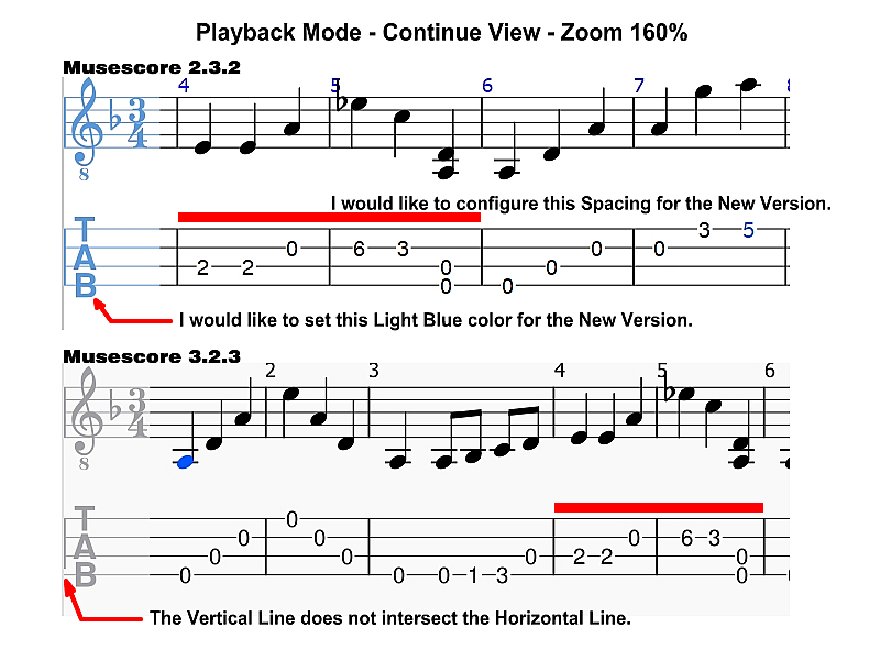
I sent the File to you to see the Incomplete Vertical Line in the TAB Section and the Gray Color of the Key and the Initial Compass of both Sections.
The smallest spacing of the Notes in Playback Mode, is comparing it with Musescore 2, as I mentioned initially.
I would like to modify it for Blue as it was previously shown in Musescore 2.
And give it a larger spacing just like Musescore 2 did.
In reply to I sent the File to you to… by ComeBytes
Understood, but see above.
Ahh, I can see the too short barline when in continuous mode as soon as the left most measure hits the left border of the screen. A pretty minor problem IMHO, it'd never print that way.
I don't see it being mentioned in #272135: [EPIC] Continuous view issues though, so feel free to add this to the issue tracker
In reply to Understood, but see above. by Jojo-Schmitz
Sorry. Let's see if I explain.
I mean: In Playback Mode - Continuous View, Musescore 3 has less Spaced Notes than the Musescore 2. This makes it less pleasant and readable.
In reply to Sorry. Let's see if I… by ComeBytes
You mean in continuous mode? Anyway, I don't see this as being unpleasent, but you can increase the default settings to your heart's content.
In reply to You mean in continuous mode?… by Jojo-Schmitz
Yes!!! Where I can do this? (Without modify the Spacing Notes in the Page View)
In reply to Yes!!! Where I can do this? … by ComeBytes
You can increase the over all spacing in Format > Style > Measure, and for Page view reduce stretch maybe?
In reply to You can increase the over… by Jojo-Schmitz
Thanks a Lot. Your answers were very helpful.
In terms of the Spacing of the Notes in Playback Mode - Continuous View, I think I have achieved a Balance Point between what I had in Musescore 2 and what I now have with Musescore 3.
I just need to change that Light Gray Color that maintains the Clef , Key Signature, Tempo, and Principle of Compasses in Playback Mode - Continuous View.
In reply to Thanks a Lot. Your answers… by ComeBytes
Colors are found in edit->Preferences->Advanced. I believe the color you want to change is ui/score/layoutbreakcolor (it could be the option above that I have the same color for both) and I use #55aaff in the HTML filed.
In reply to Colors are found in edit-… by mike320
My Dear Friend, you are Right. I could change that light gray color. Thank you so much for your valuable help.