Flat symbol too close to chord letter
Hello
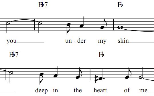
On this screenshot :

I find that on the Bb and Eb chords the flat sign is too close
to the chord symbol, especially the Eb could easily be mistaken for a Bb because the
b runs into the E .
The screenshot is of a pdf file exported from musescore, but in musescore also the flat sign is too close.
This is with musescore 1.3
Note :
This issue is similar to the one described in this thread :
(except that said thread was about the flat symbol being to far away).
However it seems there was an issue with fonts defaulting something else when the flat sign is absent, so I doubt this is the same issue here (since I'm using the default font).
| Attachment | Size |
|---|---|
| i've got you.jpg | 20.32 KB |
Comments
Try my modified chord symbol description file.
The next version 2.0,won't have that problem, you can try it now, get it from http://musescore.org/en/download#nightly
In reply to Try my modified chord symbol by Jojo-Schmitz
Well that was fast. Thanks for the quick reply !
So I tried it, here's what I get :

It's much better. However I can't help thinking maybe just a little
more space would be perfect (sorry to be such an obsessive freak).
I understand if you disagree, but in that case could you tell me
which of the parameters in the file I should modify? I did a diff on both files
and several things were changed, and I can't figure out which one I should tweak.
Thanks
In reply to Well that was fast. Thanks by BigJack3
I believe I only changed 2 lines, one for the chord and the other for the bass note
Also need to compromise, for the # not getting too much distance for example.
In reply to I believe I only changed 2 by Jojo-Schmitz
Well yes, two lines... so I would like to know which of those two lines I should be working on.
Also these lines contain a bunch of numbers, it's not really apparent what they are for.
If this is this documented somewhere I will be happy to read it; otherwise I hope it's not to much to ask which of those numbers controls the space between the chord symbol and the flat sign?
Thanks in advance for any help.
In reply to Well yes, two lines... so I by BigJack3
AFAIK there's no documentation, except in the source and the bit that is in the XML file already.
The 1st line is for tha chord symbol, the 2nd for the bass note to that.
{syntaxhighlighter brush:xml; gutter: false;}
:n m:1:-1 :a m:0:1
m:0:2 / :n m:1:-1 :a
{/syntaxhighlighter}
So print the note (:n), then move (m:) one unit right (1) and one up (-1), than draw the accidental (:a) and move (m:) one unit down (to get back to the same hight we started with)
For a bass (or base) note move (m:) down 2 more, draw the / then the note (:n), move (m:) one right (1) and one up (-1), then draw the accidental (:a)
Clear as mud?
My experiments with this seem to reveal that fractions don't work, so you can't move 1.5 units.
In reply to AFAIK there's no by Jojo-Schmitz
Thanks so much !
Winter is coming, now I know I can stay home and experiment with the placement of my accidentals.
So thanks for taking the time to write all this, much appreciated.
In reply to Thanks so much ! Winter is by BigJack3
FWIW, I wouldn't spend a ton of time on this. When MuseScore 2.0 comes out (no specific time frame announced, but it feels like it is getting closer and closer), the whole way this file works is going to change. For the better - it won't be necessary to edit the file just to get MuseScore to recognize chords the way you like to type them, and rendering should also be better for most chord types. And if you do choose to edit the file to customize rendering further, there will be new options for doing so.
Meanwhile, note the specific issue discussed here - flat too close to letter - is unique to stdchords.xml. The other available chord description files don't suffer this problem. For most people, simpy choosing a more appropriate chord description file is a better way to go than customizing the file themselves. Whatever tweaks you were thinking of making, you might find one of the other chord description files already does that by default. See Chord name for more.
In reply to FWIW, I wouldn't spend a ton by Marc Sabatella
I believe my 'fix' to tsdchords.xml is just a workaround for a shortcoming of the font it uses. The other chord description files use a different font so don't have the problem.
And indeed 2.0 doesn't have it either, seems the fond got fixed there
In reply to I believe my 'fix' to by Jojo-Schmitz
I think it's a combination of both - the current font has too little leading space on the flat sign to be useful in text, but it's the correct amount for use in music. For 2.0, it seems this has all been redesigned - it's two different glyphs, I think. Anyhow, even for 1.X, stdchords.xml *should* have accounted for this and added extra space.
In reply to FWIW, I wouldn't spend a ton by Marc Sabatella
Thanks Marc, I hadn't realized that. I'll give it a try...